How to Create Infographics from Data with AI
A practical workflow for turning raw data, reports, and research notes into clear, useful infographics with AI.
A practical workflow for turning raw data, reports, and research notes into clear, useful infographics with AI.
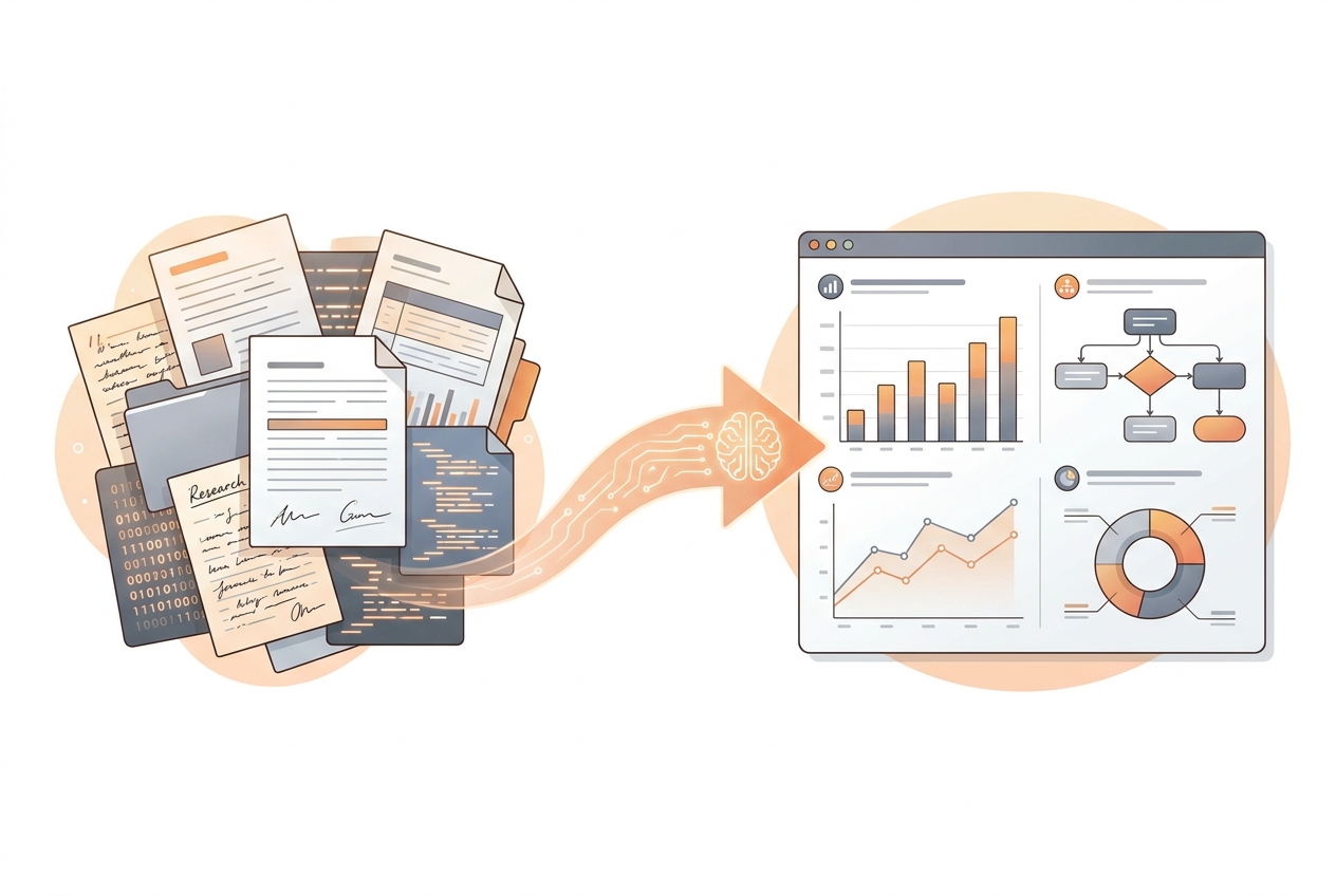
Raw data rarely tells a clear story on its own. A spreadsheet, research summary, analytics export, or report may contain useful evidence, but the audience still needs structure: what changed, why it matters, and what they should remember.
That is where infographics help. A good infographic turns information into a visual explanation. It removes unnecessary detail, highlights the important pattern, and gives the reader a path through the idea.
AI can speed up this process, but it works best when you give it a clear source, a goal, and a review process.
Before you generate anything, write one sentence that defines the job of the infographic.
Examples:
This keeps the infographic focused. Without a clear purpose, the result may become a collection of facts instead of a useful visual story.
AI tools work better when the input is clean. You do not need a perfect dataset, but you should remove anything that is not relevant to the visual story.
Useful source material can include:
If your data has important caveats, include them. For example, note the date range, sample size, or segment being analyzed.
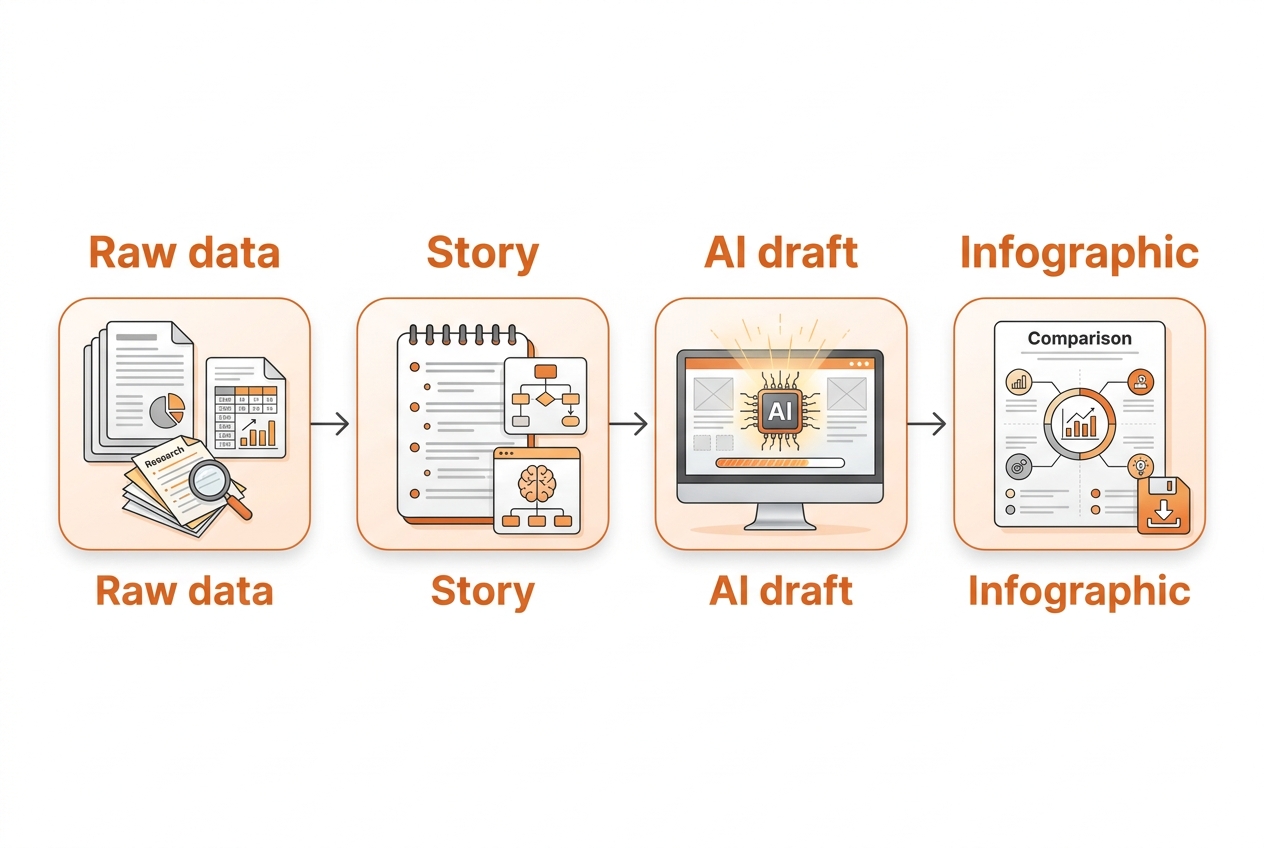
Do not jump straight from raw data to final visual. First, ask AI to identify the message.
A good first prompt is:
Analyze this source and identify the main takeaway, supporting points, and any data that should be visualized. The audience is [audience]. The infographic should help them understand [goal].This step helps you decide whether the infographic should be a timeline, comparison, funnel, process diagram, mind map, chart-based summary, or visual report.
Different stories need different layouts.
Use a timeline when the story is about sequence or change over time.
Use a comparison when the audience needs to choose between options.
Use a funnel when the story is about drop-off, conversion, or stages.
Use a process diagram when the story is about how something works.
Use a mind map when the story has a central topic with related branches.
Use a visual report when the story combines multiple insights, charts, and summary points.
The structure should match the reader's question. If the reader asks "what happened over time," a timeline is often clearer than a generic poster.
A useful infographic usually has three to six sections. Each section should carry one idea.
For example:
Keep the text short. Infographics are not full reports. Use the source material to decide what matters, then compress each idea into a heading, a short sentence, and a visual cue.
AI can create a strong first draft, but the final infographic still needs human review.
Check for:
This is especially important for business, scientific, education, healthcare, legal, or financial content.
Infograph.me is designed to help turn documents, links, text, topics, and data into infographics faster. It can help with the early draft: reading the source, identifying a structure, and generating a visual starting point.
The strongest results still come from a clear brief. Tell the tool the audience, the goal, and the kind of visual explanation you need.
Create an infographic from this source for [audience].
The goal is to explain [main idea].
Use a clear structure with 3-5 sections.
Highlight the most important data points and keep the copy concise.
Then review the draft against your original source before sharing or publishing.
AI is most useful when it removes the repetitive work between source material and a clear visual draft. Treat it as a drafting partner: define the message, choose the right structure, review the facts, and refine the final infographic for your audience.
Turn documents, links, text, topics, and data into clear infographics with AI.
Get started