
Visualize Data Clearly
Convert raw measurements, tables, and study notes into readable charts with labels, captions, and visual hierarchy.
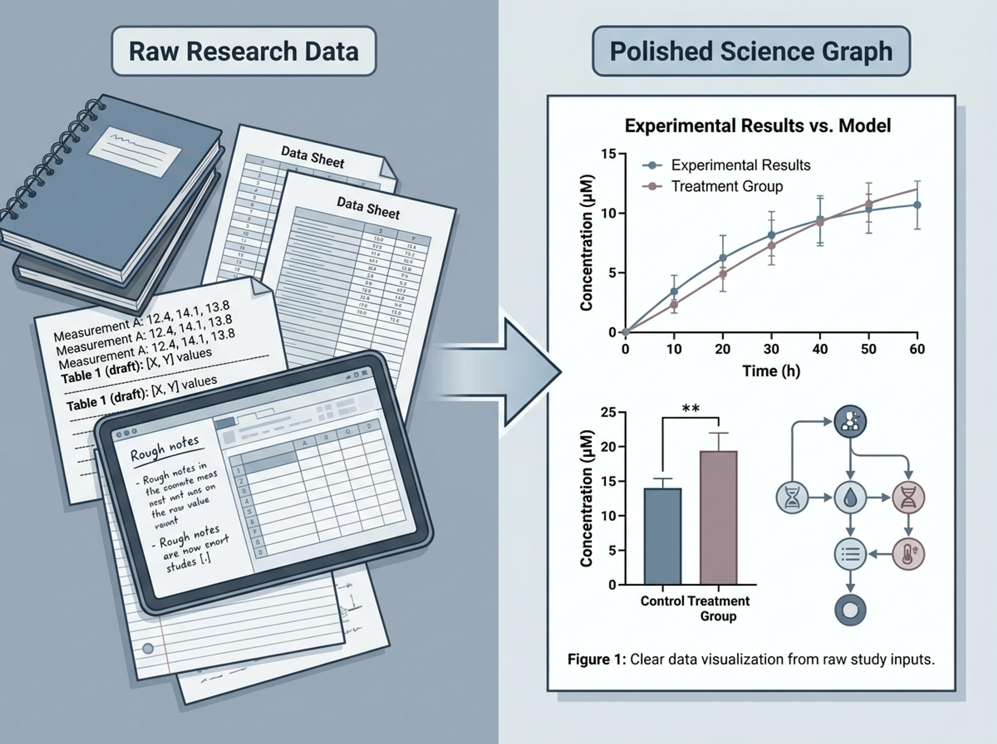
Turn complex research, raw data, and academic papers into clear science graphs with Infograph's AI generator.
Turn data, papers, methods, and findings into clear science graphs and figure-style visuals.
Convert raw measurements, tables, and study notes into readable charts with labels, captions, and visual hierarchy.
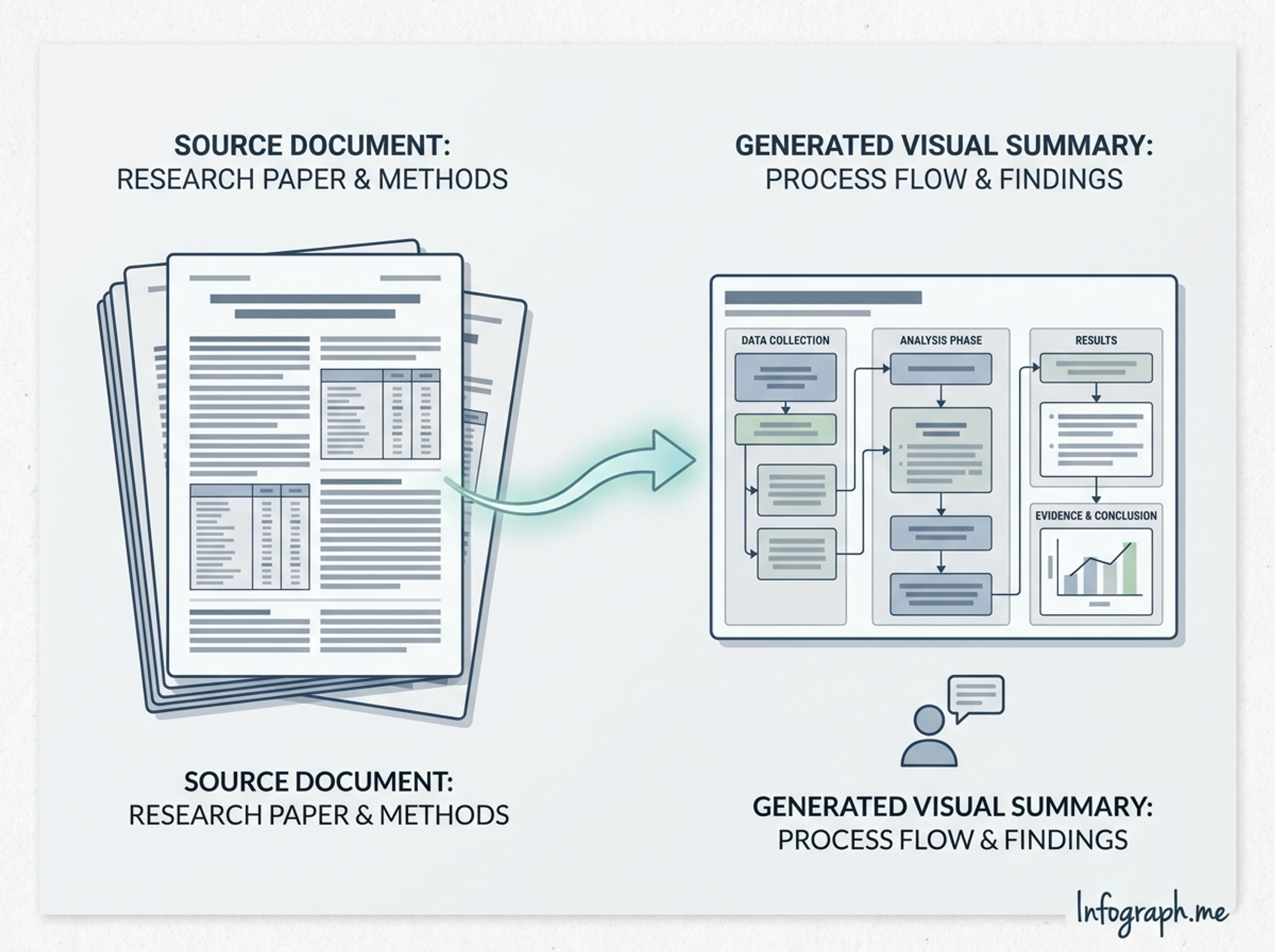
Upload research material and generate visuals that explain methods, evidence, or findings without rebuilding figures from scratch.
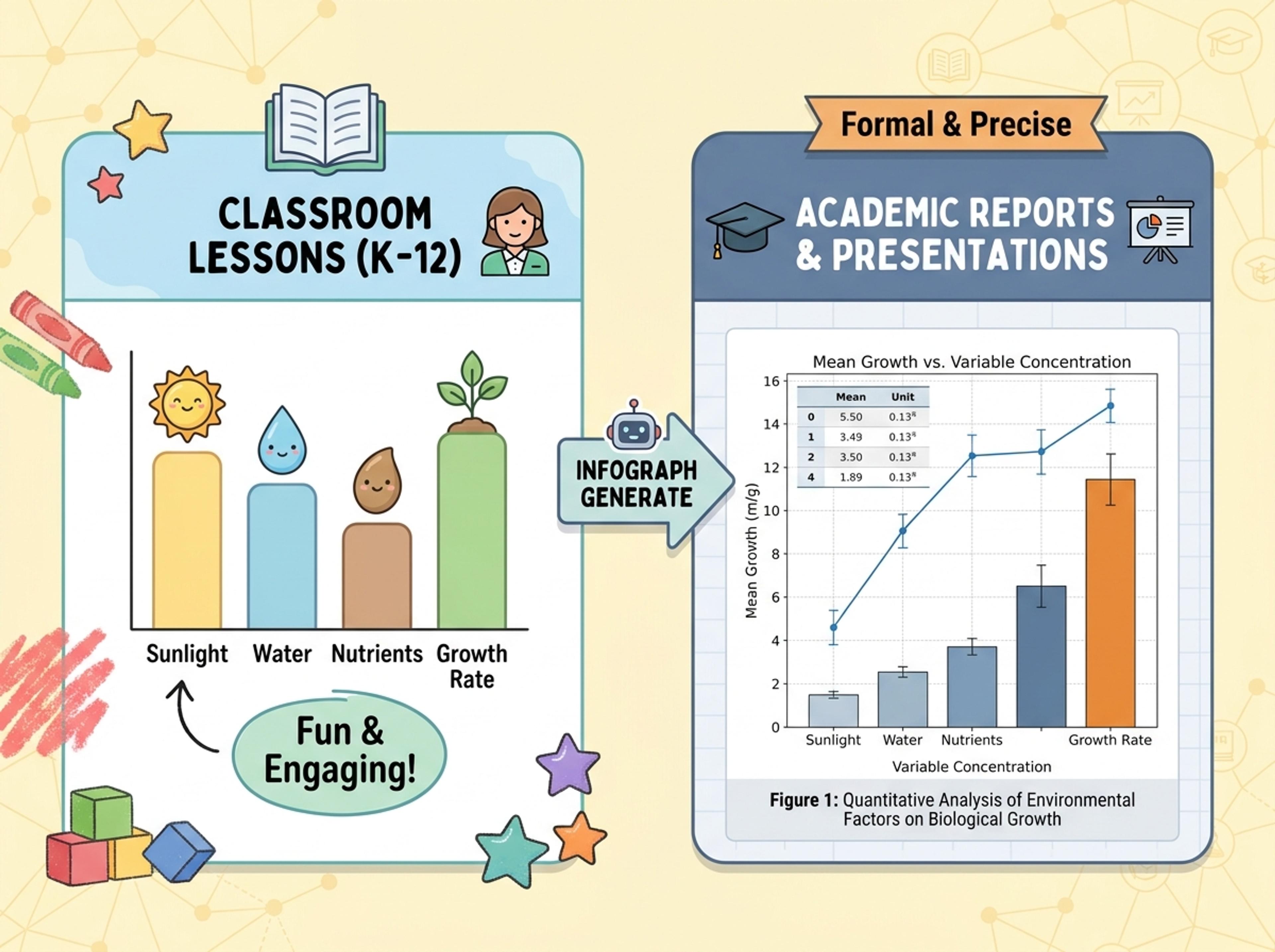
Use a classroom-friendly K-12 style for lessons or a more formal academic style for reports, posters, and presentations.
Explore generated science graph styles for classroom explanation, academic review, research communication, and strategy reports.
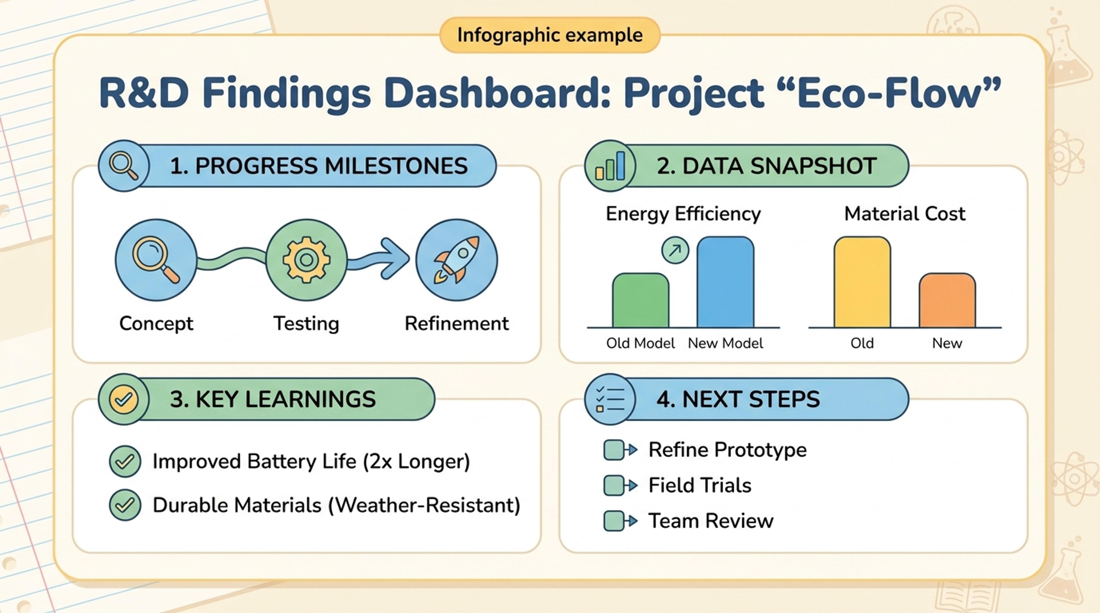
Turn technical evidence into a clear internal update for product or research teams.
Scientific visuals need both accuracy and readability. Infograph helps with the structure and presentation layer.
Visuals are shaped around the source data, findings, and labels.
Upload papers, notes, or methods so graphs reflect the source.
Titles, axes, callouts, and captions are organized for scanning.
Use K-12 clarity or academic polish depending on the page goal.
Ask for simpler labels, different emphasis, or a cleaner layout.
Export figures for reports, posters, decks, and learning materials.
Upload a paper, paste lab notes, add a data summary, or describe the scientific relationship you want to visualize.
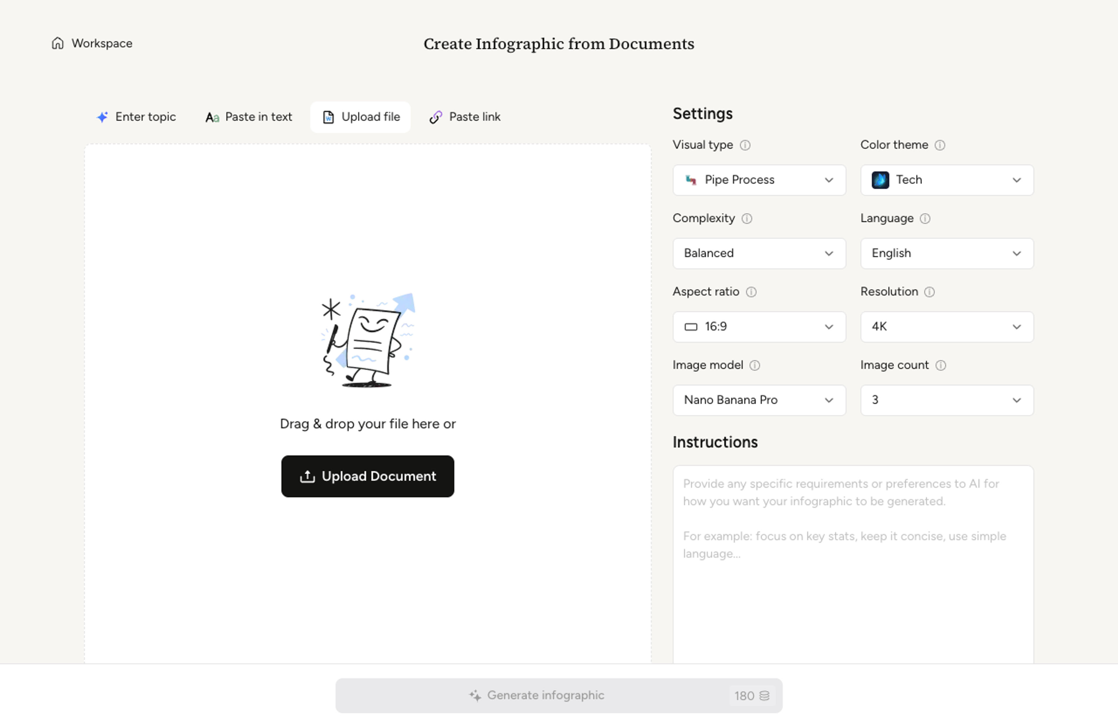
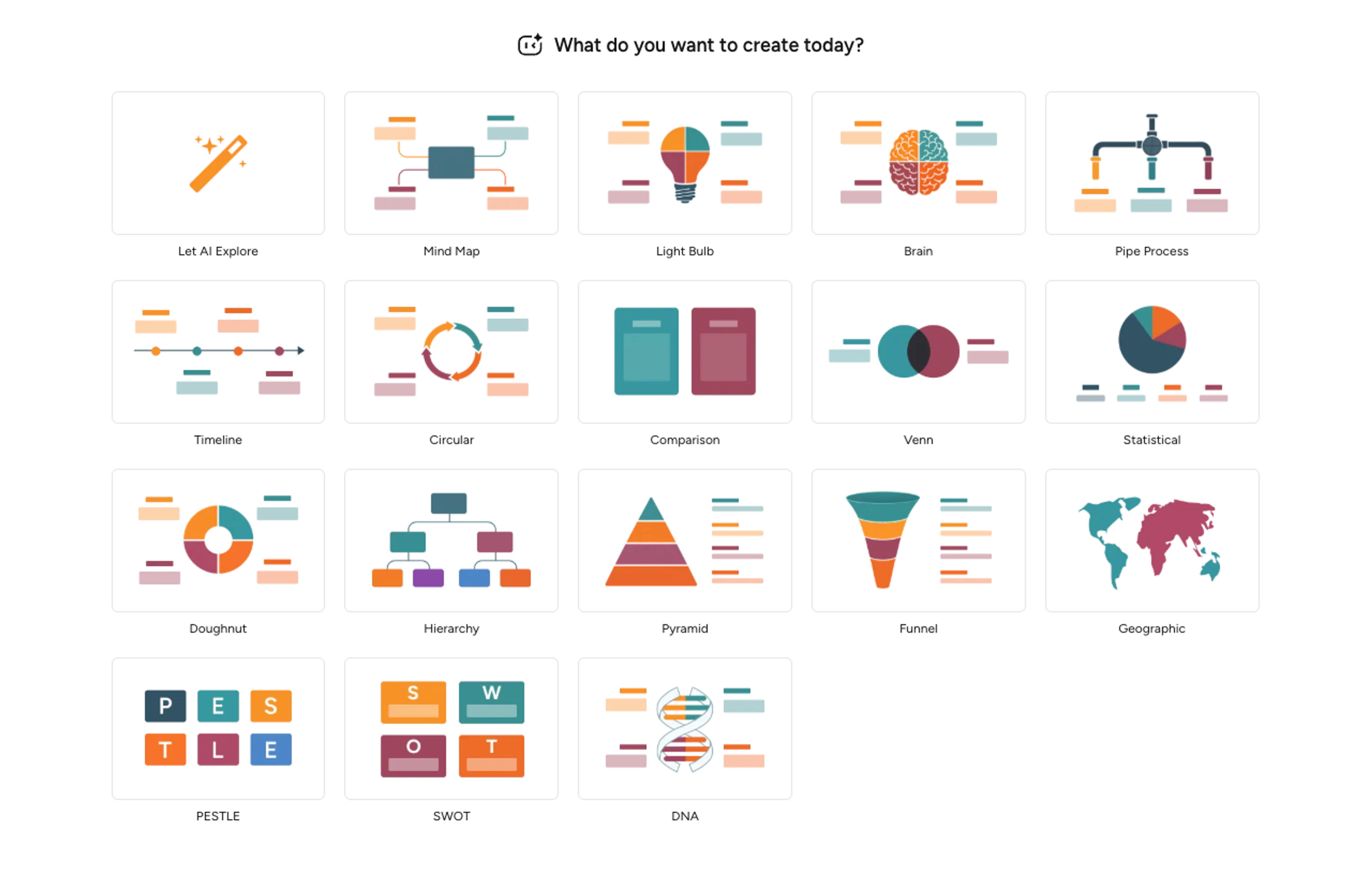
Pick whether the result should be a chart, comparison, scientific figure, process explanation, or classroom visual.
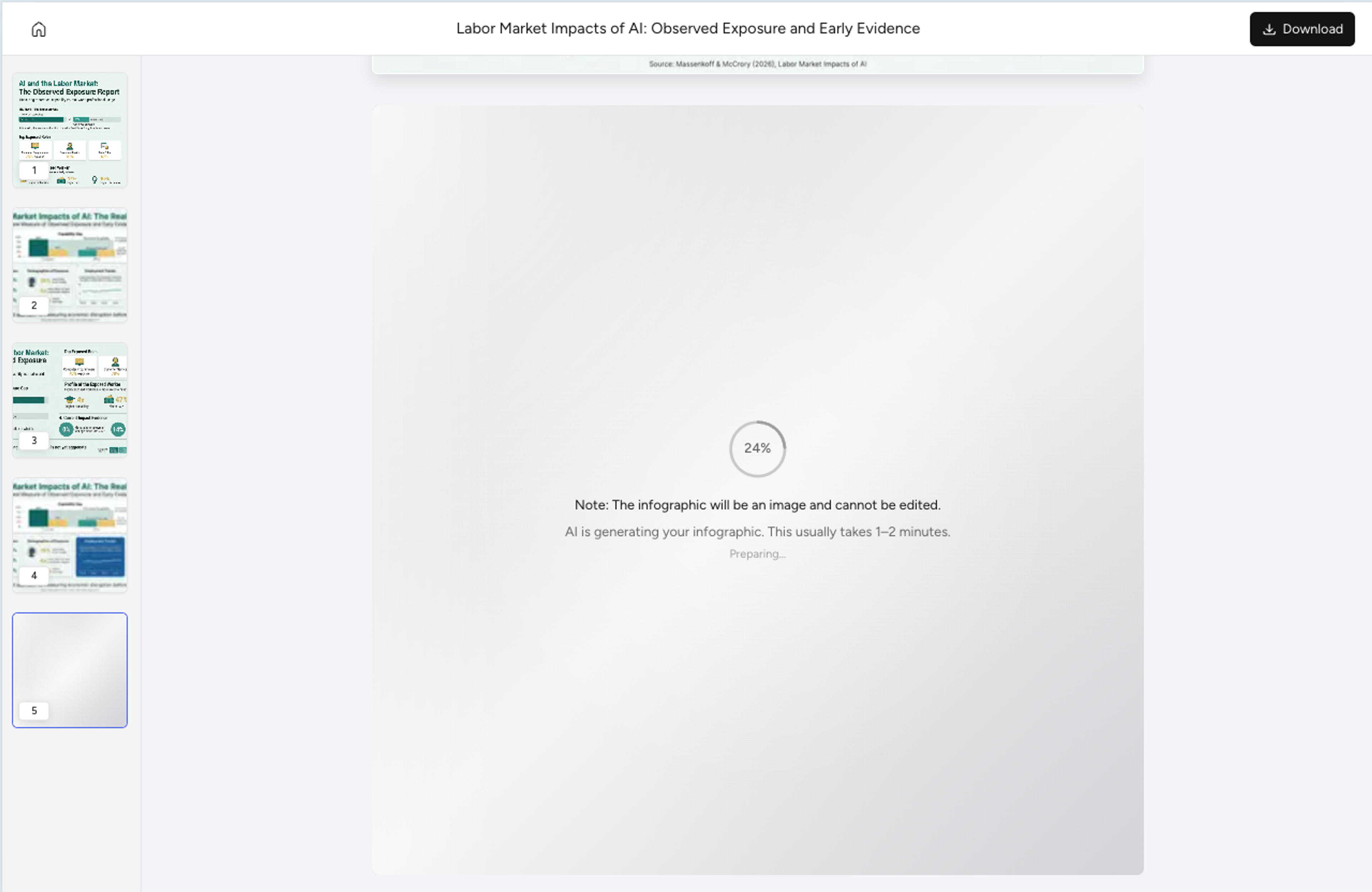
Infograph turns the source into a readable graph-style visual with labels, captions, and a clear visual hierarchy.
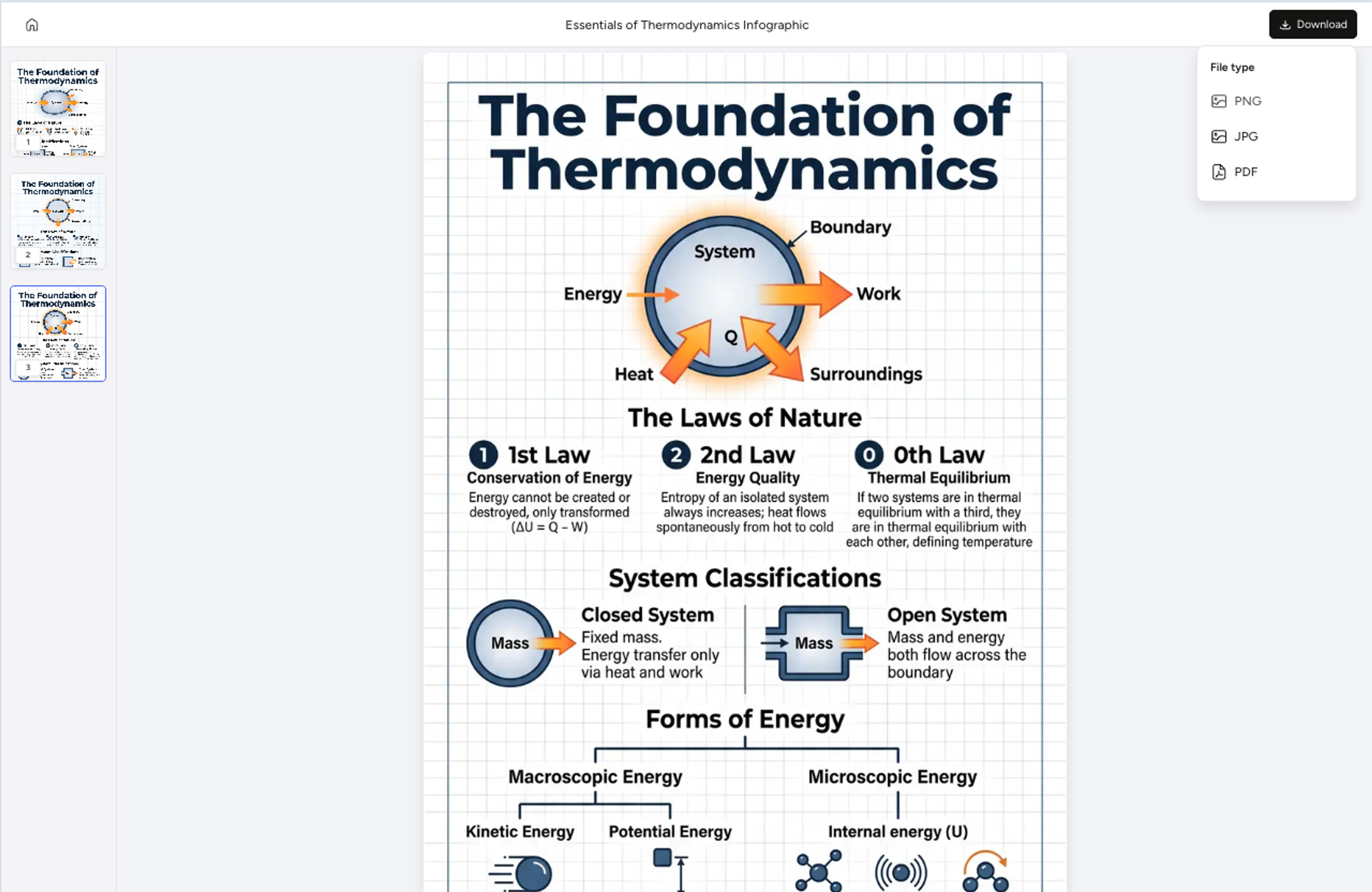
Adjust labels, simplify sections, change the audience style, and export the graph as PNG, JPG, or PDF.
Yes. You can provide data summaries, research notes, papers, or text descriptions, and Infograph will create a graph-style visual from the source.
Both. Education examples can be K-12 friendly, while Academic examples should use a more formal university, graduate, or research communication style.
Yes. You can ask the AI to rewrite labels, simplify captions, reorganize sections, or change the visual emphasis.
Yes. You can export generated visuals as PNG, JPG, or PDF and place them into decks, reports, posters, and classroom materials.
No. Infograph is for creating readable visuals from your data and notes. Use your scientific analysis tools for statistical computation and validation.
Explore related science and diagram tools for figures, DNA diagrams, and academic visual summaries.
Turn methods sections, results tables, and lab notes into publication-ready scientific figures without rebuilding diagrams in vector software.
Turn sequencing notes, gene descriptions, or research papers into a clear DNA diagram suitable for posters, journals, and classroom slides.
Use Infograph to turn your research papers, data, and notes into professional scientific figures and educational graphics instantly.
Drop in percentages, raw numbers, or a paragraph describing the breakdown and Infograph will compose a balanced doughnut chart with clean callouts.
Drop in a CSV, paste a markdown table, or upload a sheet and Infograph turns the rows into a chart-driven infographic instead of a wall of numbers.
Turn papers, lab notes, links, text, and data into scientific figures, graphical abstracts, biology diagrams, and research visuals. AI Scientific Figure Maker | Built for research and education