


Explain Budget Breakdowns
Paste categories and values to create a chart that shows where spend, revenue, or resources are concentrated.
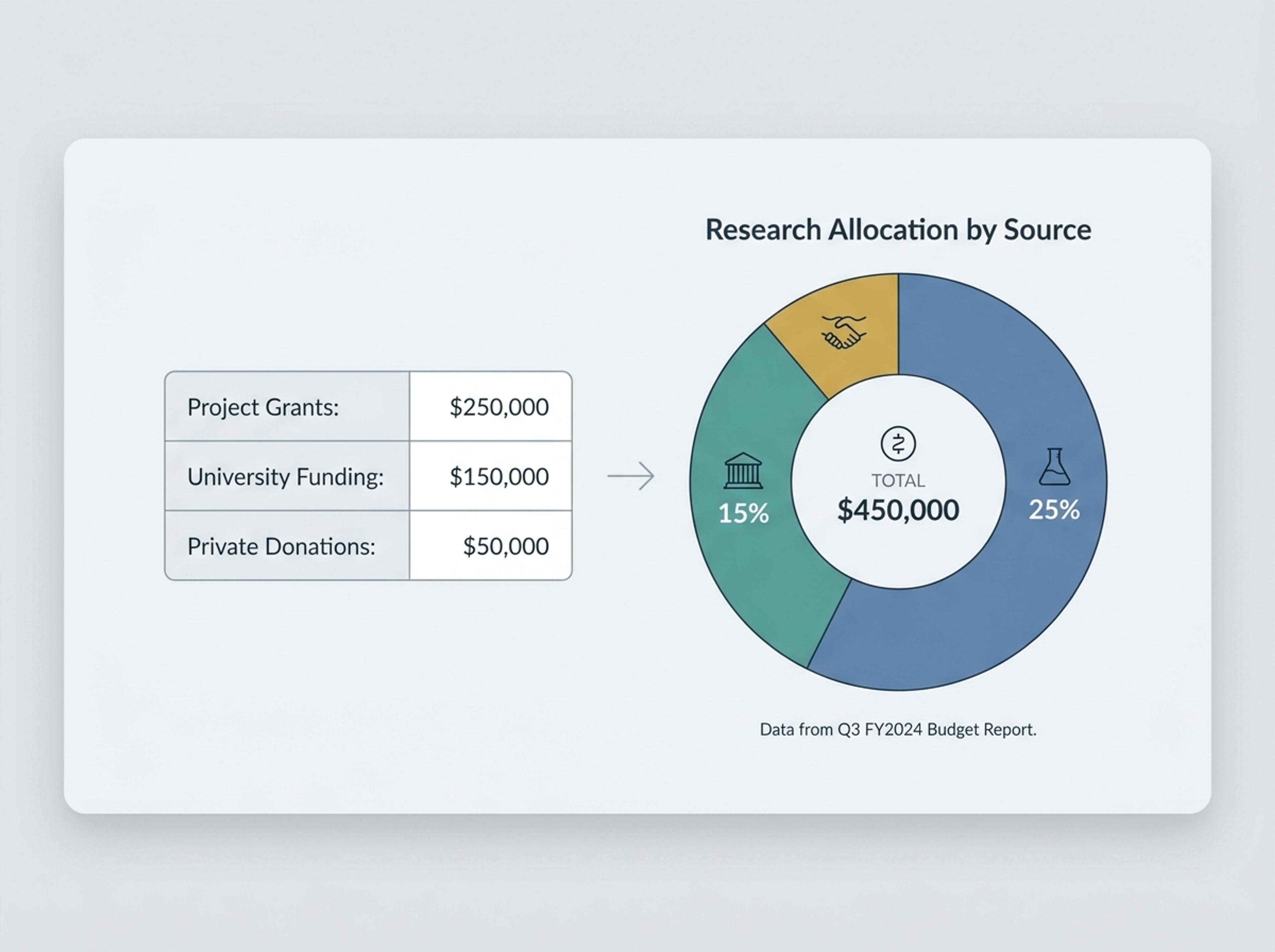
Drop in percentages, raw numbers, or a paragraph describing the breakdown and Infograph will compose a balanced doughnut chart with clean callouts.
Drag and drop your paper, lab notes, lesson material, or document here or
A doughnut chart shows share-of-total data as proportional segments around a ring, leaving room for a central label, total, or key insight. It is useful for budget breakdowns, channel mix, survey results, classroom data, and any simple composition story.
Start with raw numbers, percentages, or a paragraph describing a breakdown and let Infograph size segments, labels, and callouts into a polished doughnut chart.
Paste categories and values to create a chart that shows where spend, revenue, or resources are concentrated.
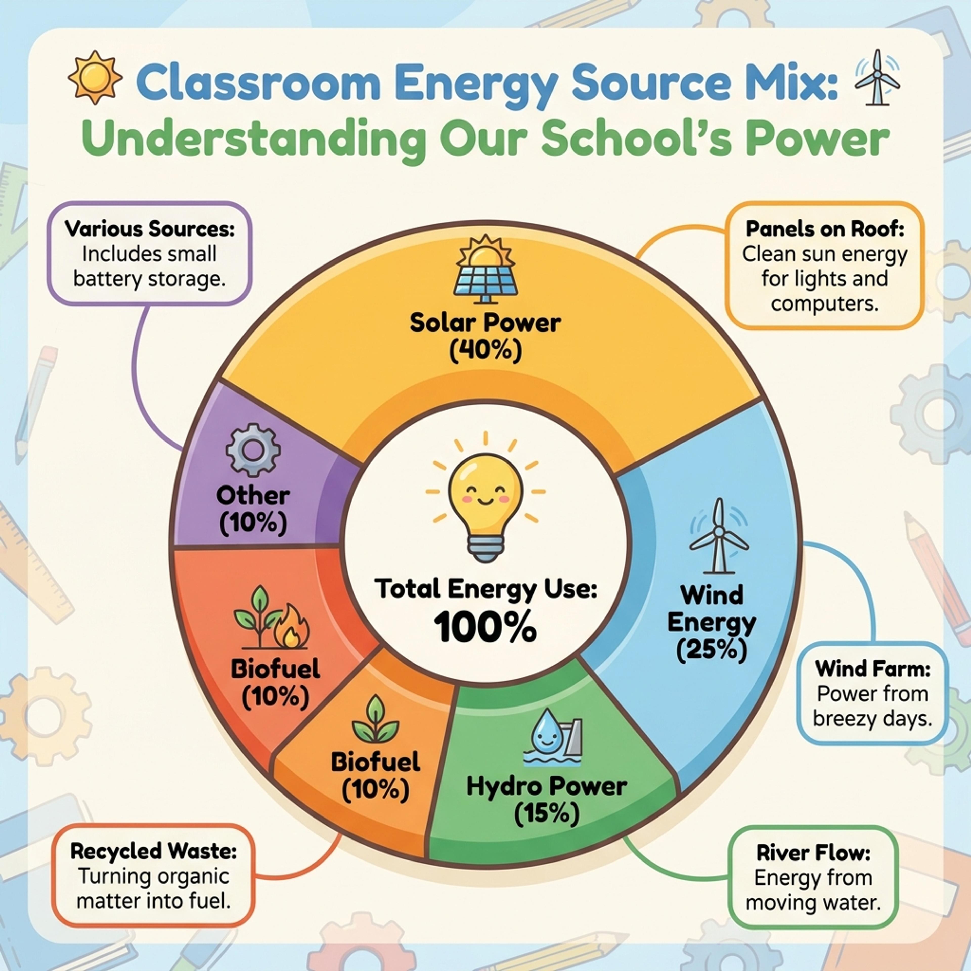
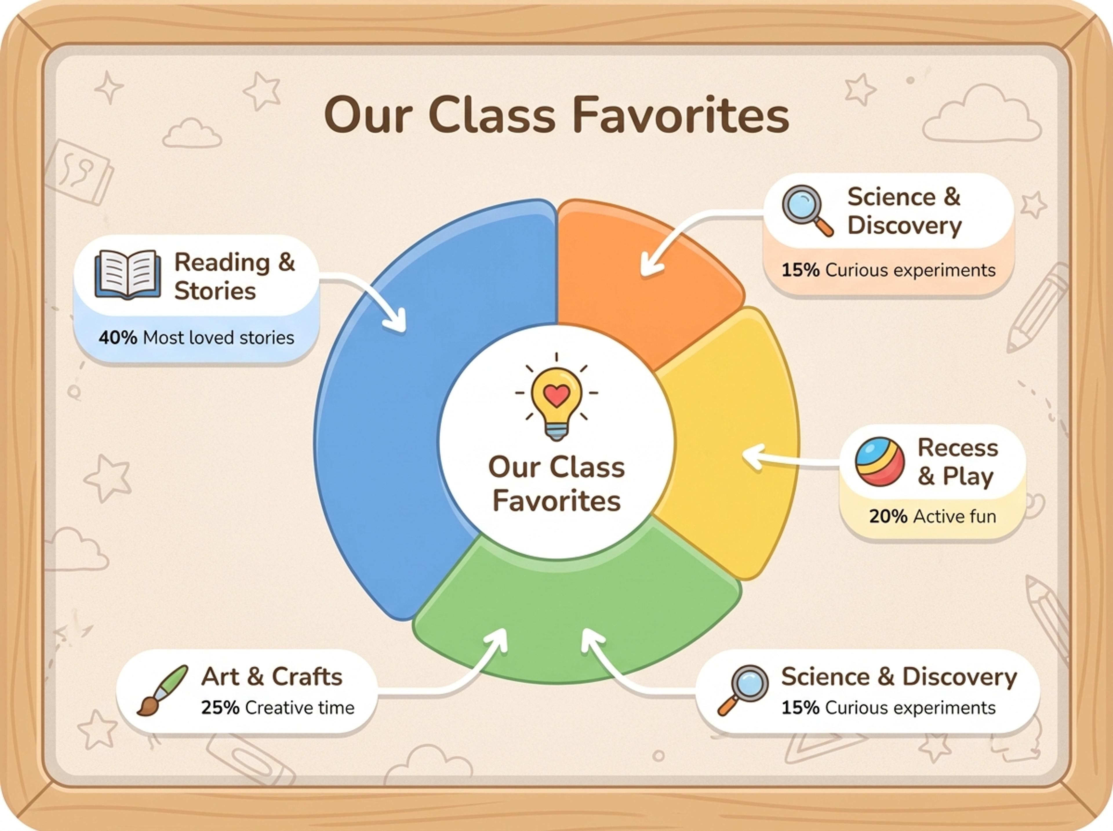
Turn K-12 survey results or class data into a colorful chart students can read and discuss quickly.
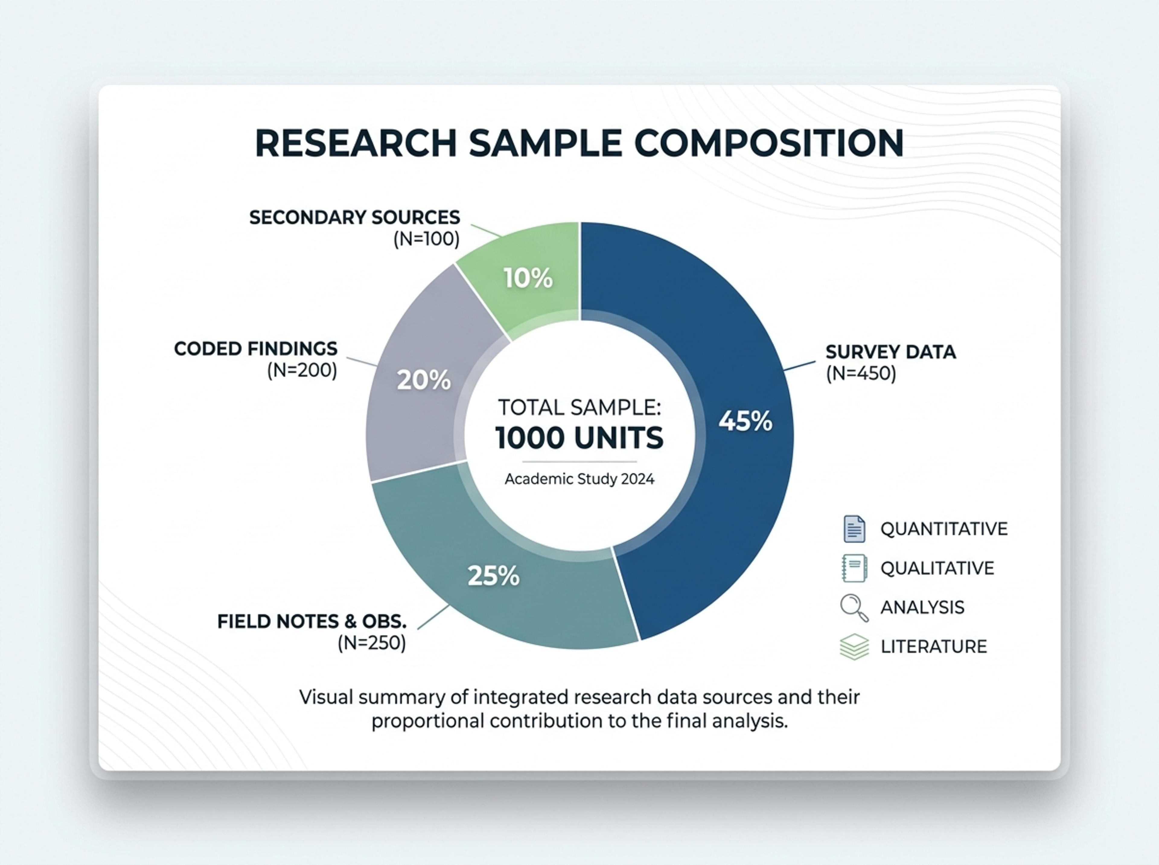
Convert survey tables, study samples, or coded findings into a clean academic share-of-total visual.
Paste a CSV of category and value, drop in a paragraph that lists shares, or upload a sheet. The AI keeps every label exactly as you provided.
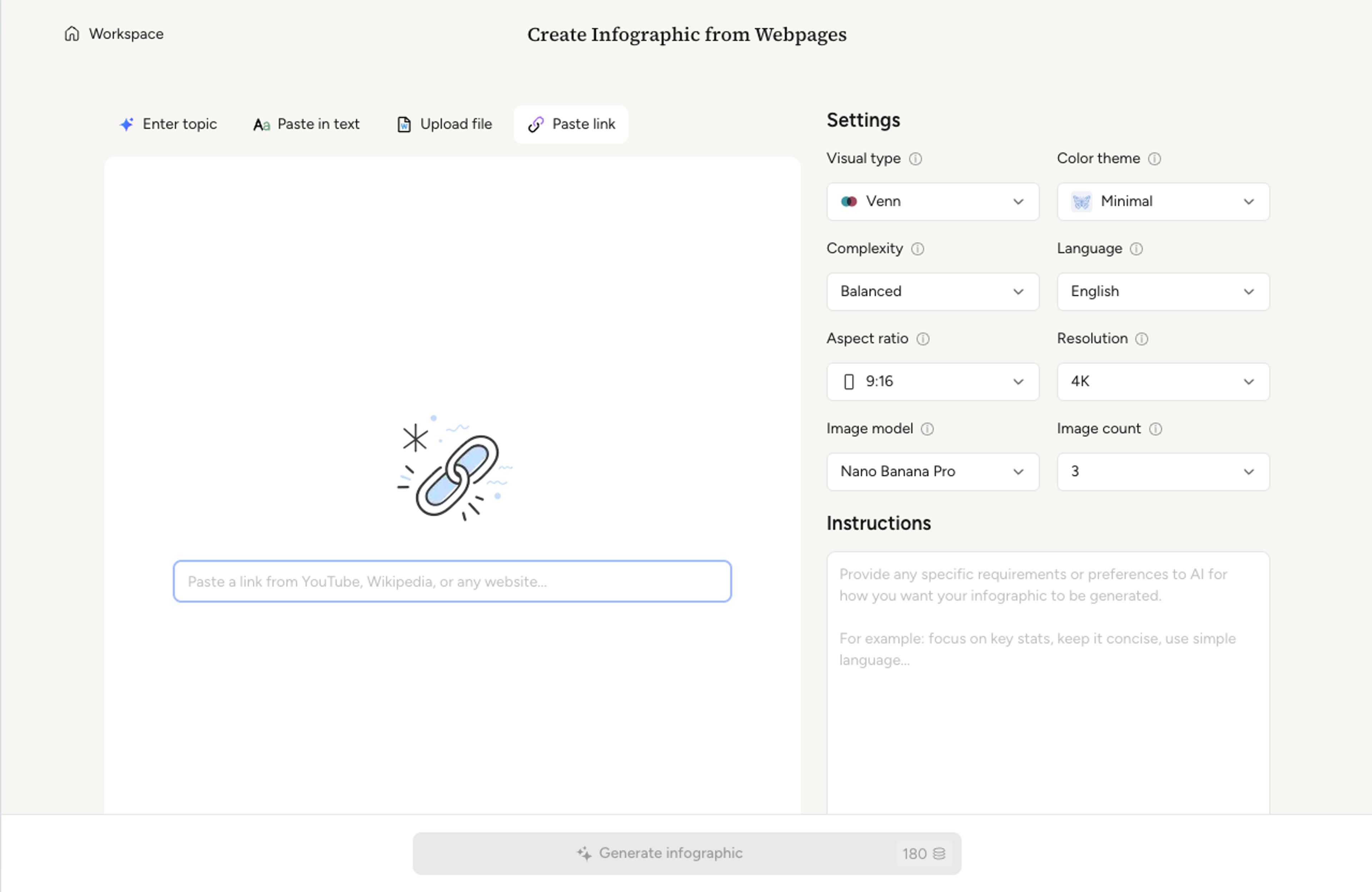
Decide how many slices to show, what to merge into "Other," and whether the donut hole should display the total, headline metric, or category name.
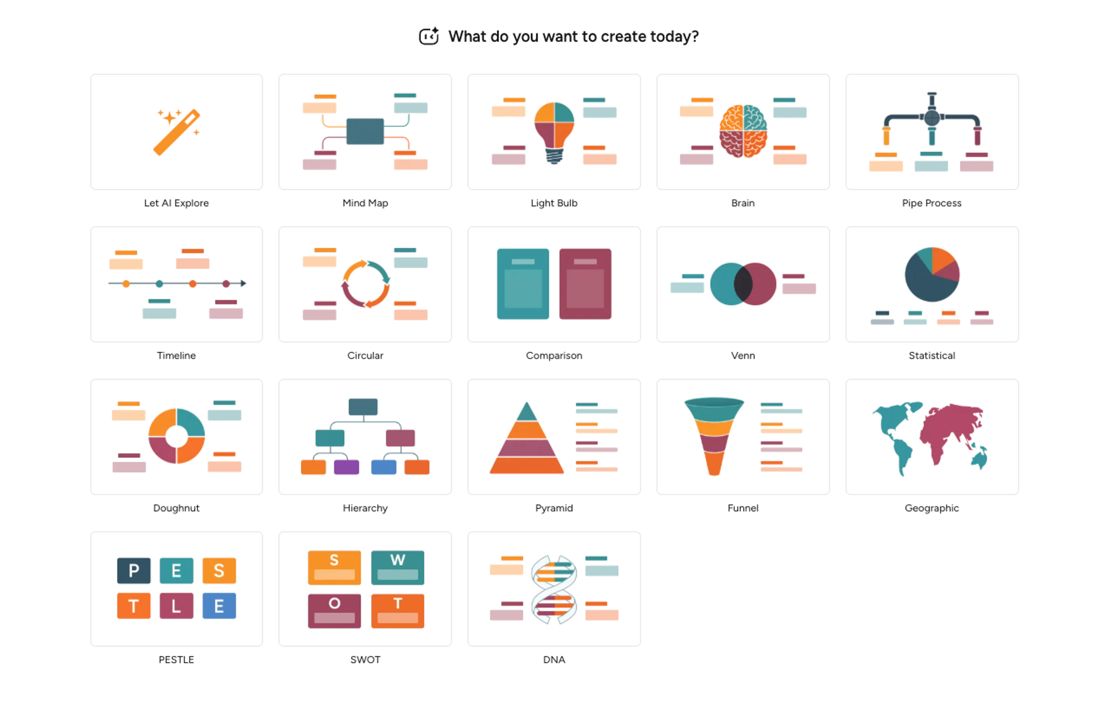
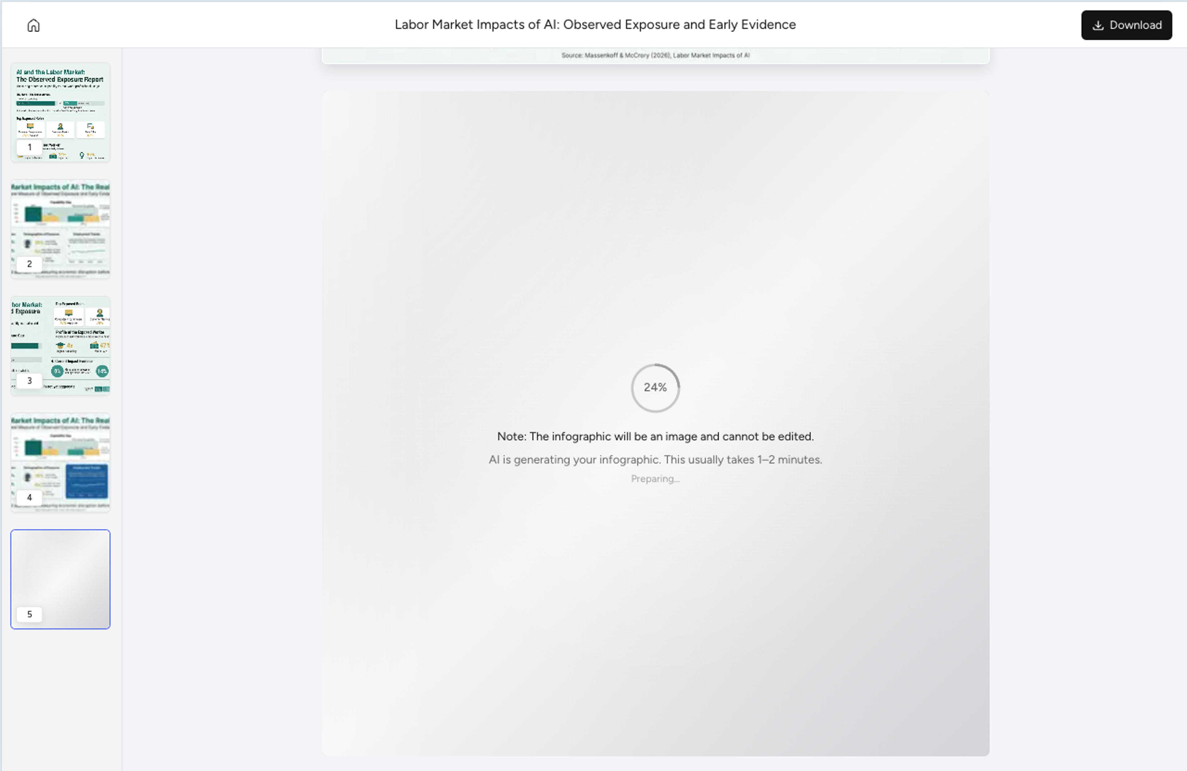
Infograph sizes each slice to the actual share, picks a coherent palette, and writes a short caption per segment that explains what drives the number.
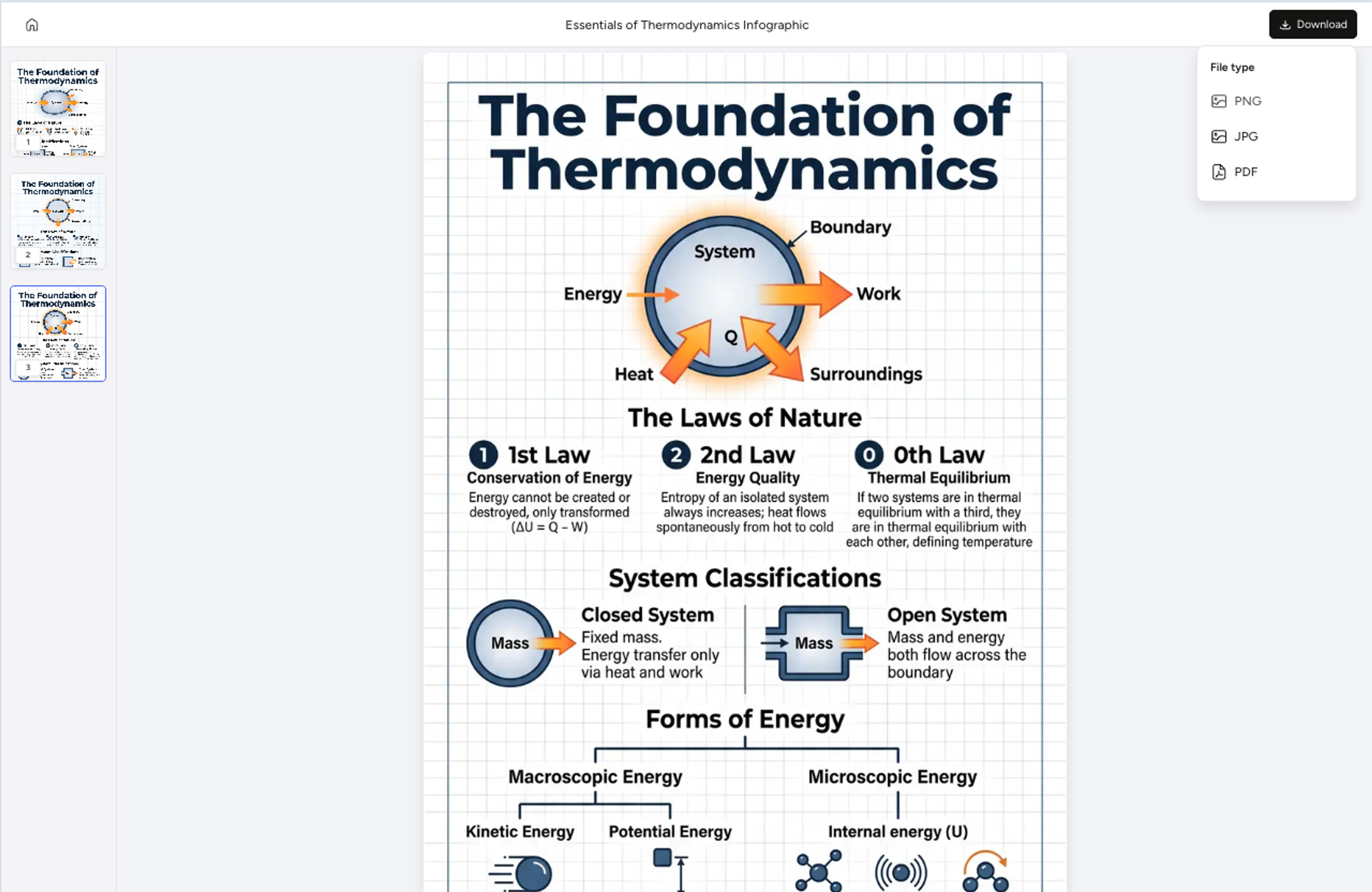
Recolor a slice, pull one outward for emphasis, rewrite a caption, or rearrange order with a single instruction. Export as PNG, JPG, or PDF.
Explore doughnut chart results Infograph can create for business dashboards, K-12 data activities, research summaries, and strategic reporting.
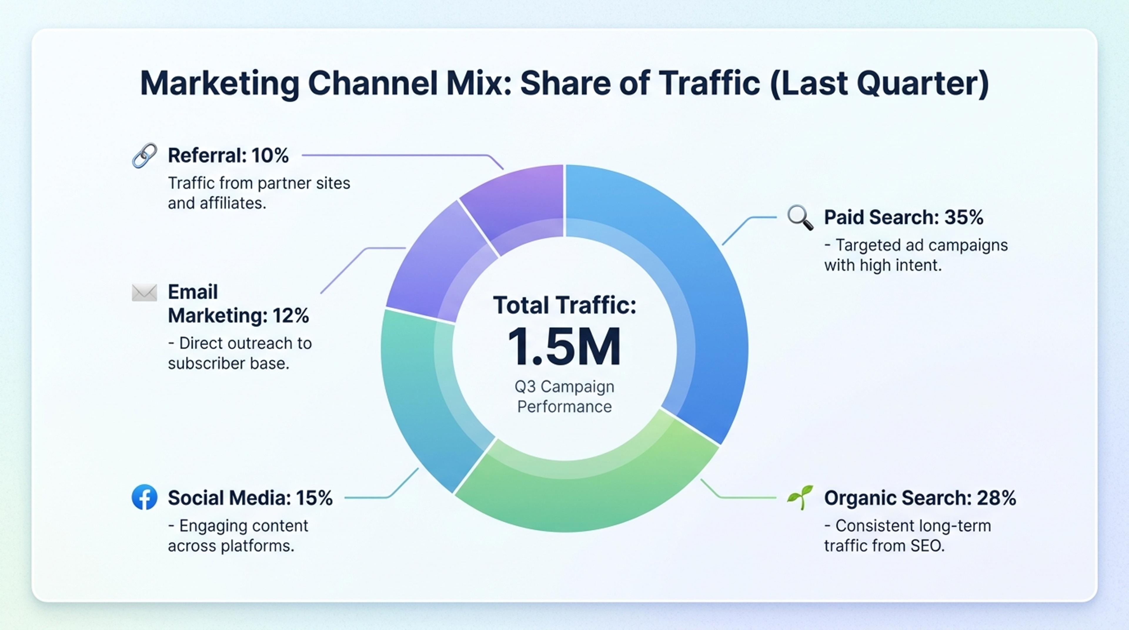
Show campaign, revenue, or traffic mix with balanced labels and a central headline metric.
Yes. Paste percentages or raw counts and the AI sizes slices to the values. You can mix percentages and counts, and the chart normalizes to 100%.
Five to seven slices reads well. The AI suggests grouping the smallest categories into "Other" when there are more, so the chart stays scannable.
Yes. Place the total, the headline metric, or the category name inside the hole. You can hide it any time for a cleaner chart.
Tell the AI to pull a slice outward, recolor it, or add a callout. The other slices stay aligned so the doughnut stays balanced.
Export as PNG or JPG for slides and embeds, or PDF for printed handouts and reports.
Explore adjacent Infograph tools for statistical infographics, funnel charts, comparison charts, geographic visuals, and source-to-infographic workflows.
Drop in your funnel data, paste a marketing recap, or describe each stage and turn it into a clean conversion funnel ready for the next QBR slide.
Drop in feature lists, evaluation docs, or research notes and turn them into a side-by-side comparison chart that reads cleanly in decks and reports.
Drop in market reports, country-level data, or a research summary and Infograph composes a clean map-driven infographic with calibrated callouts.
Paste an article, transcript, or batch of notes and Infograph turns the text into a polished infographic with hierarchy, callouts, and chart treatments.
Drop in a CSV, paste a markdown table, or upload a sheet and Infograph turns the rows into a chart-driven infographic instead of a wall of numbers.
Turn papers, lab notes, links, text, and data into scientific figures, graphical abstracts, biology diagrams, and research visuals. AI Scientific Figure Maker | Built for research and education