


Explain Conversion Drop-Off
Paste acquisition, activation, signup, or sales numbers and create a funnel that shows where prospects advance or leave.
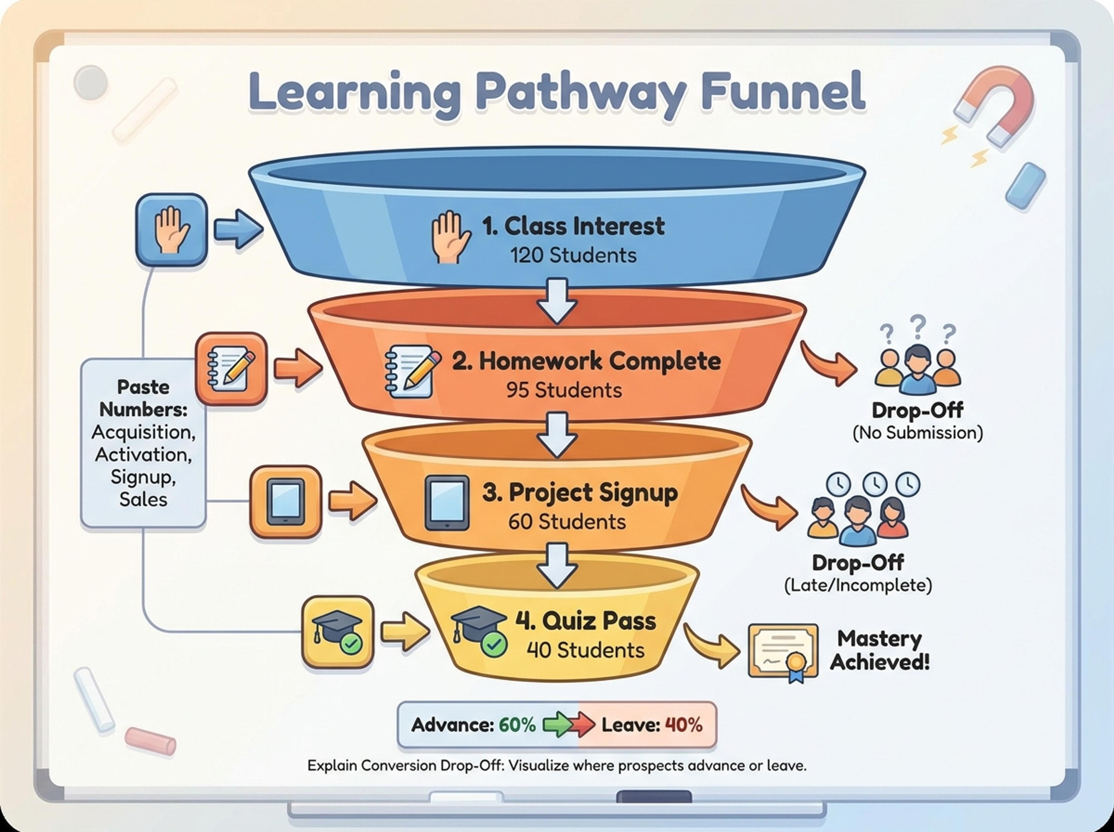
Drop in your funnel data, paste a marketing recap, or describe each stage and turn it into a clean conversion funnel ready for the next QBR slide.

Drag and drop your paper, lab notes, lesson material, or document here or
A funnel chart shows how volume changes across ordered stages, making conversion, pipeline, onboarding, and process drop-off easier to understand. It is useful for GTM reviews, sales reporting, product analytics, and any workflow where each stage narrows toward an outcome.
Start with rough numbers, notes, or a brief and let Infograph organize stages, percentages, labels, and callouts into a readable funnel chart.
Paste acquisition, activation, signup, or sales numbers and create a funnel that shows where prospects advance or leave.
Turn weekly marketing recaps, pipeline notes, or campaign summaries into a compact chart ready for a QBR or team review.
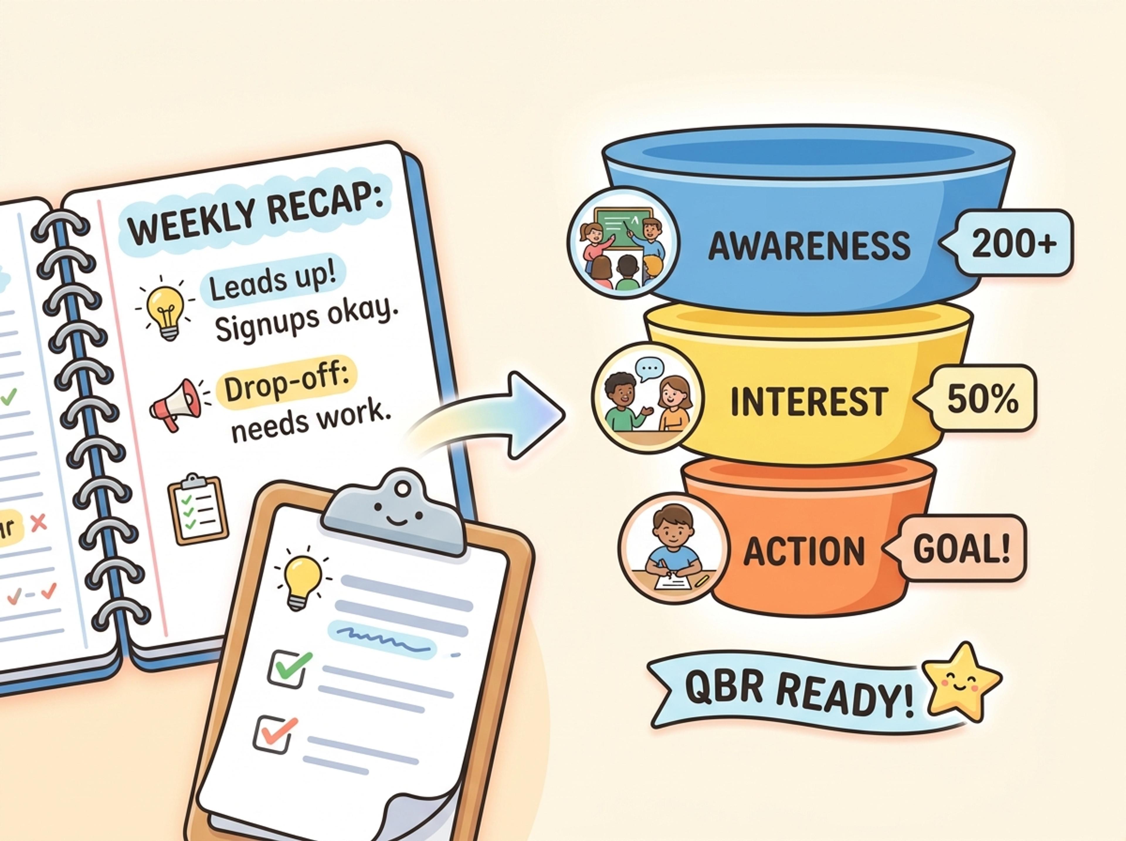
Describe a multi-step workflow and let Infograph size, label, and annotate the stages so the full flow is easy to scan.
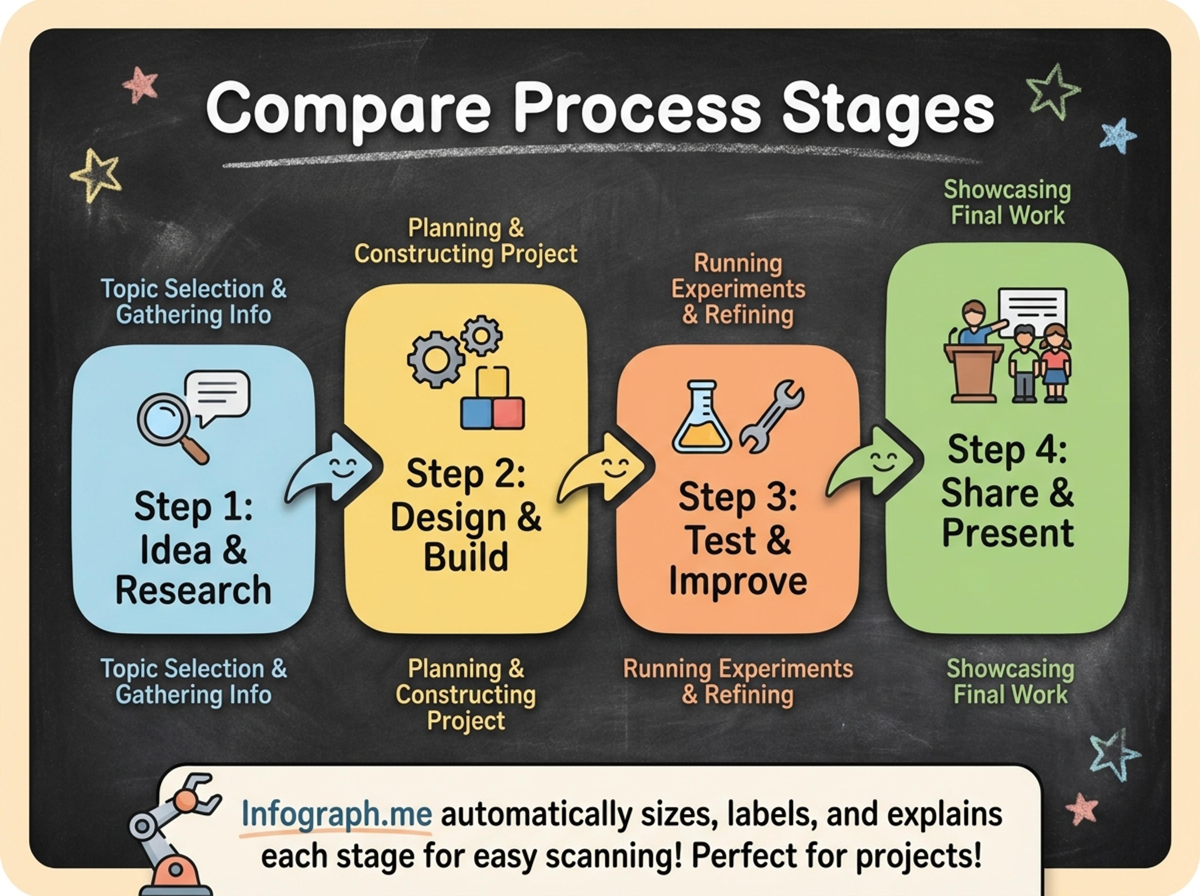
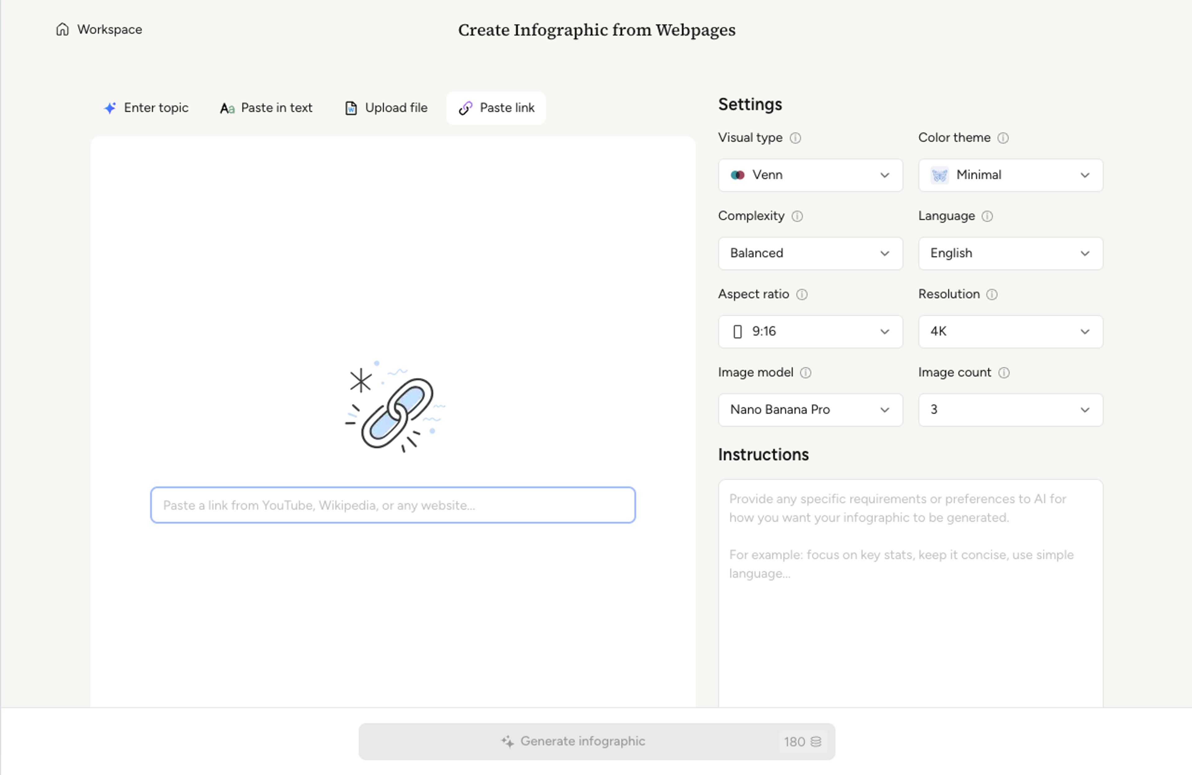
Upload a CSV of stage data, paste a marketing recap, or describe each stage in plain language. The AI keeps every stage label exactly as you wrote it.
Decide how many stages to show, whether to add absolute numbers or percentages, and which stage deserves a callout for conversion drop-off.
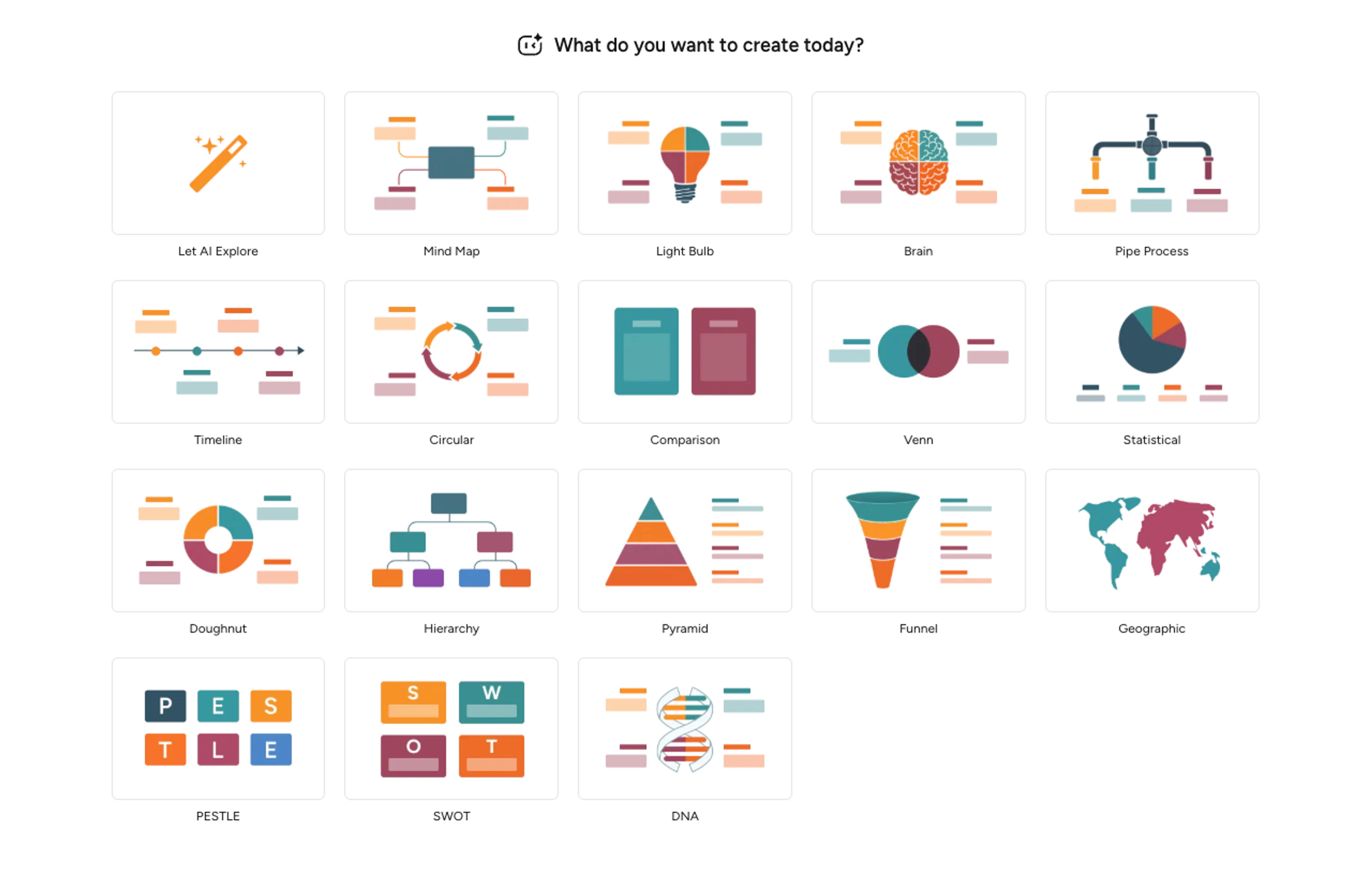
Infograph sizes each stage proportionally to your data, picks a coherent color ramp, and writes one-line captions per stage based on your source.
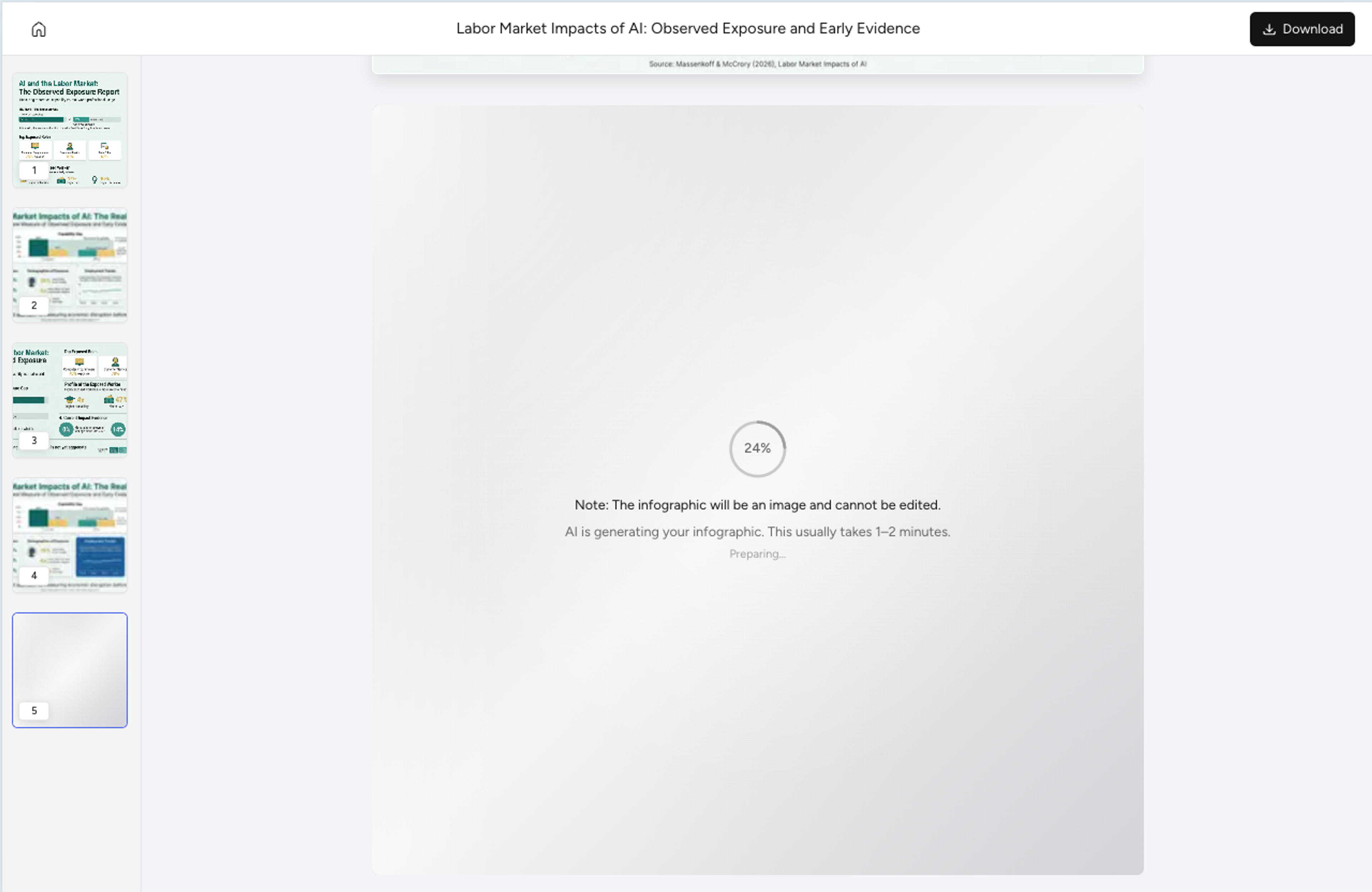
Resize a stage, recolor the worst-performing step, rewrite a label, or add a benchmark with a single instruction. Export as PNG, JPG, or PDF.
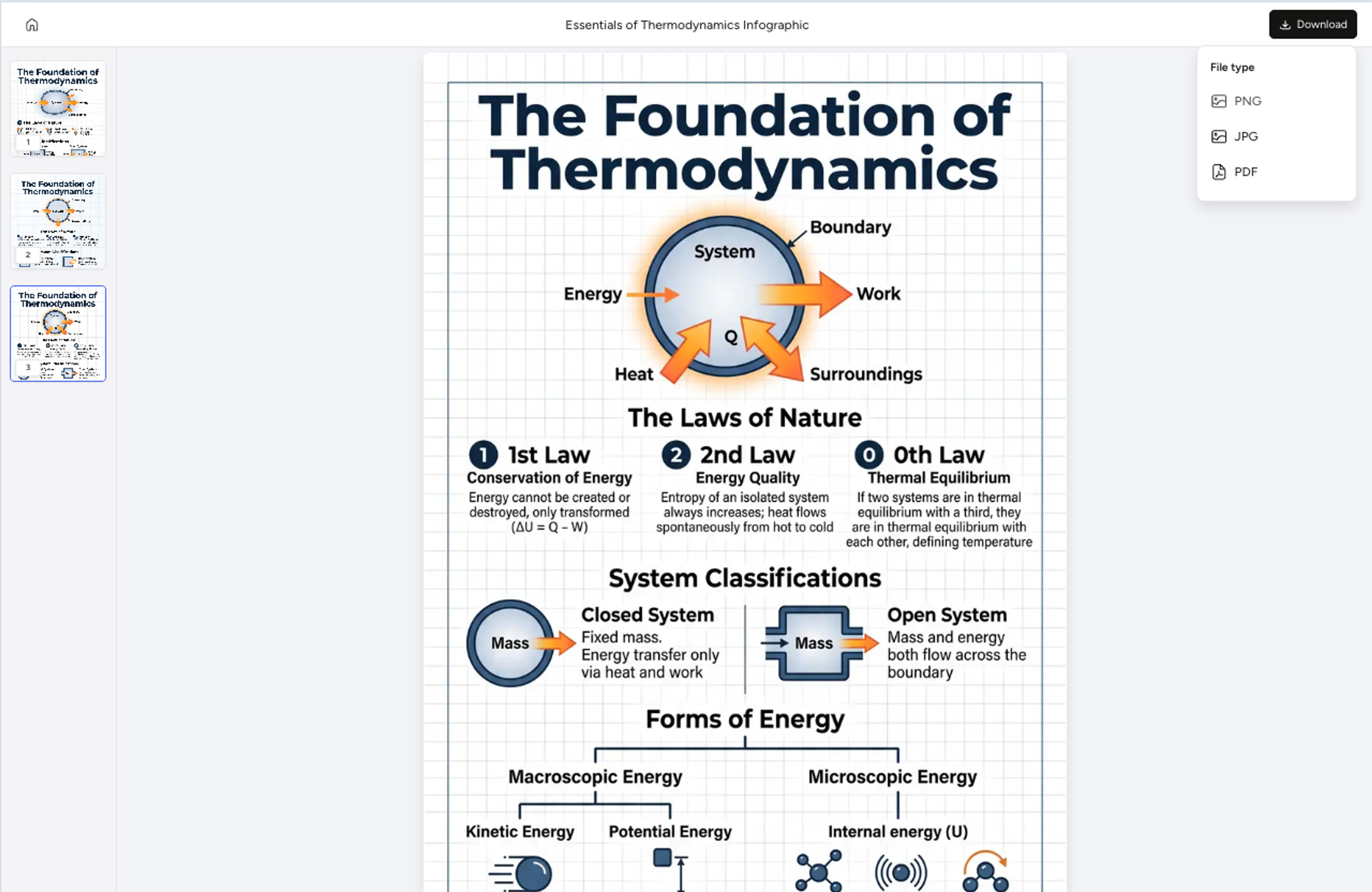
Explore funnel chart results Infograph can create for growth teams, sales reviews, classrooms, and strategic planning.
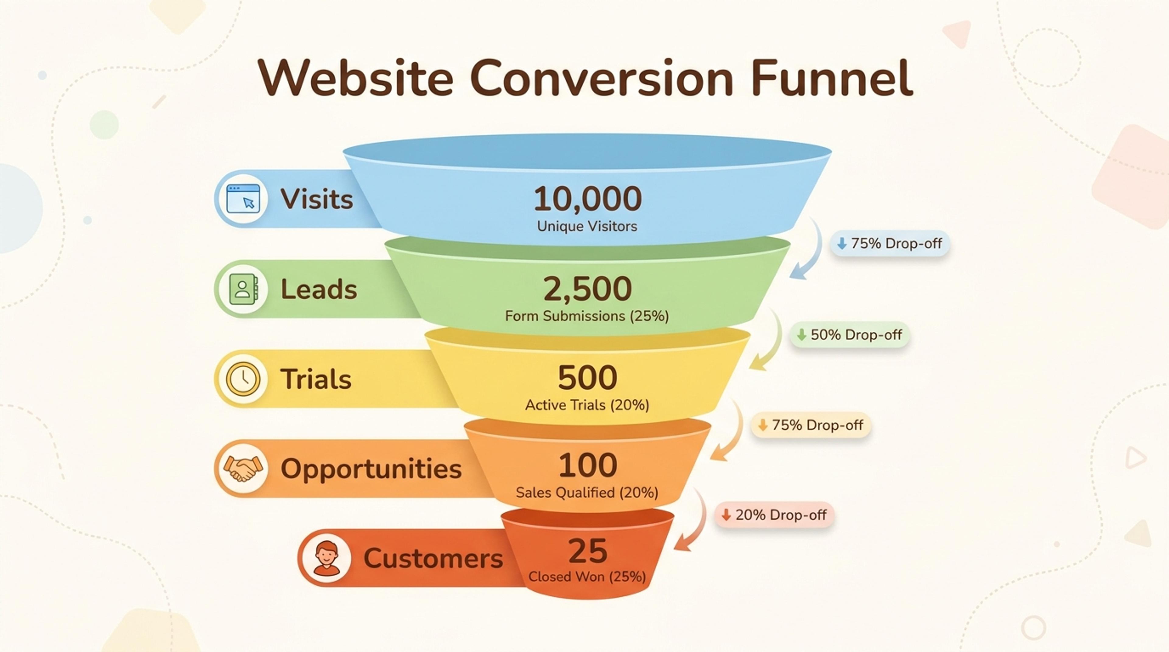
Show visits, leads, trials, opportunities, and customers with readable stage metrics.
Yes. Paste a CSV-like table or upload your export and the AI sizes each stage proportionally without you retyping any value.
Three to seven stages reads cleanly. The AI can support more but will suggest collapsing closely-related stages so the visual stays balanced.
Yes. Each stage can carry the raw count and the conversion rate side by side. You can hide either with a quick prompt.
Tell the AI which stage to emphasize and it recolors that segment, adds a callout, and writes a short note explaining the drop-off.
Export as PNG or JPG for slide embeds, or PDF for printed reports and one-pagers.
Explore adjacent Infograph tools for pyramids, timelines, mind maps, comparisons, and source-to-infographic workflows.
Turn frameworks like Maslow, Bloom's, or your own strategy stack into a clean pyramid chart that orders priorities at a glance.
Turn project briefs, history readings, research notes, or links into a clean timeline infographic with milestones, labels, and visual flow.
Drop in meeting transcripts, research notes, or a single topic and Infograph builds a clean radial mind map you can iterate on.
Turn topics, notes, documents, or links into a clean two-circle or three-circle Venn diagram with readable labels and overlap summaries.
Paste an article, transcript, or batch of notes and Infograph turns the text into a polished infographic with hierarchy, callouts, and chart treatments.
Upload a research paper, white paper, or report PDF and Infograph extracts the structure to render a clean infographic — no copy-paste between tools.
Turn papers, lab notes, links, text, and data into scientific figures, graphical abstracts, biology diagrams, and research visuals. AI Scientific Figure Maker | Built for research and education