


Compare Audiences and Personas
Show where customer segments overlap so teams can spot shared needs, unique motivations, and the best message for each group.
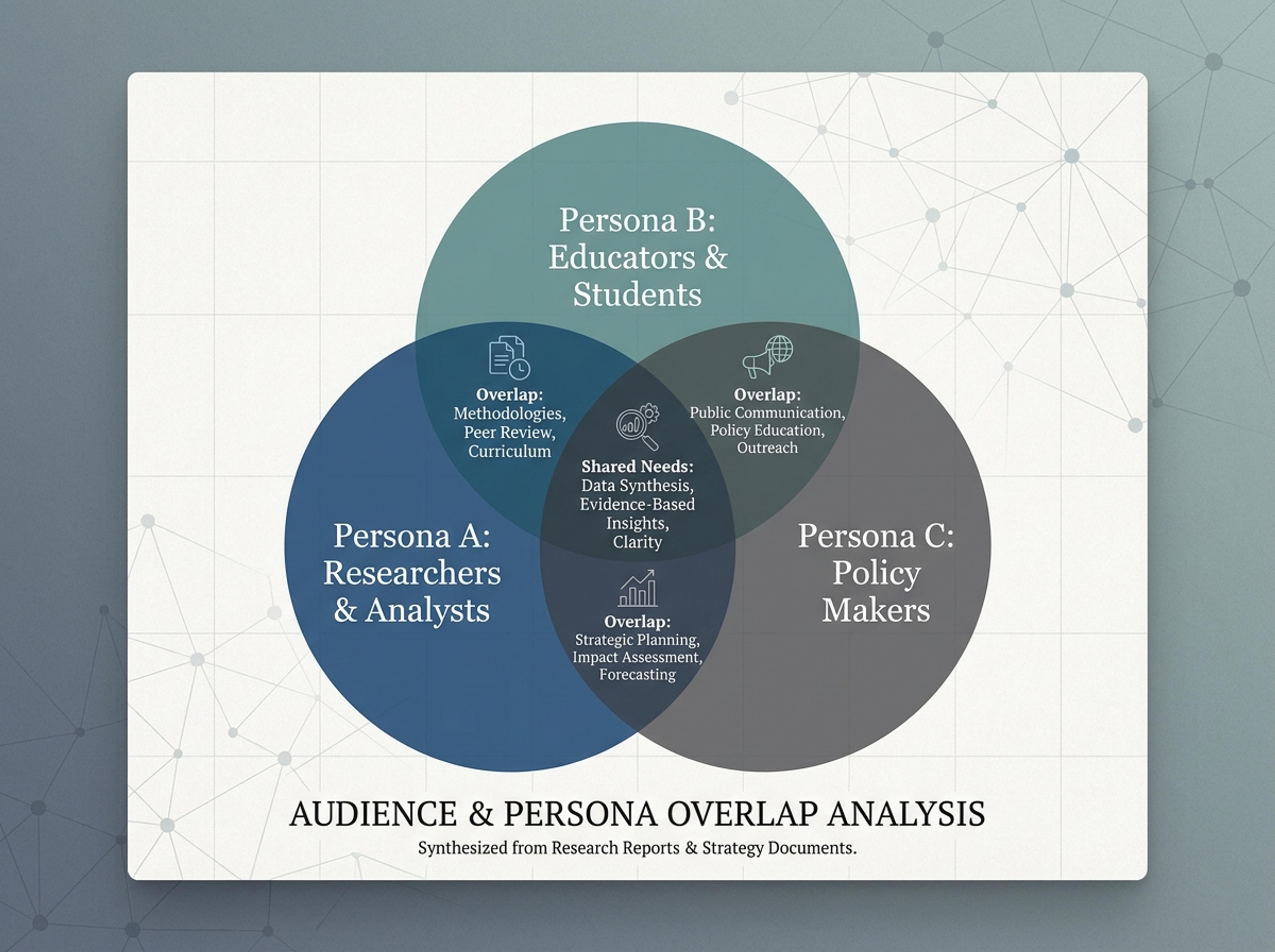
Turn topics, notes, documents, or links into a clean two-circle or three-circle Venn diagram with readable labels and overlap summaries.
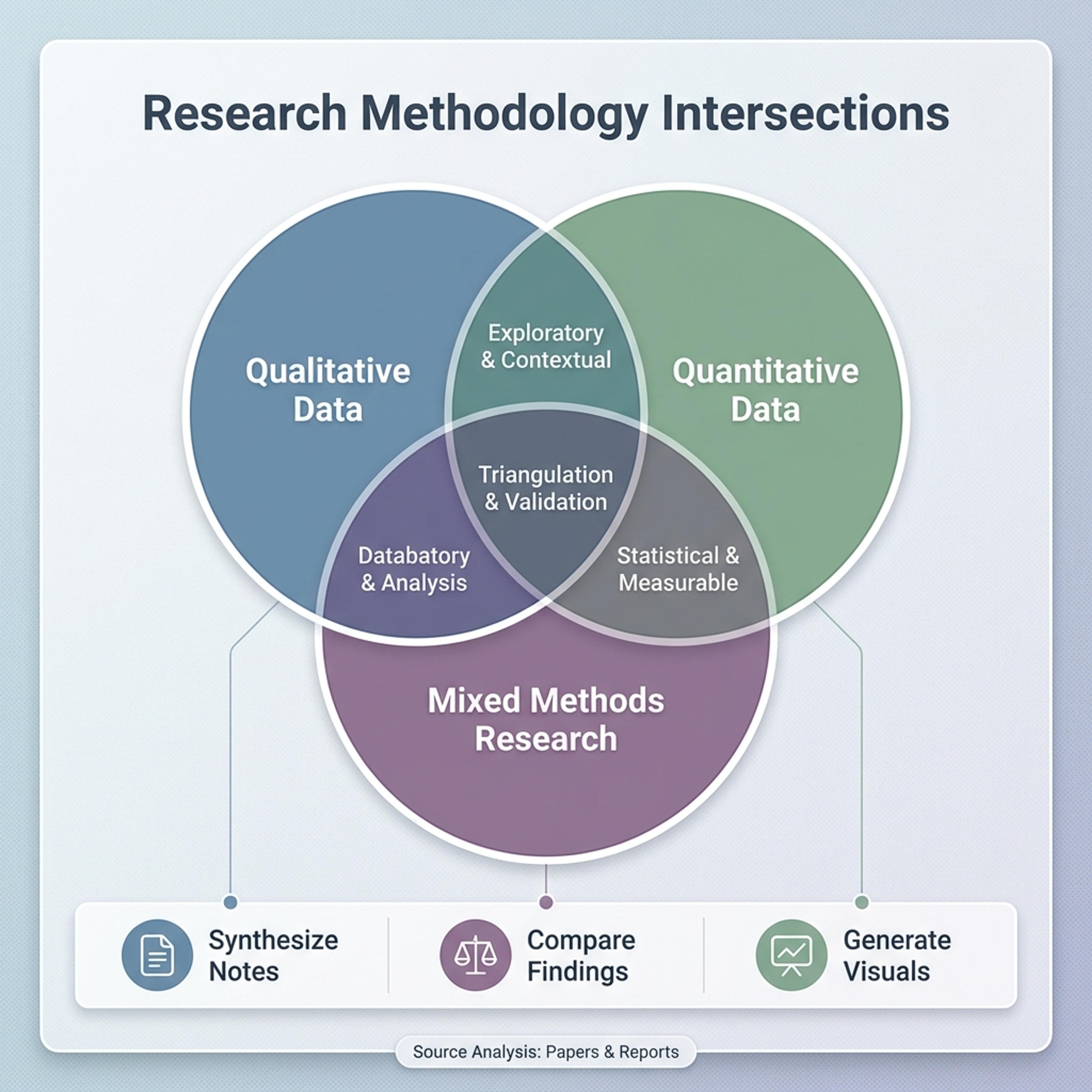
Drag and drop your paper, lab notes, lesson material, or document here or
A Venn diagram shows how two or three sets overlap, making similarities, differences, and shared ideas easier to compare. It is useful for strategy workshops, classroom lessons, research summaries, and any explanation where relationships matter.
Start from rough source material and let Infograph organize the sets, intersections, and labels into a readable visual.
Show where customer segments overlap so teams can spot shared needs, unique motivations, and the best message for each group.
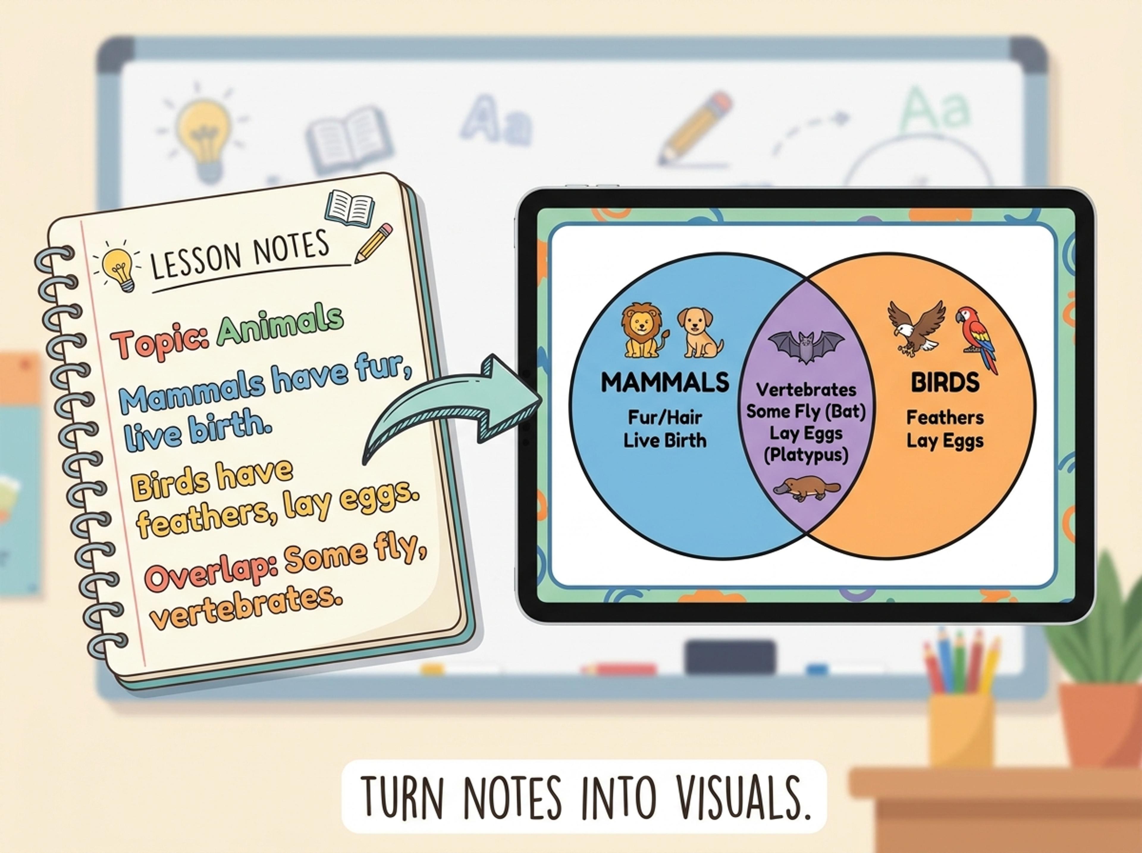
Turn lesson notes into a two-set or three-set comparison that helps students see what belongs in each category and why.
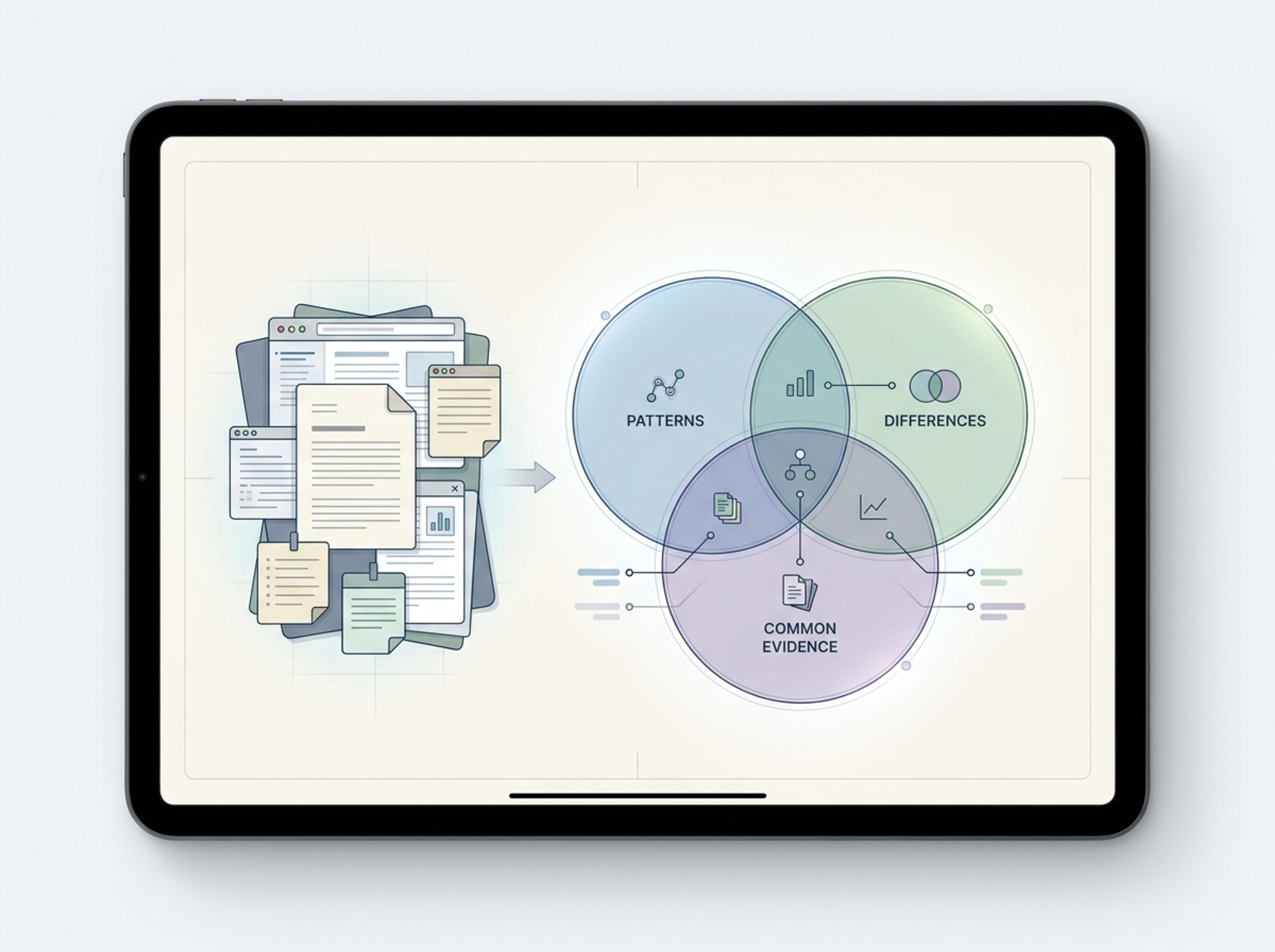
Paste findings, papers, or interview notes and create a compact visual summary of patterns, differences, and common evidence.
Describe the sets directly, paste comparison notes, upload a document, or add a link. Infograph can work from real source material, not only a short prompt.
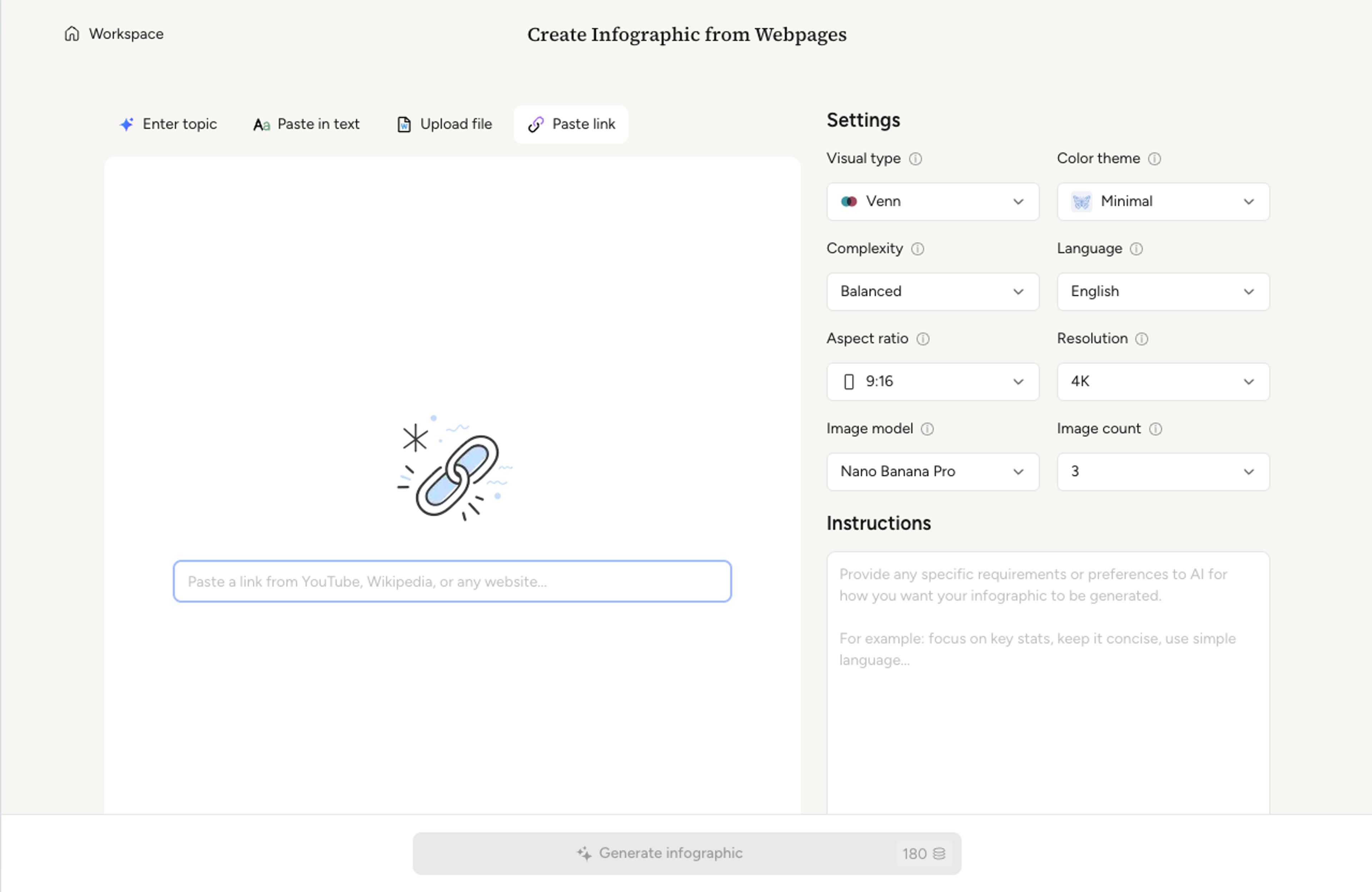
Use a two-circle diagram for simple comparisons or a three-circle diagram when the overlap between multiple categories matters.
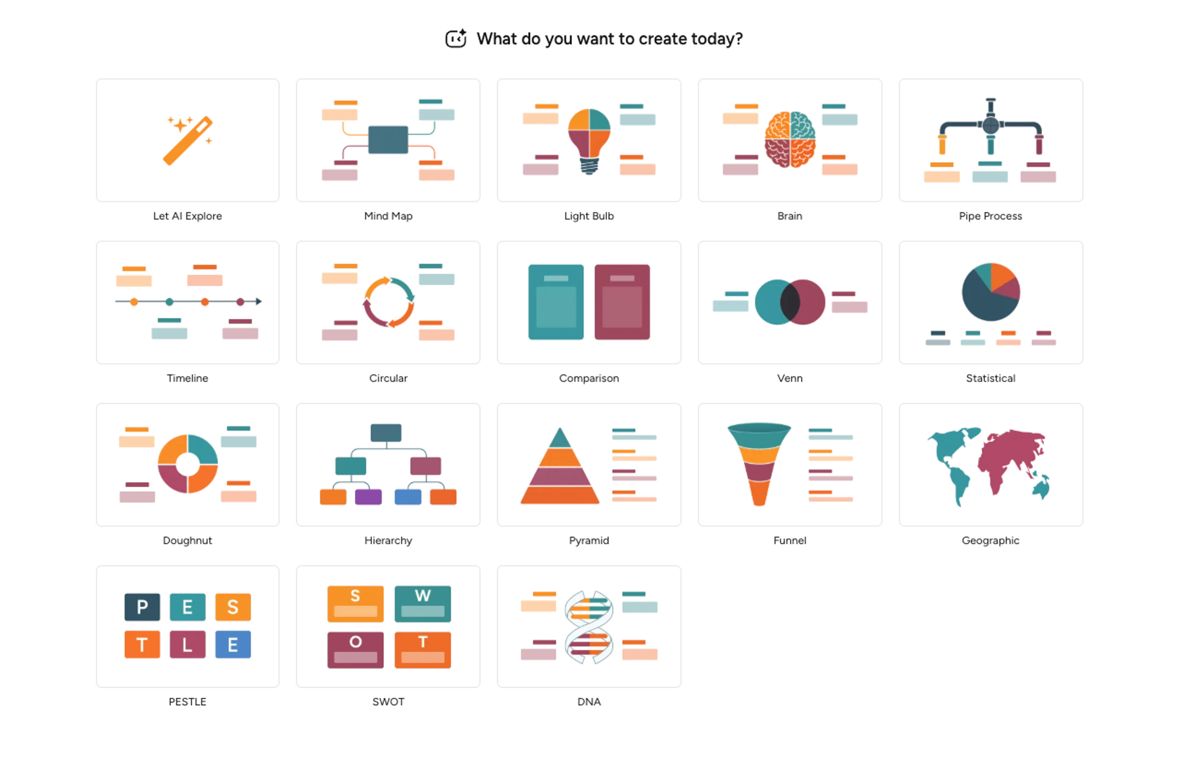
Infograph organizes labels into the right regions, summarizes the intersections, and keeps the layout readable for slides, reports, or handouts.
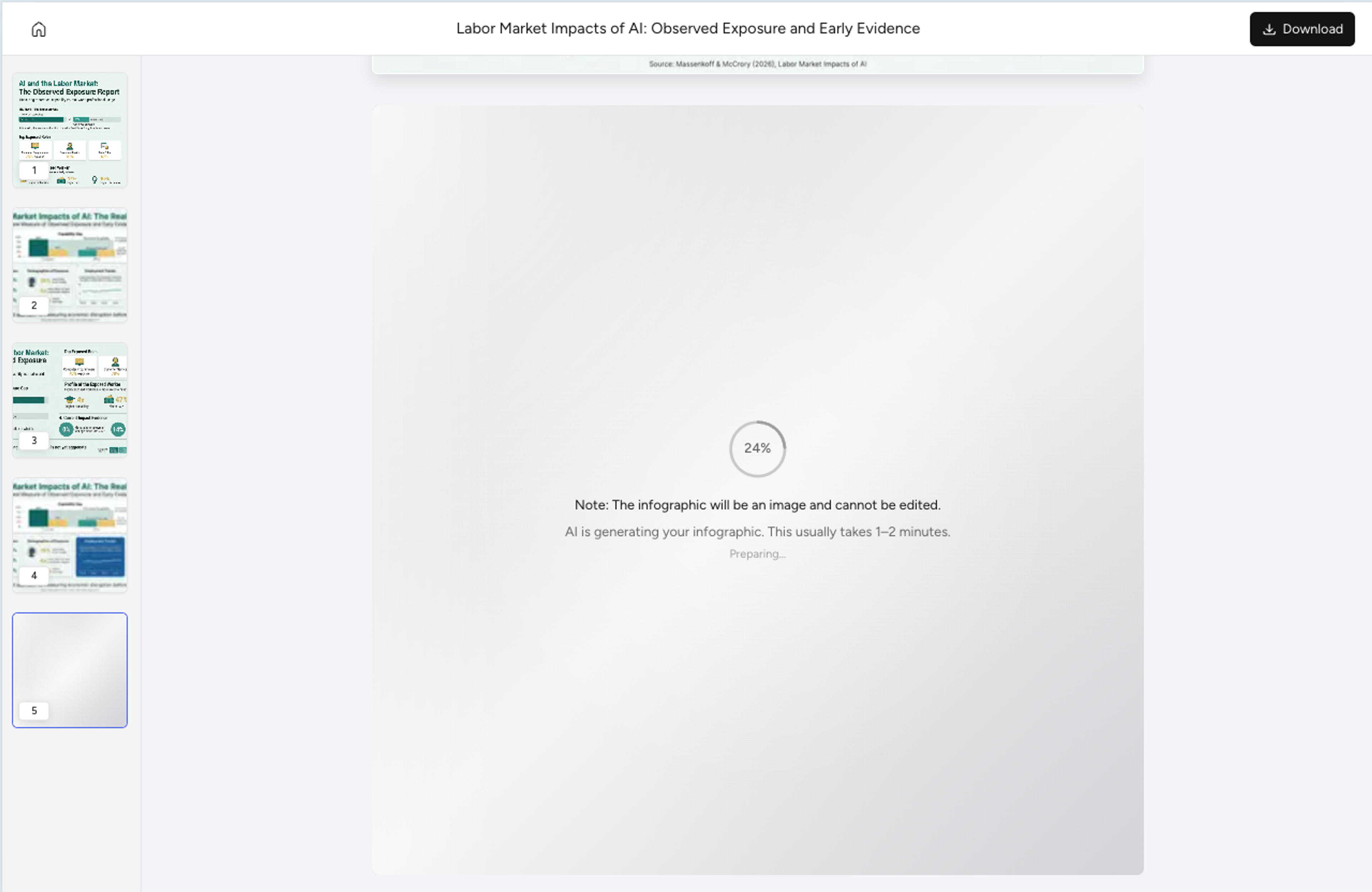
Ask AI to rewrite labels, move ideas between sets, adjust tone, or simplify the overlap text, then export as PNG, JPG, or PDF.
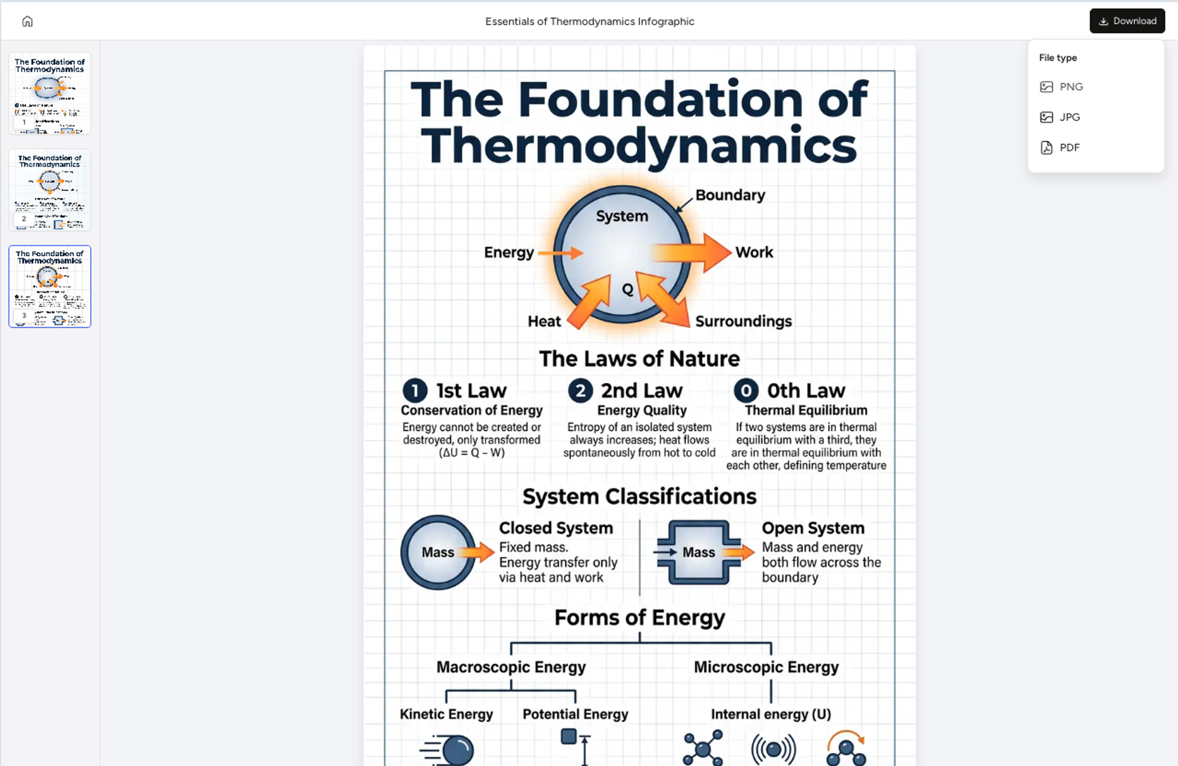
Explore examples of Venn diagram results Infograph can create for business, education, research, and strategy comparisons.
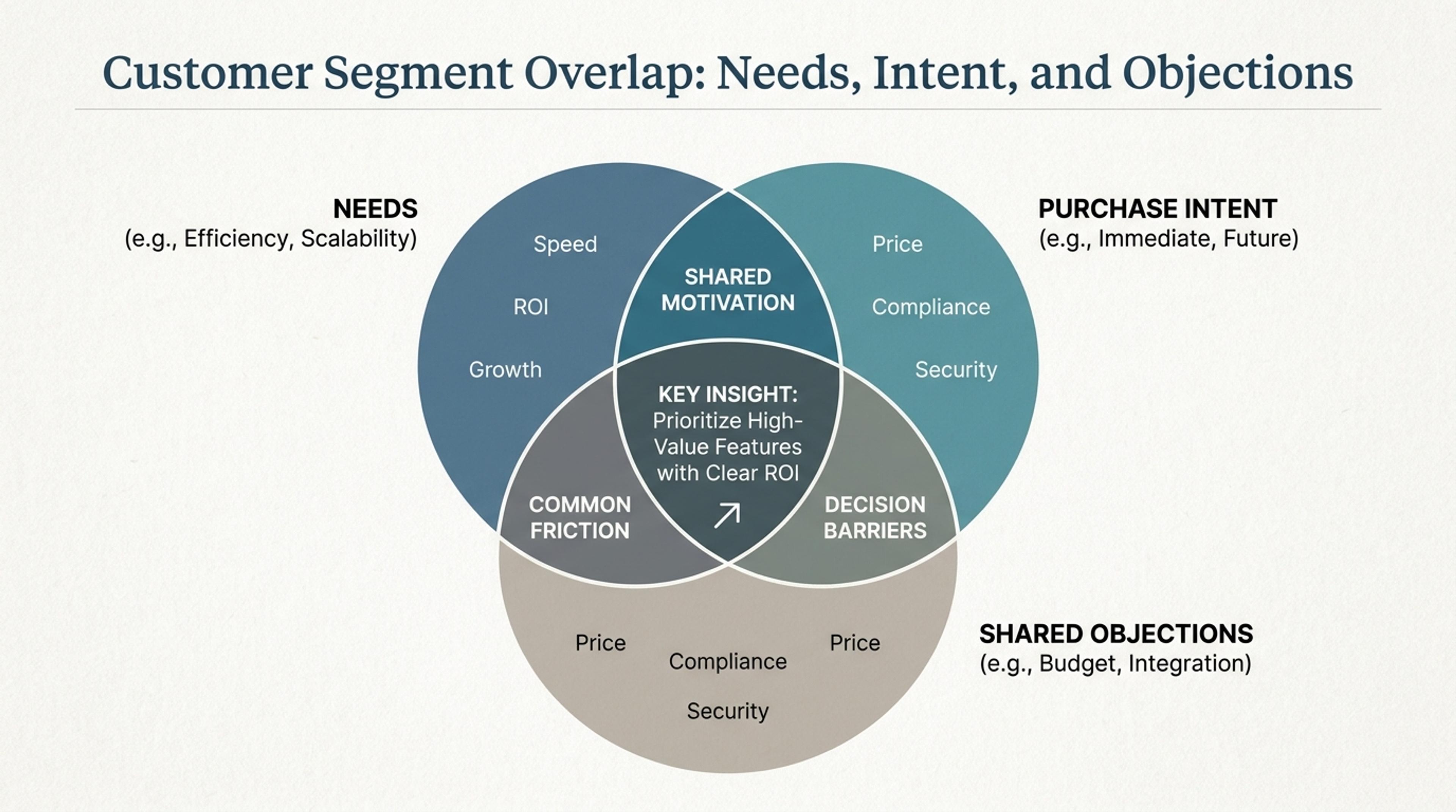
Compare personas by needs, purchase intent, and shared objections.
Yes. You can create simple two-circle comparisons or richer three-circle diagrams. Infograph keeps labels and overlap summaries readable.
Yes. Paste notes, a paragraph, research material, or a lesson outline and the AI identifies the sets, differences, and overlap points.
Yes. Use the document and link tabs when the comparison lives in a report, article, brief, or other source content.
Yes. Tell the AI to rewrite a label, move an item between regions, simplify an overlap, or adjust the explanation style.
You can export the finished visual as PNG, JPG, or PDF for slides, reports, teaching materials, and shared documents.
Explore adjacent Infograph tools for timelines, mind maps, funnels, pyramids, and source-to-infographic workflows.
Turn project briefs, history readings, research notes, or links into a clean timeline infographic with milestones, labels, and visual flow.
Drop in meeting transcripts, research notes, or a single topic and Infograph builds a clean radial mind map you can iterate on.
Drop in your funnel data, paste a marketing recap, or describe each stage and turn it into a clean conversion funnel ready for the next QBR slide.
Turn frameworks like Maslow, Bloom's, or your own strategy stack into a clean pyramid chart that orders priorities at a glance.
Paste an article, transcript, or batch of notes and Infograph turns the text into a polished infographic with hierarchy, callouts, and chart treatments.
Upload a research paper, white paper, or report PDF and Infograph extracts the structure to render a clean infographic — no copy-paste between tools.
Turn papers, lab notes, links, text, and data into scientific figures, graphical abstracts, biology diagrams, and research visuals. AI Scientific Figure Maker | Built for research and education