


Structure Strategic Priorities
Turn business goals, operating principles, or planning notes into a hierarchy that shows what supports the top outcome.

Turn frameworks like Maslow, Bloom's, or your own strategy stack into a clean pyramid chart that orders priorities at a glance.
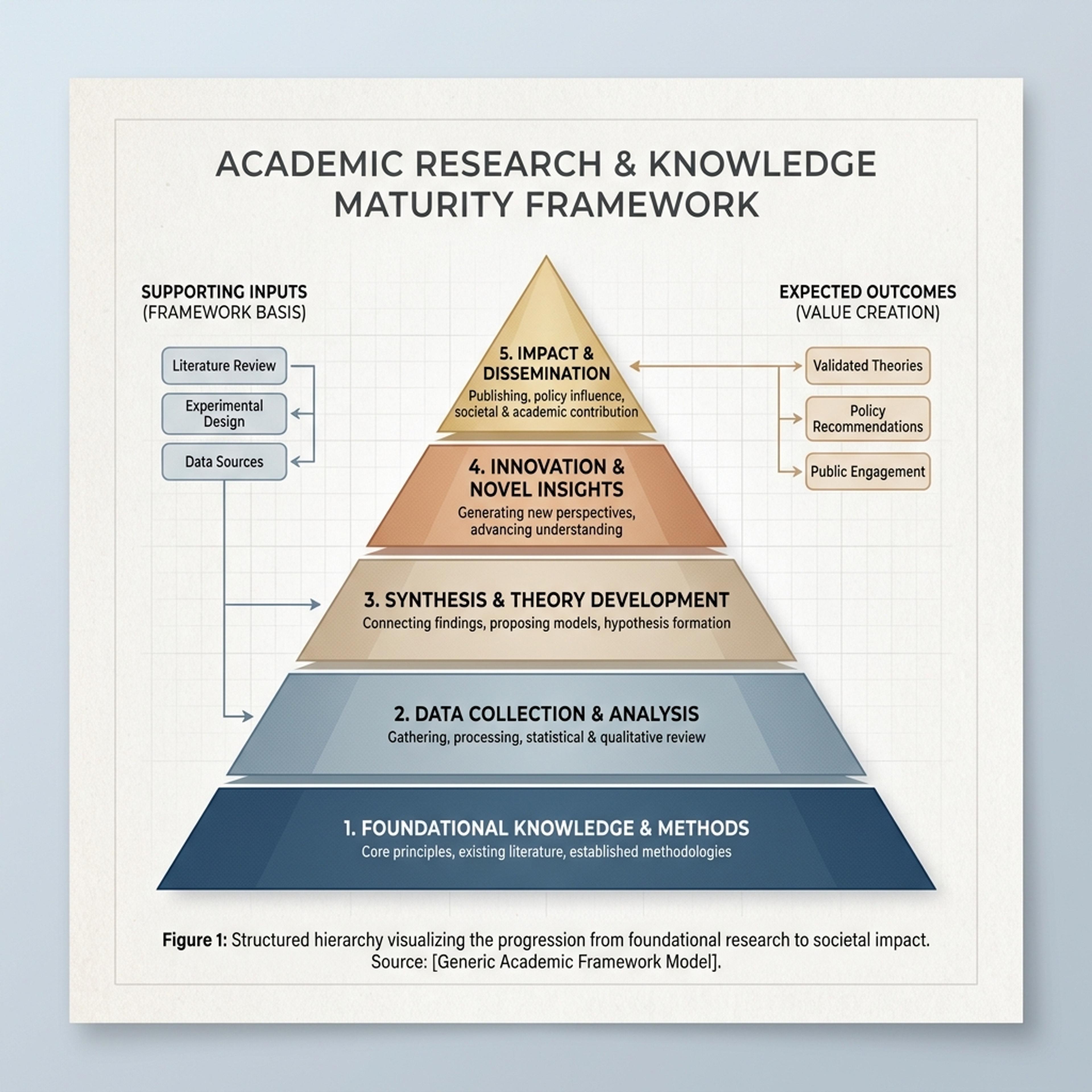
Drag and drop your paper, lab notes, lesson material, or document here or
A pyramid chart arranges ideas into stacked levels so hierarchy, priority, maturity, or progression is easy to understand. It is useful for frameworks, learning taxonomies, strategy stacks, needs models, and any explanation where lower layers support higher ones.
Start with a framework, notes, or a topic and let Infograph organize levels, labels, and explanations into a readable pyramid chart.
Turn business goals, operating principles, or planning notes into a hierarchy that shows what supports the top outcome.
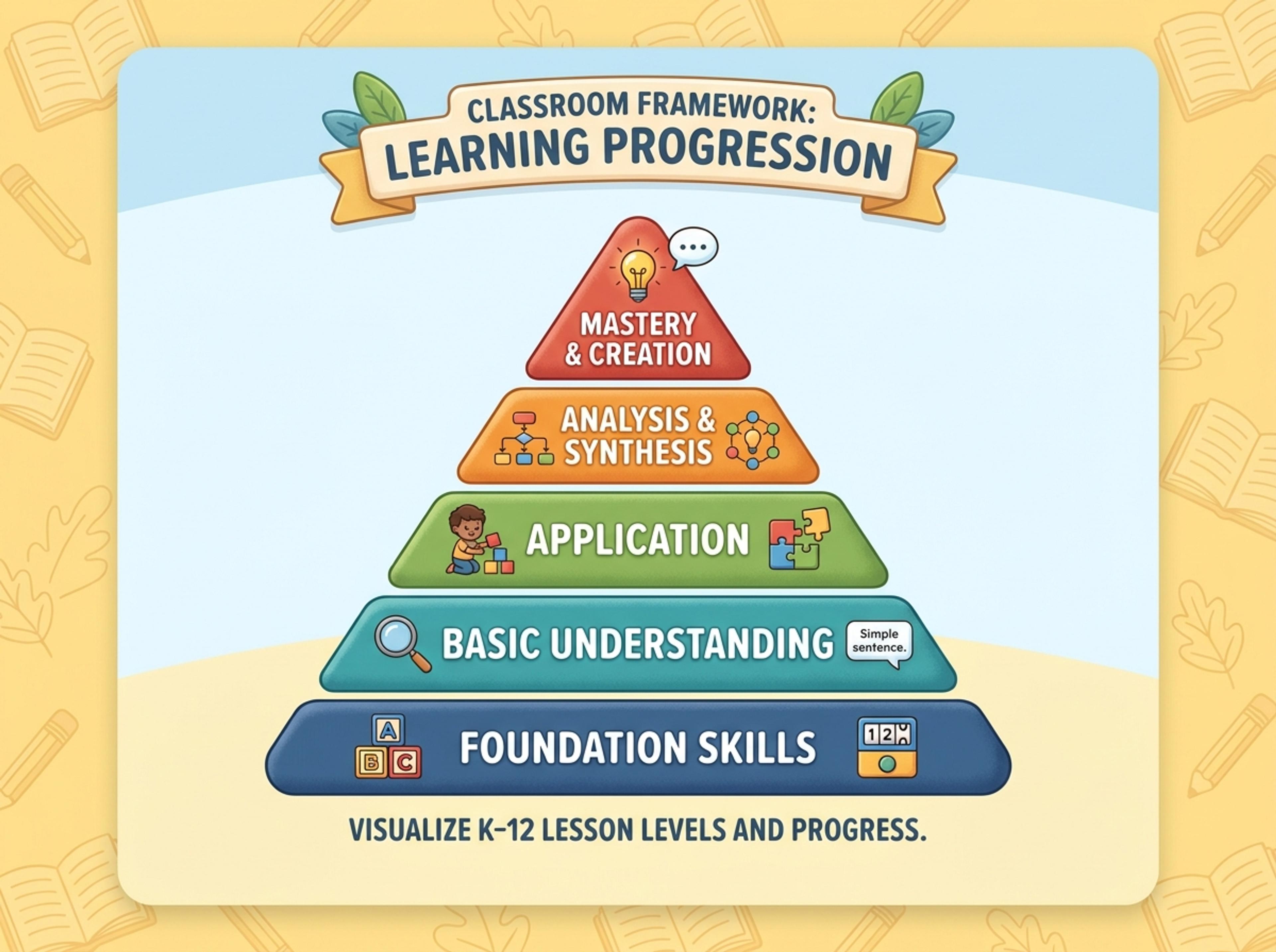
Convert K-12 lesson material into a student-friendly pyramid that makes levels, examples, and progressions easy to follow.
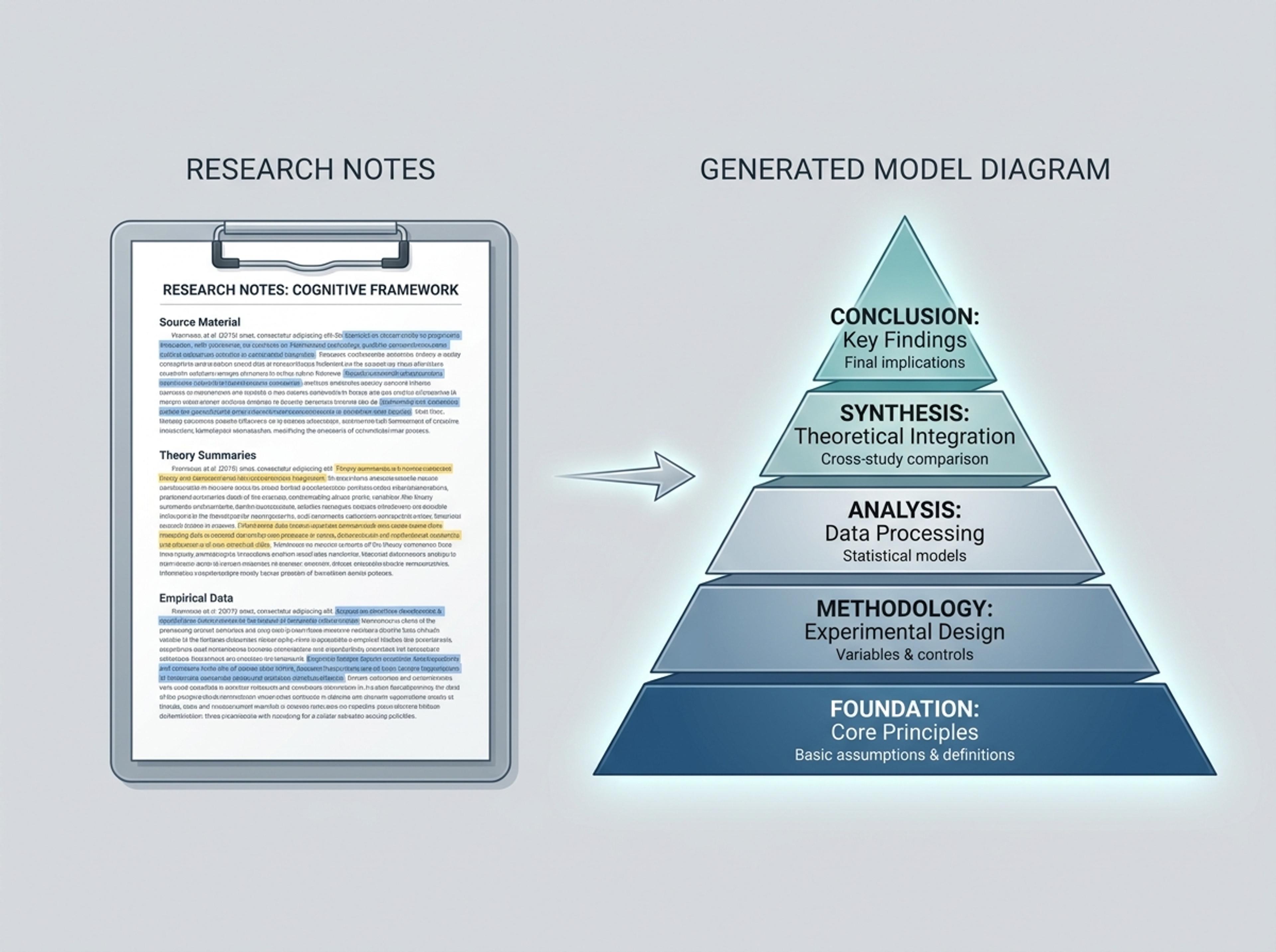
Paste academic notes, theory summaries, or paper excerpts and create a credible model diagram with clean hierarchy.
List the tiers from base to peak, paste a framework description, or upload a strategy doc. The AI keeps the order and wording you provided.
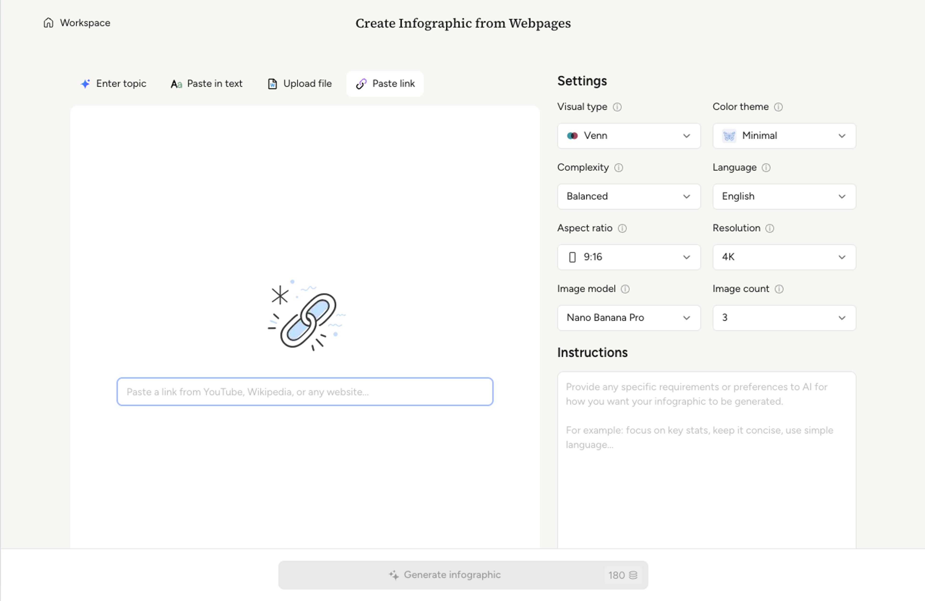
Choose how many tiers to render, whether the apex is a single keyword or a phrase, and where to place per-tier captions.
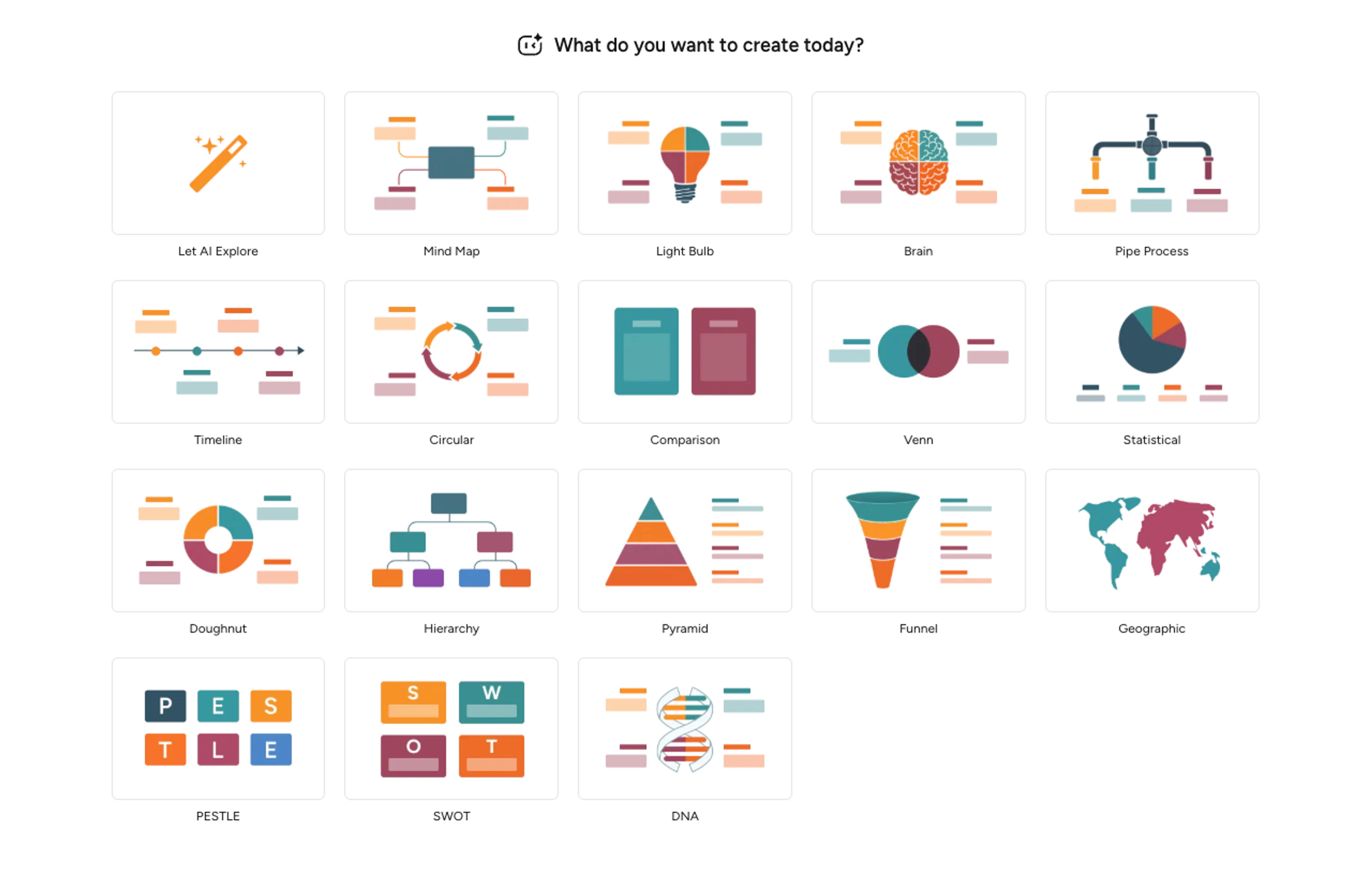
Infograph sizes each tier with a clean gradient, places labels inside or alongside each band, and writes one-line tier descriptions from your source.
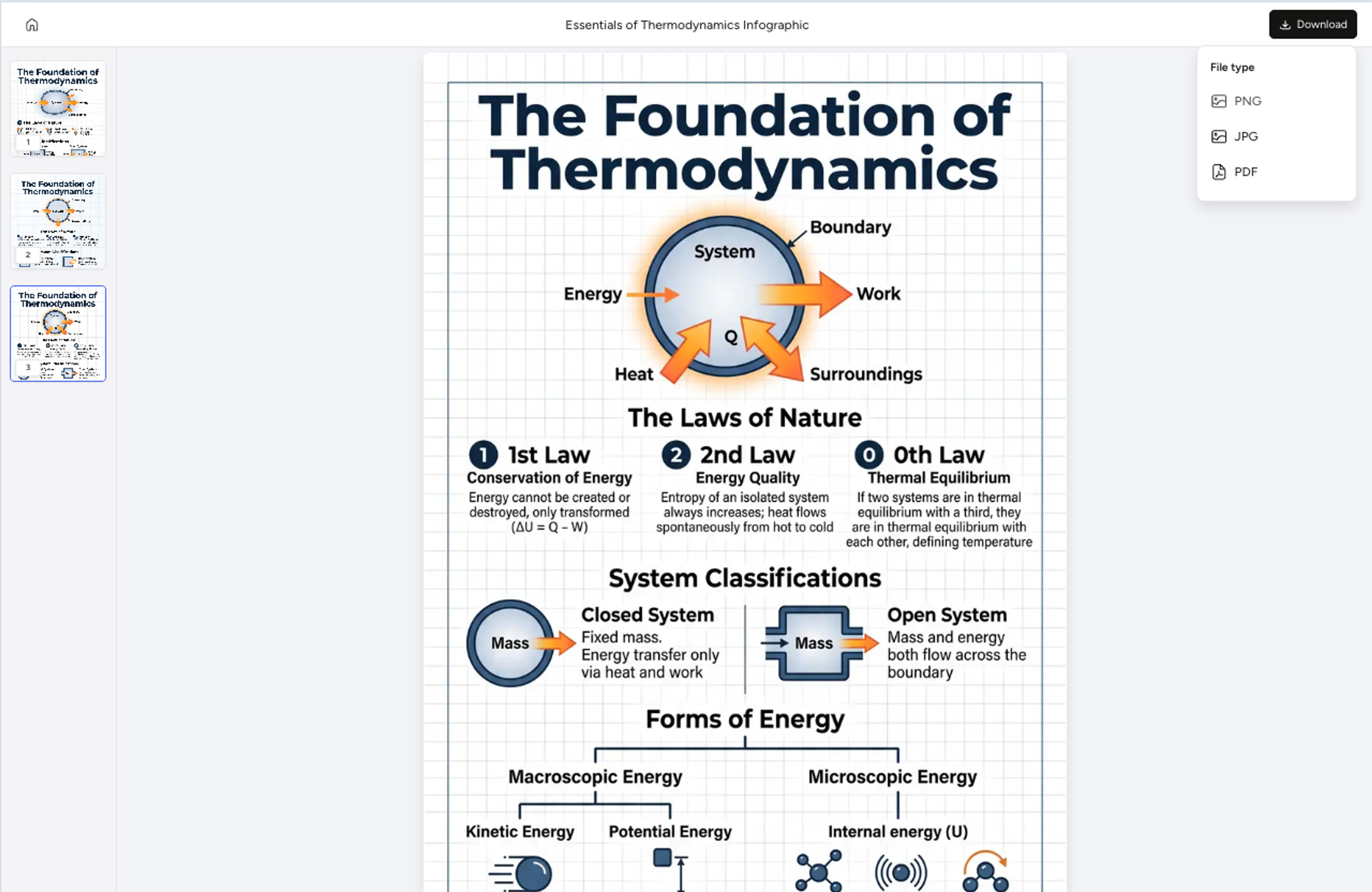
Add a tier, recolor the apex, rewrite a caption, or invert the pyramid with a single instruction. Export as PNG, JPG, or PDF.
Explore pyramid chart results Infograph can create for strategy, K-12 lessons, academic models, and structured frameworks.
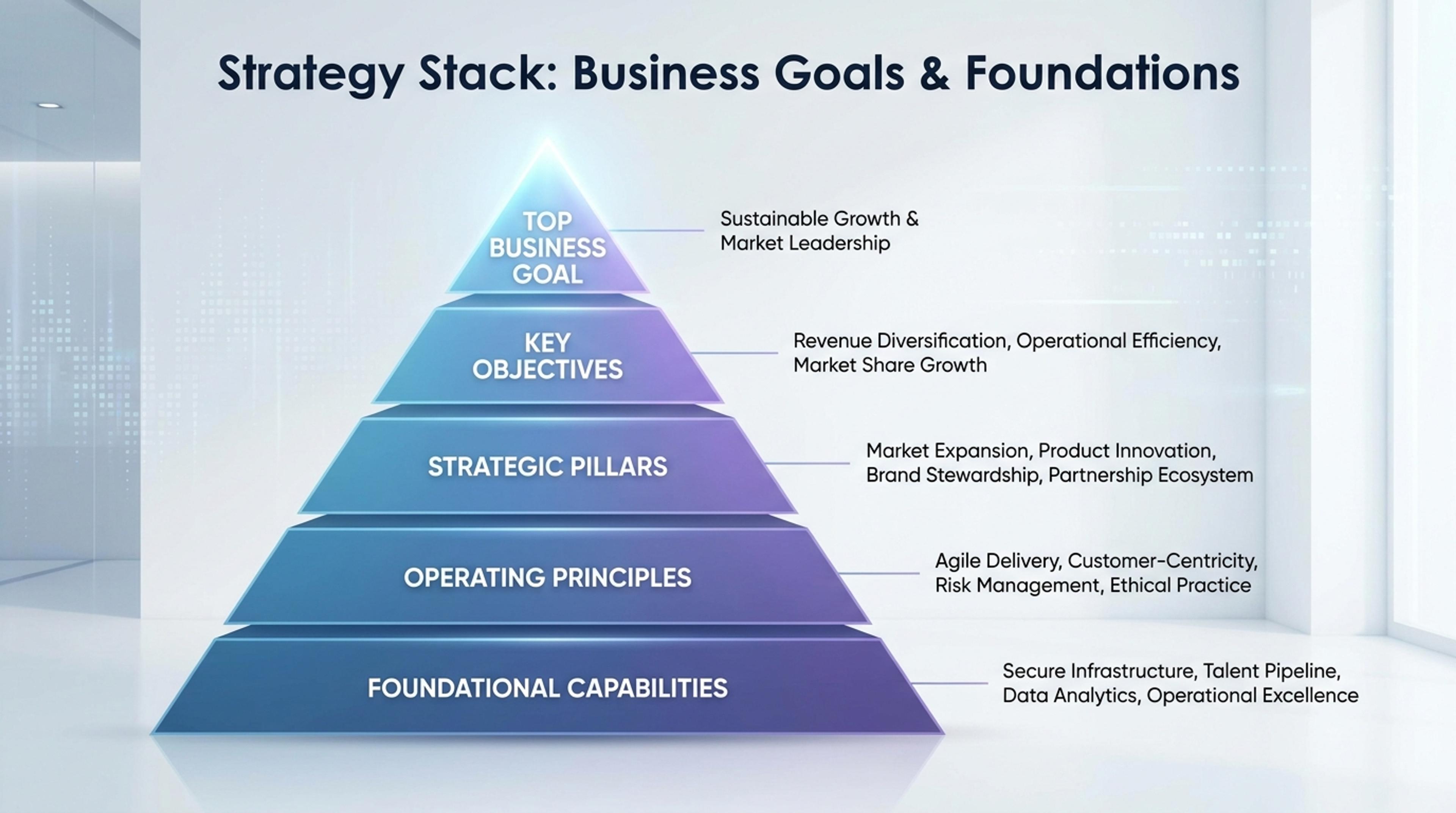
Show foundational capabilities, operating principles, and the top business goal in one visual.
Yes. Use it for Maslow's hierarchy, Bloom's taxonomy, food pyramids, strategy stacks, talent ladders, or any layered model you can describe.
Three to six tiers reads cleanly. More than six tends to crowd the apex, so the AI suggests merging closely-related tiers when needed.
Yes. Tell the AI to invert and the apex flips to the bottom while gradients and labels rebalance to keep the visual hierarchy clear.
Yes. Each tier can carry a short phrase inside the band and a longer caption alongside. You can hide either to keep the chart minimal.
Export as PNG or JPG for slide embeds, or PDF for printed handouts and reports.
Explore adjacent Infograph tools for funnels, timelines, mind maps, comparisons, and source-to-infographic workflows.
Drop in your funnel data, paste a marketing recap, or describe each stage and turn it into a clean conversion funnel ready for the next QBR slide.
Turn project briefs, history readings, research notes, or links into a clean timeline infographic with milestones, labels, and visual flow.
Drop in meeting transcripts, research notes, or a single topic and Infograph builds a clean radial mind map you can iterate on.
Turn topics, notes, documents, or links into a clean two-circle or three-circle Venn diagram with readable labels and overlap summaries.
Paste an article, transcript, or batch of notes and Infograph turns the text into a polished infographic with hierarchy, callouts, and chart treatments.
Upload a research paper, white paper, or report PDF and Infograph extracts the structure to render a clean infographic — no copy-paste between tools.
Turn papers, lab notes, links, text, and data into scientific figures, graphical abstracts, biology diagrams, and research visuals. AI Scientific Figure Maker | Built for research and education