


Compare Options and Tradeoffs
Paste feature lists, requirements, or decision notes and create a structured comparison with aligned criteria.
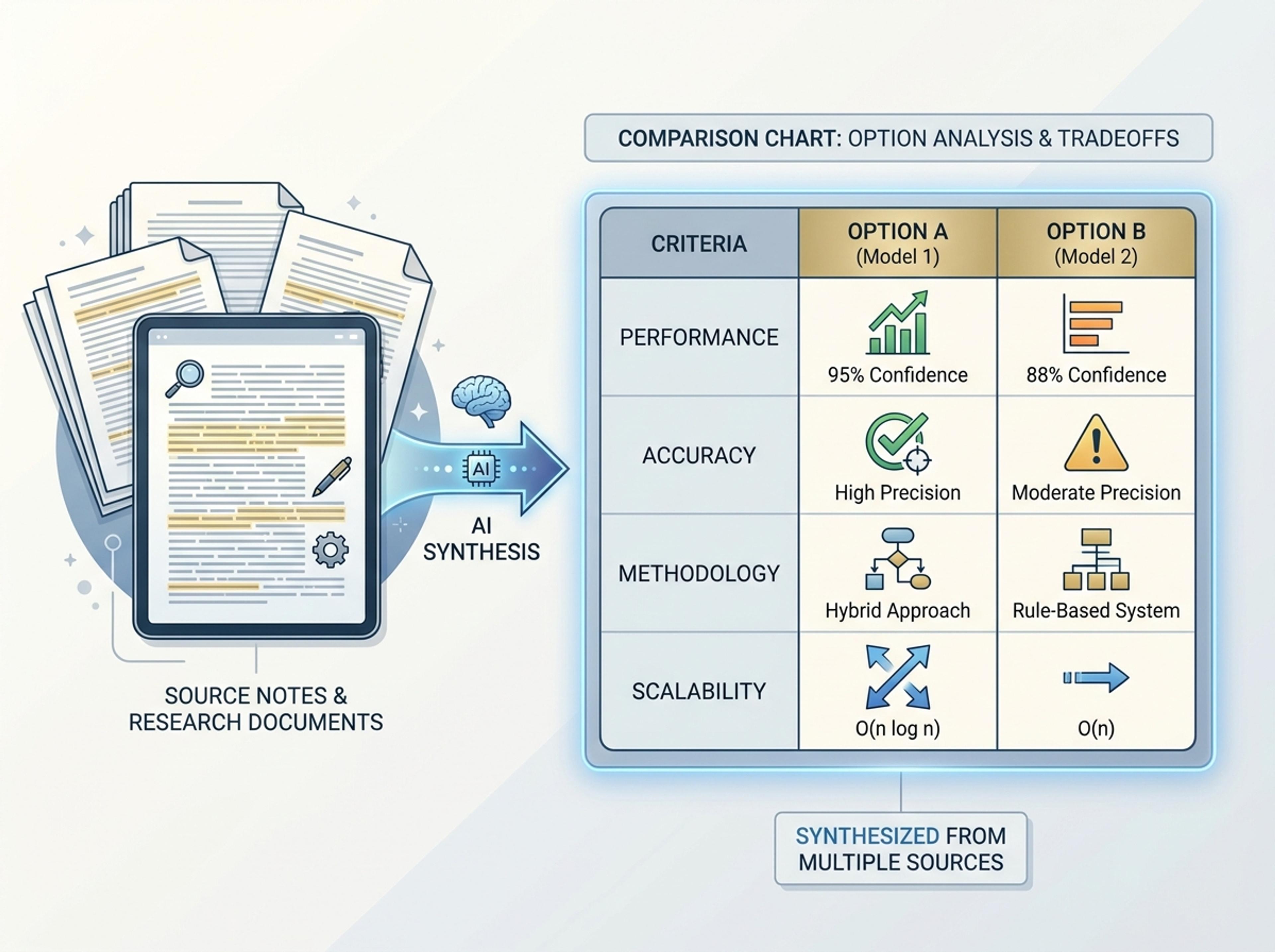
Drop in feature lists, evaluation docs, or research notes and turn them into a side-by-side comparison chart that reads cleanly in decks and reports.
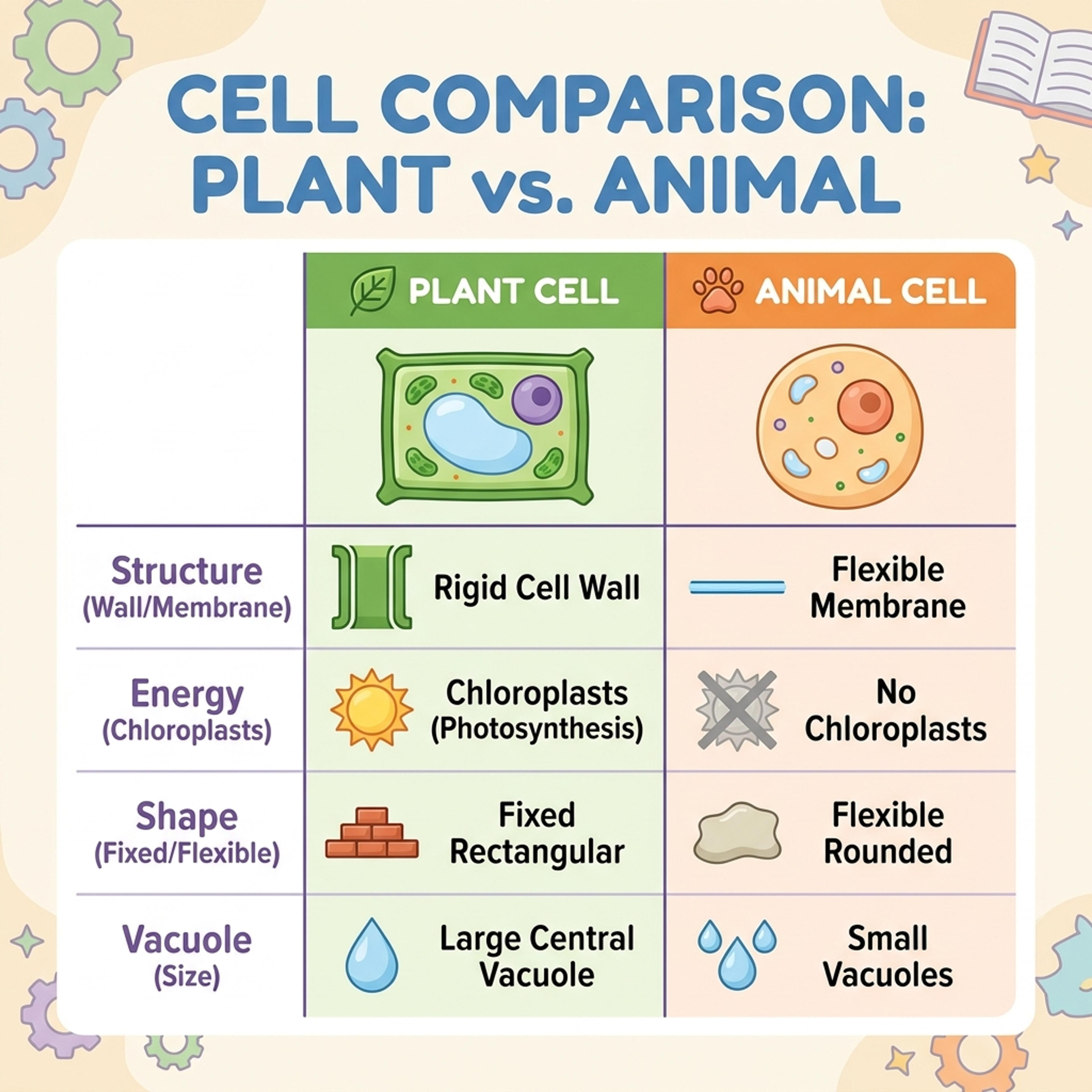
Drag and drop your paper, lab notes, lesson material, or document here or
A comparison chart organizes options, criteria, features, or tradeoffs side by side so differences are easy to scan. It is useful for vendor evaluations, product decisions, classroom compare-and-contrast work, research summaries, and strategy reviews.
Start with documents, notes, or option lists and let Infograph extract dimensions, align rows, and highlight meaningful tradeoffs.
Paste feature lists, requirements, or decision notes and create a structured comparison with aligned criteria.
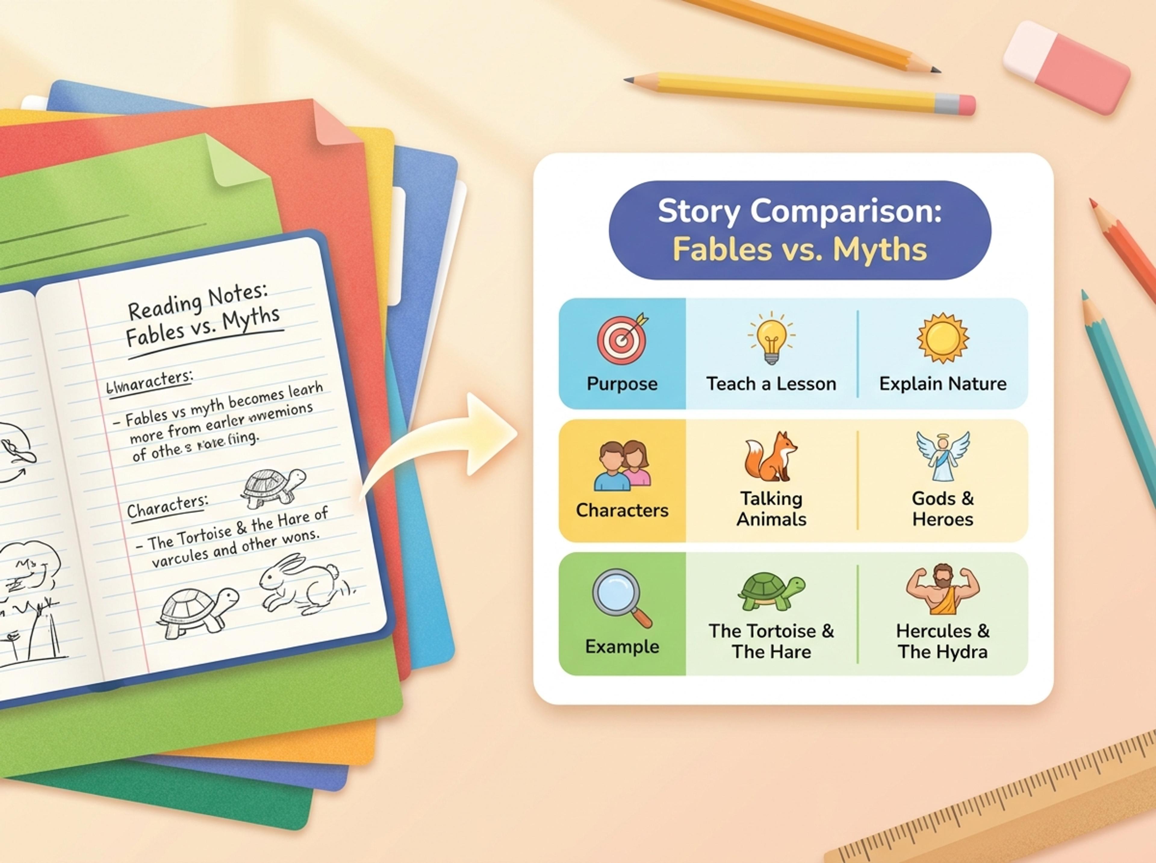
Turn K-12 reading notes or lesson prompts into a friendly compare-and-contrast chart students can use quickly.
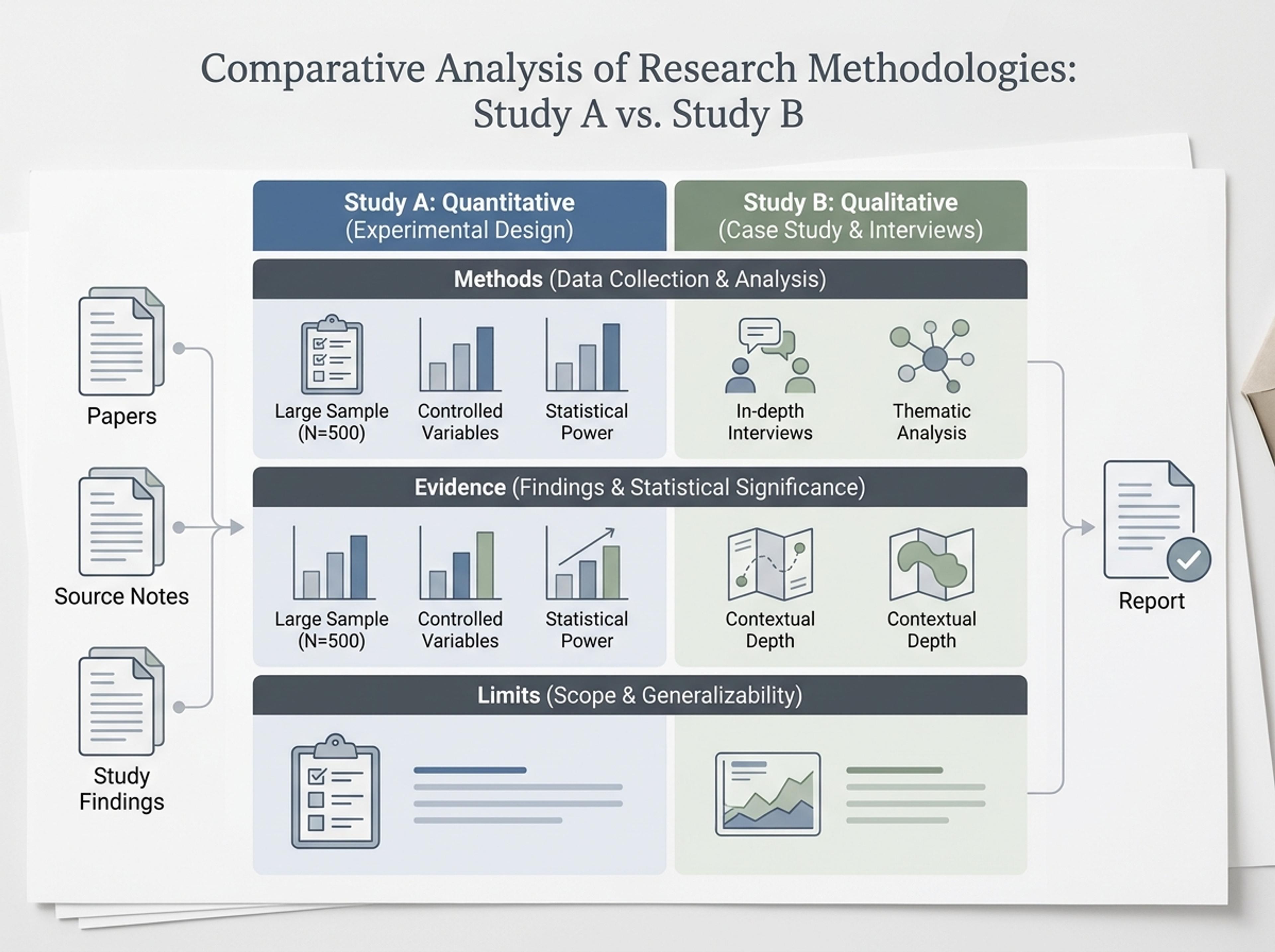
Convert papers, source notes, or study findings into a credible comparison chart with rows for methods, evidence, and limits.
Upload an evaluation doc, paste a feature list, or describe the options. The AI keeps your wording for each option exactly as written.
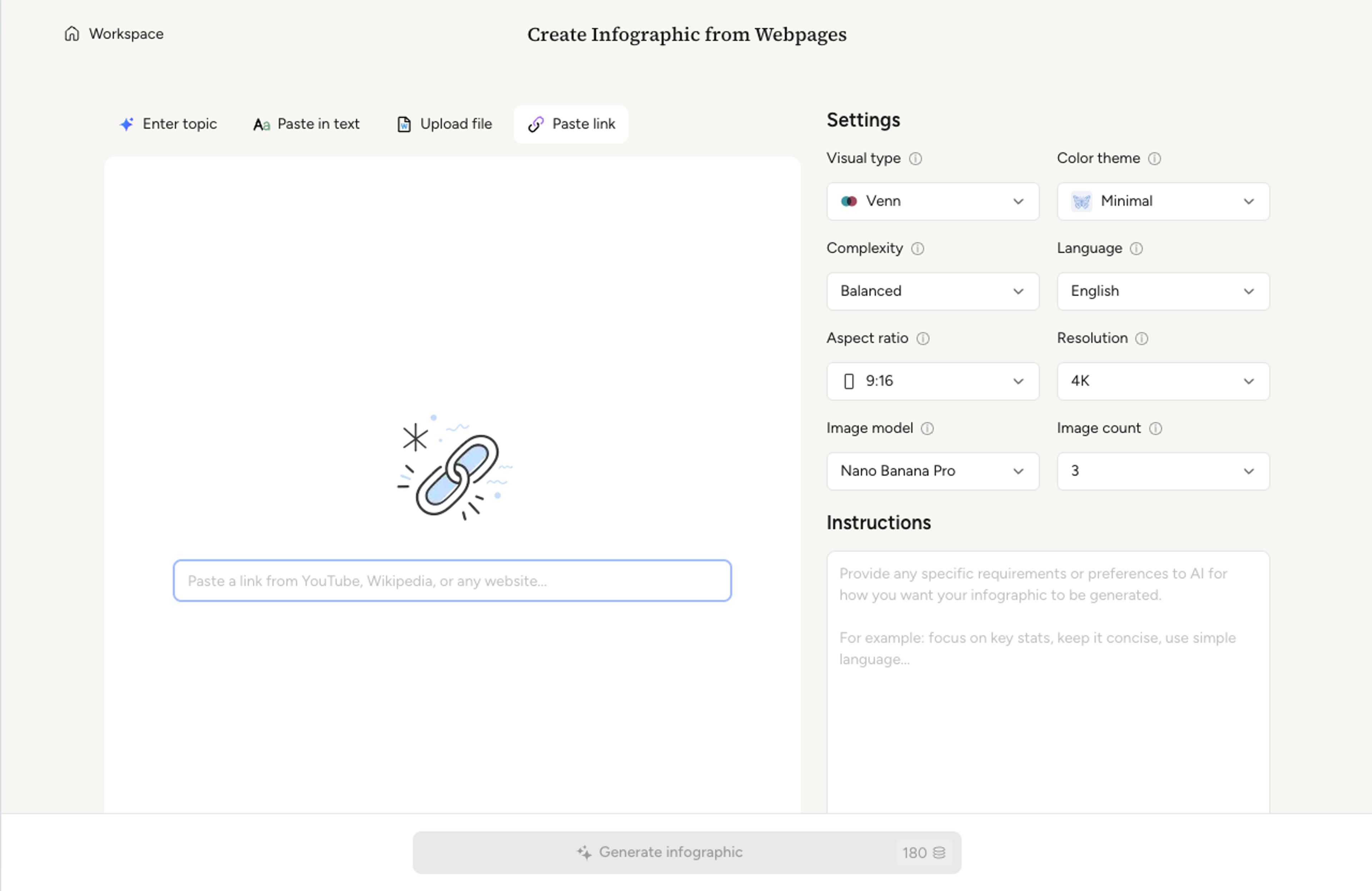
Decide which dimensions to compare across (price, feature, fit, risk) and whether the chart should highlight a recommended option.
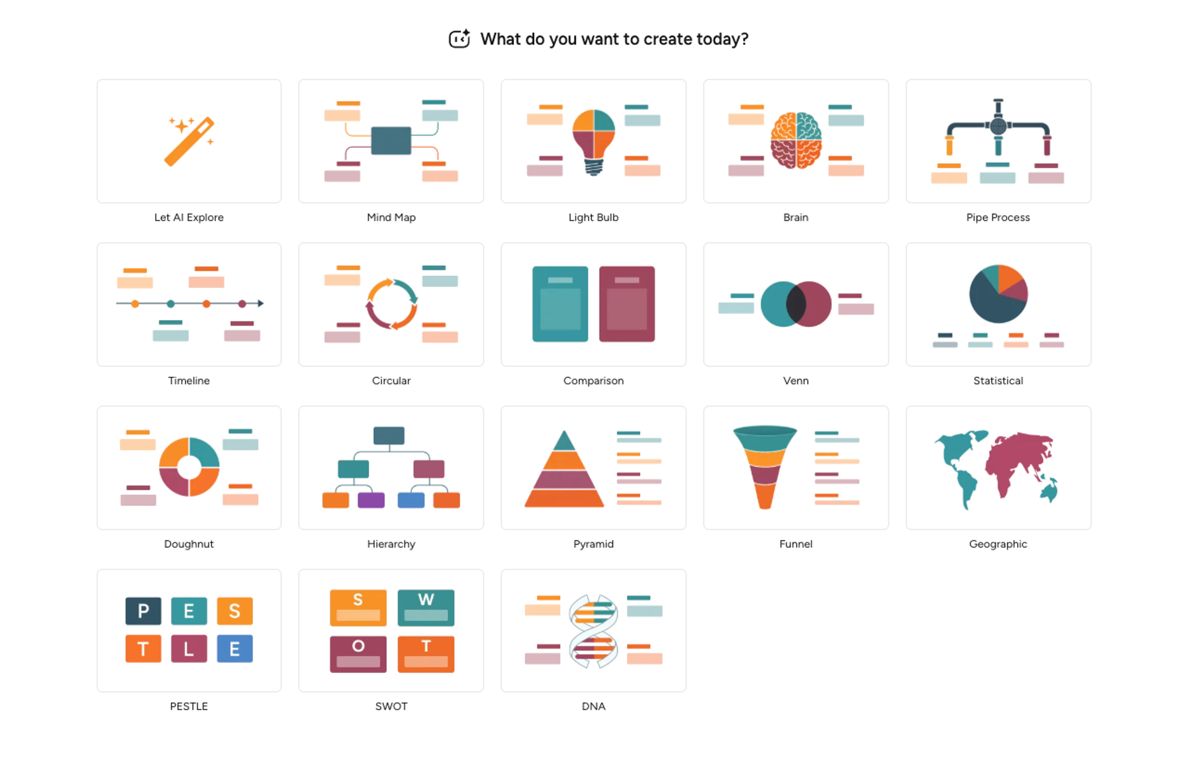
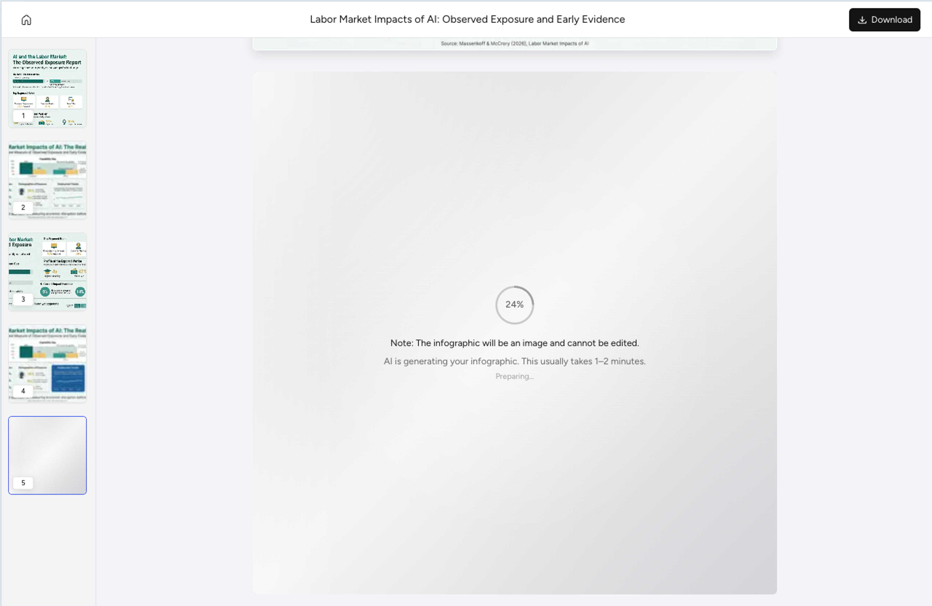
Infograph aligns options as columns and dimensions as rows, fills each cell from your source, and writes a one-line summary at the top.
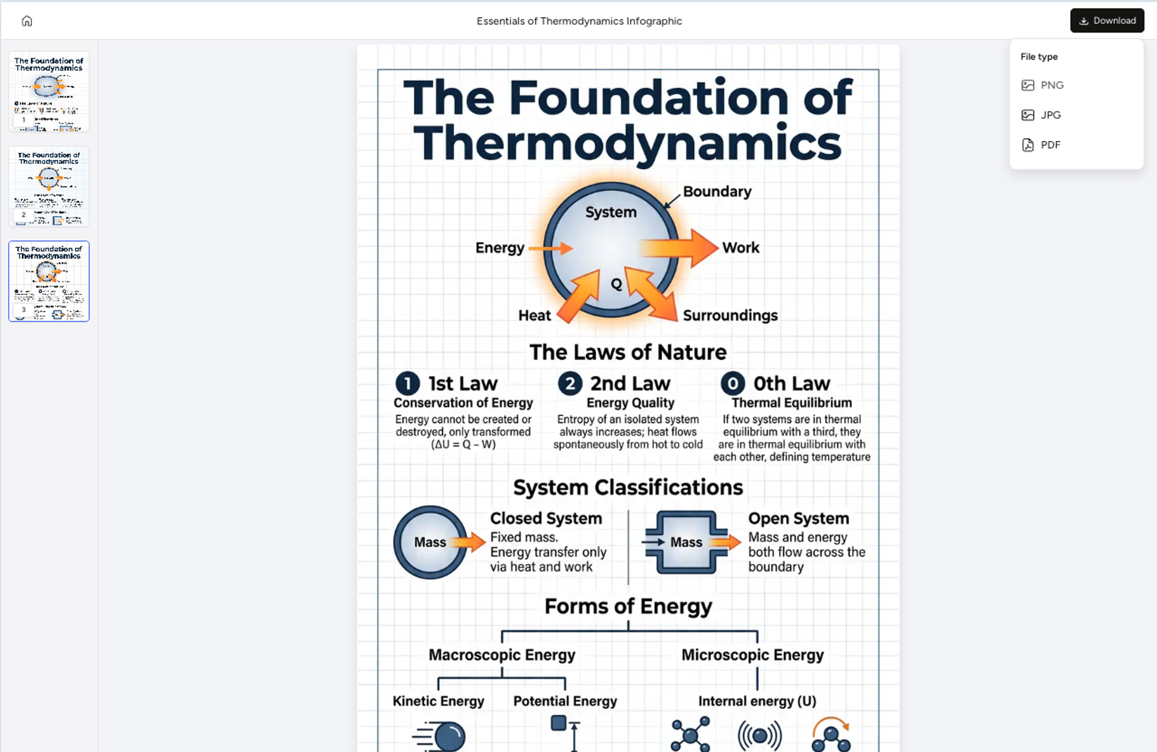
Reword a cell, swap an icon, recolor the recommended column, or hide a row with a quick instruction. Export as PNG, JPG, or PDF for decks and docs.
Explore comparison chart results Infograph can create for business decisions, K-12 lessons, academic synthesis, and strategy planning.
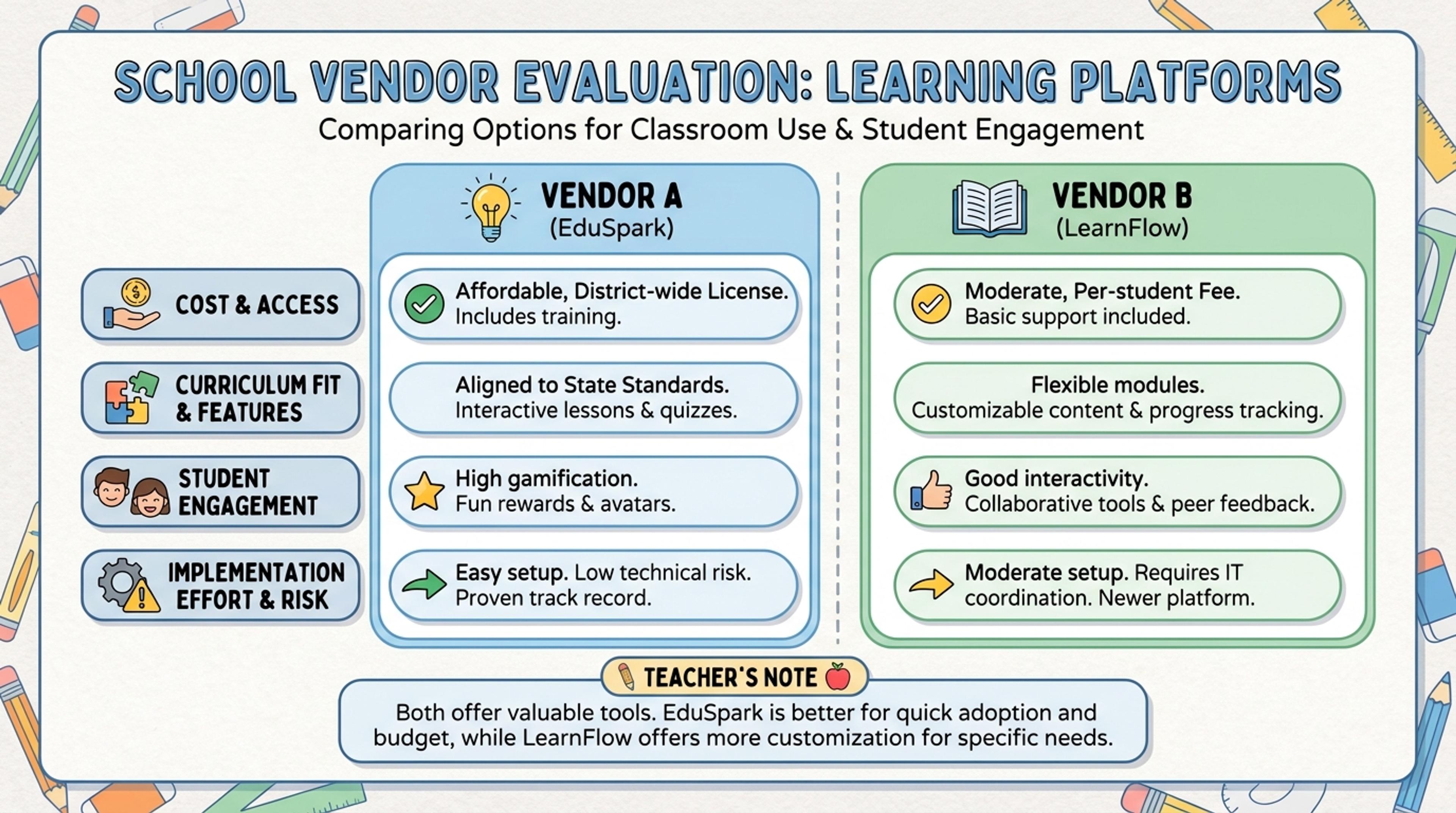
Compare cost, fit, implementation effort, risk, and recommendation across multiple options.
Two to five options stays readable in slides. The AI can support more, but it will recommend grouping closely-related options into a single column for clarity.
Yes. Upload the doc and the AI extracts options, dimensions, and tradeoffs so the chart aligns to the evaluation you have already done.
Yes. Pick a recommended column and the AI emphasizes it visually, adds a callout, and writes a short rationale below the chart.
Tell the AI exactly what to change in plain language. You can rewrite a cell, swap an icon, or merge two adjacent cells without redoing the layout.
Export as PNG or JPG for decks, or PDF for printed handouts and one-pagers. Cells stay aligned at presentation resolution.
Explore adjacent Infograph tools for Venn diagrams, mind maps, timelines, funnels, and source-to-infographic workflows.
Turn topics, notes, documents, or links into a clean two-circle or three-circle Venn diagram with readable labels and overlap summaries.
Drop in meeting transcripts, research notes, or a single topic and Infograph builds a clean radial mind map you can iterate on.
Turn project briefs, history readings, research notes, or links into a clean timeline infographic with milestones, labels, and visual flow.
Drop in your funnel data, paste a marketing recap, or describe each stage and turn it into a clean conversion funnel ready for the next QBR slide.
Paste an article, transcript, or batch of notes and Infograph turns the text into a polished infographic with hierarchy, callouts, and chart treatments.
Upload a research paper, white paper, or report PDF and Infograph extracts the structure to render a clean infographic — no copy-paste between tools.
Turn papers, lab notes, links, text, and data into scientific figures, graphical abstracts, biology diagrams, and research visuals. AI Scientific Figure Maker | Built for research and education