


Compare Regional Markets
Paste territory notes, market size, or coverage details and create a polished map-style summary for planning.
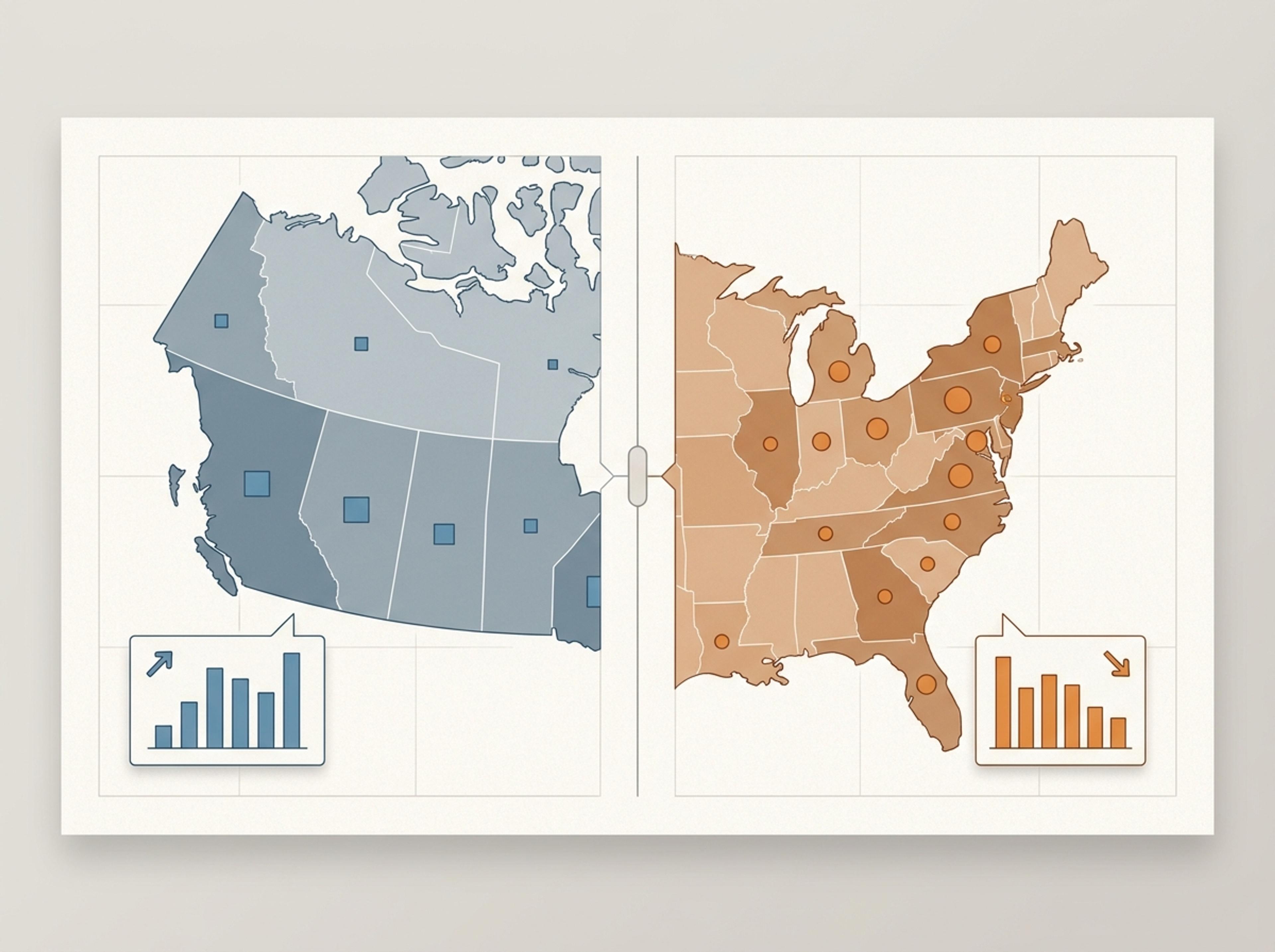
Drop in market reports, country-level data, or a research summary and Infograph composes a clean map-driven infographic with calibrated callouts.
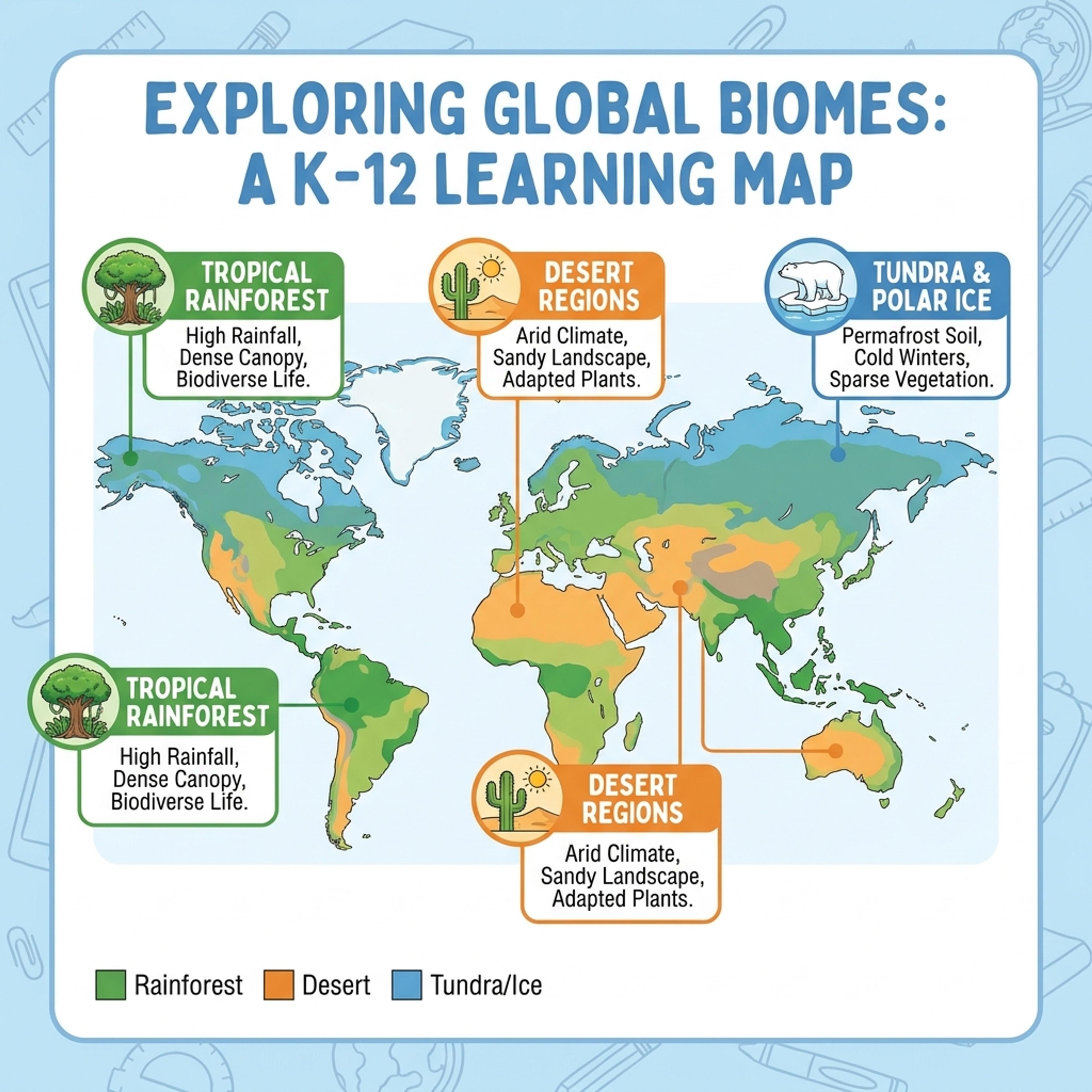
Drag and drop your paper, lab notes, lesson material, or document here or
A geographic infographic turns regional data, locations, territories, or spatial comparisons into a map-based visual. It is useful for market coverage, classroom geography, research summaries, public reports, travel planning, and any story where place or region changes the meaning.
Start with country names, regions, counts, notes, or a short brief and let Infograph organize locations, labels, legends, and callouts into a clear geographic infographic.
Paste territory notes, market size, or coverage details and create a polished map-style summary for planning.
Turn K-12 geography topics into colorful visuals with regions, labels, icons, and student-friendly callouts.
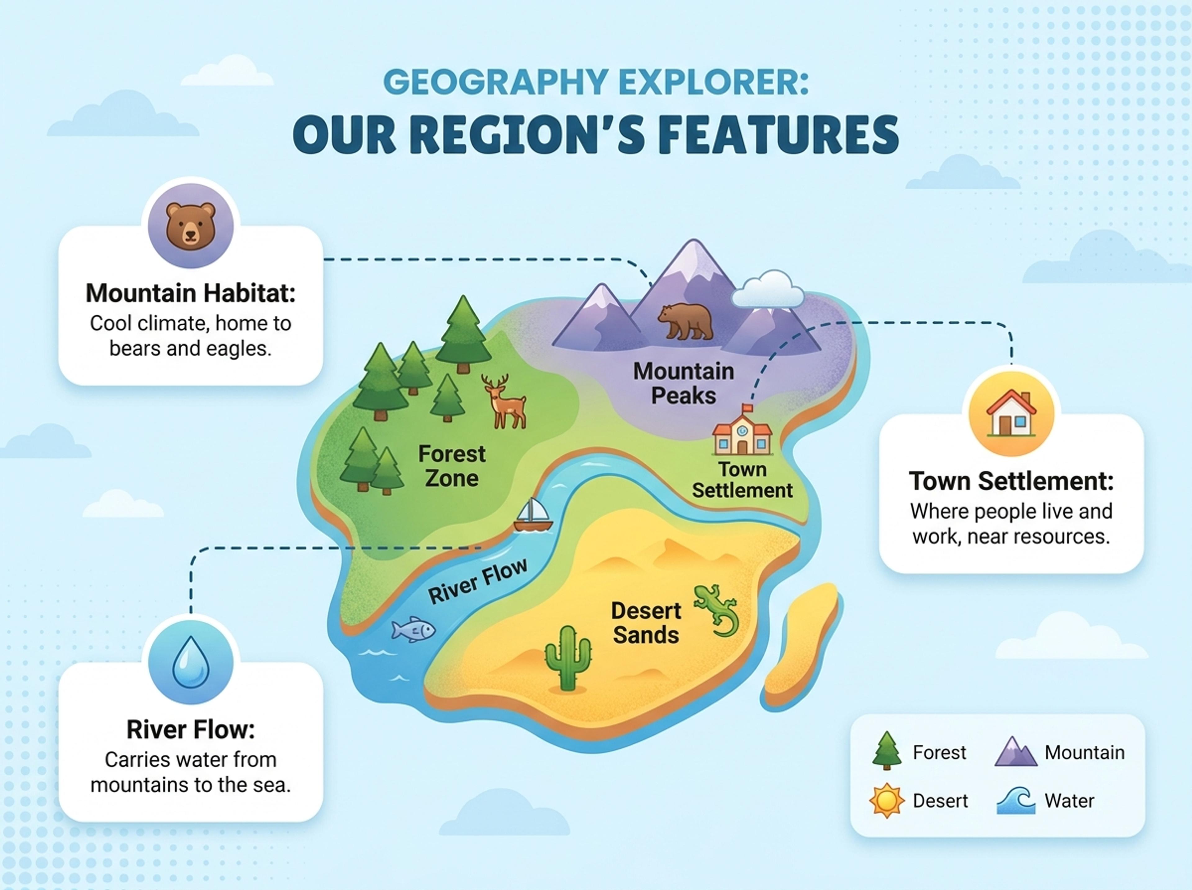
Convert regional findings, field notes, or study locations into a credible map visual for academic communication.
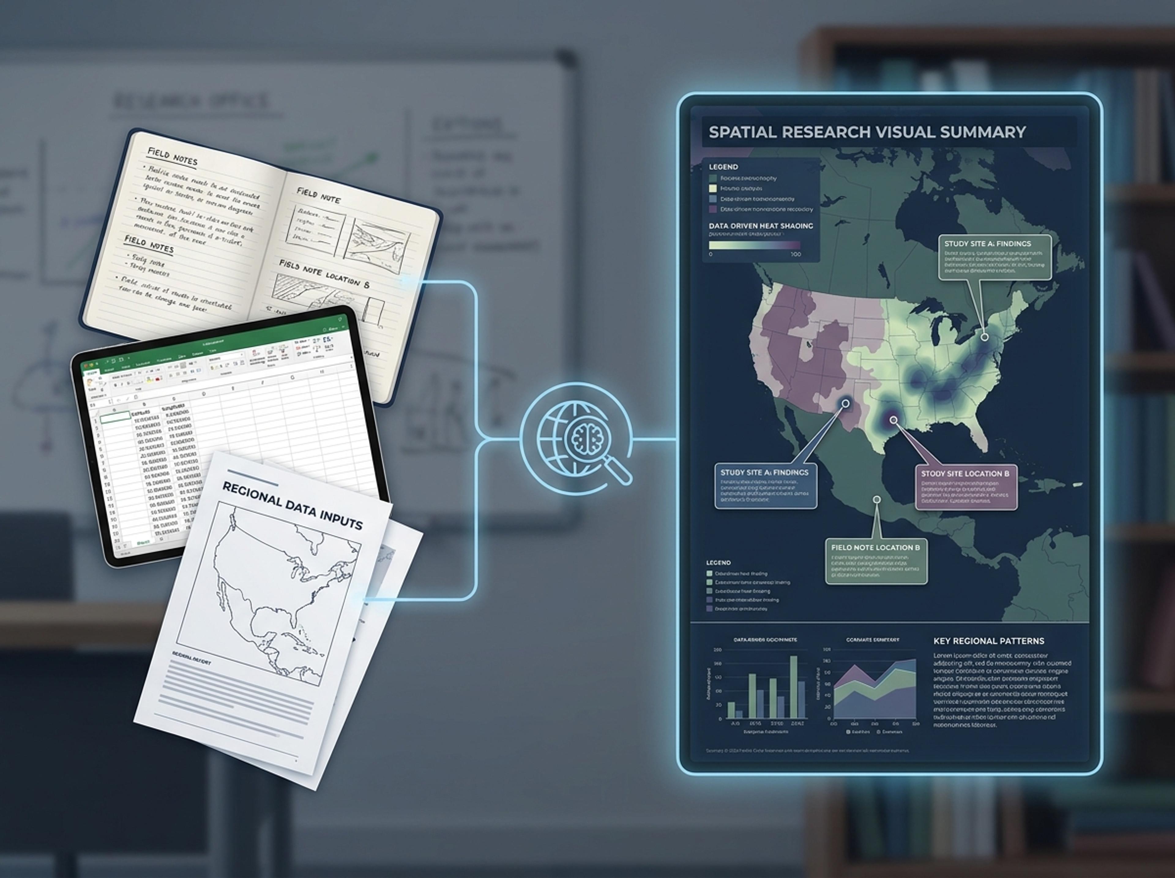
Upload a market report, paste country-level numbers, or link to a study. The AI keeps place names exactly as written so labels stay accurate.
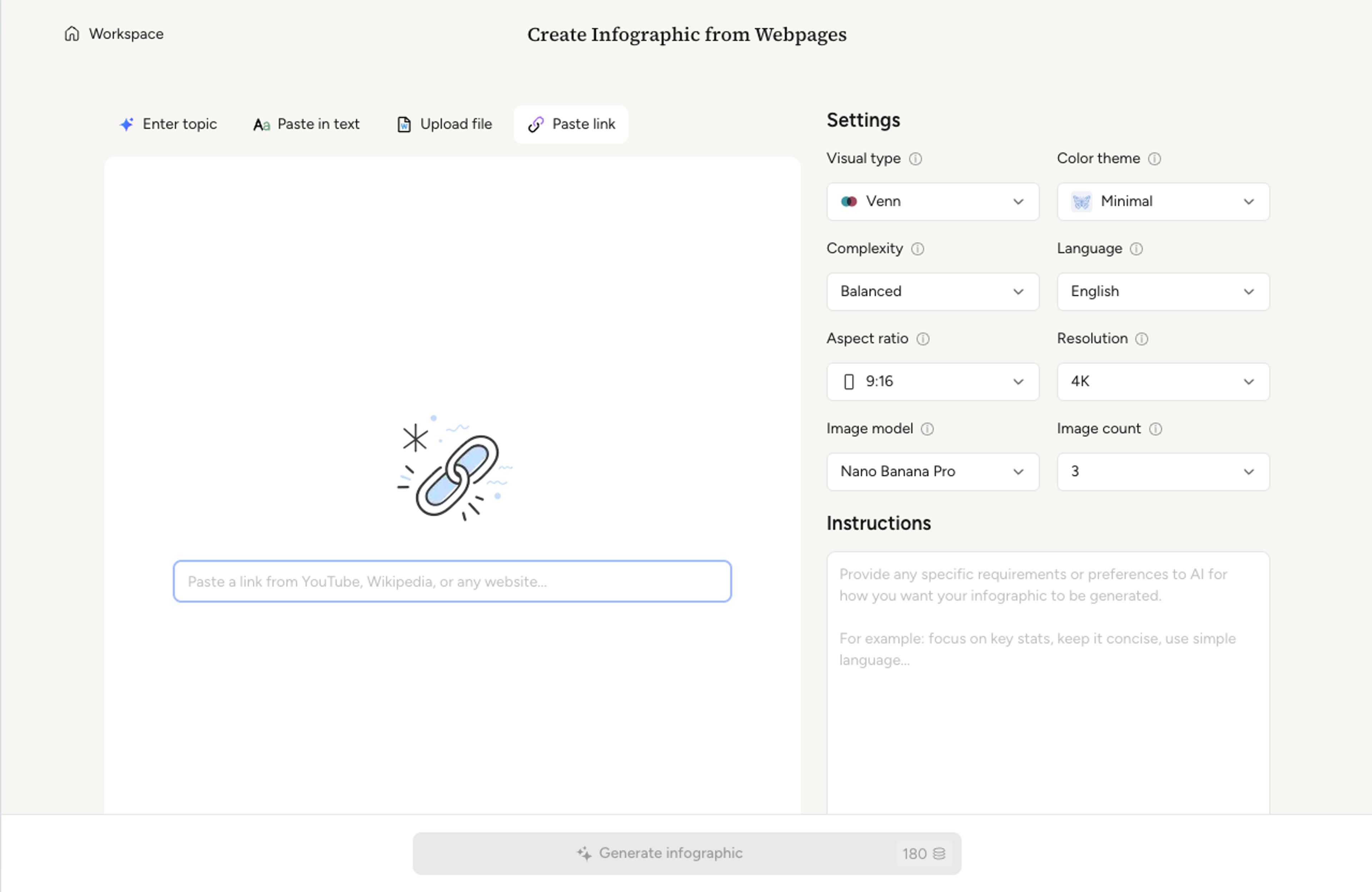
Choose the level — world, continent, country, or region — and decide whether to use heat shading, sized markers, or comparison cards alongside the map.
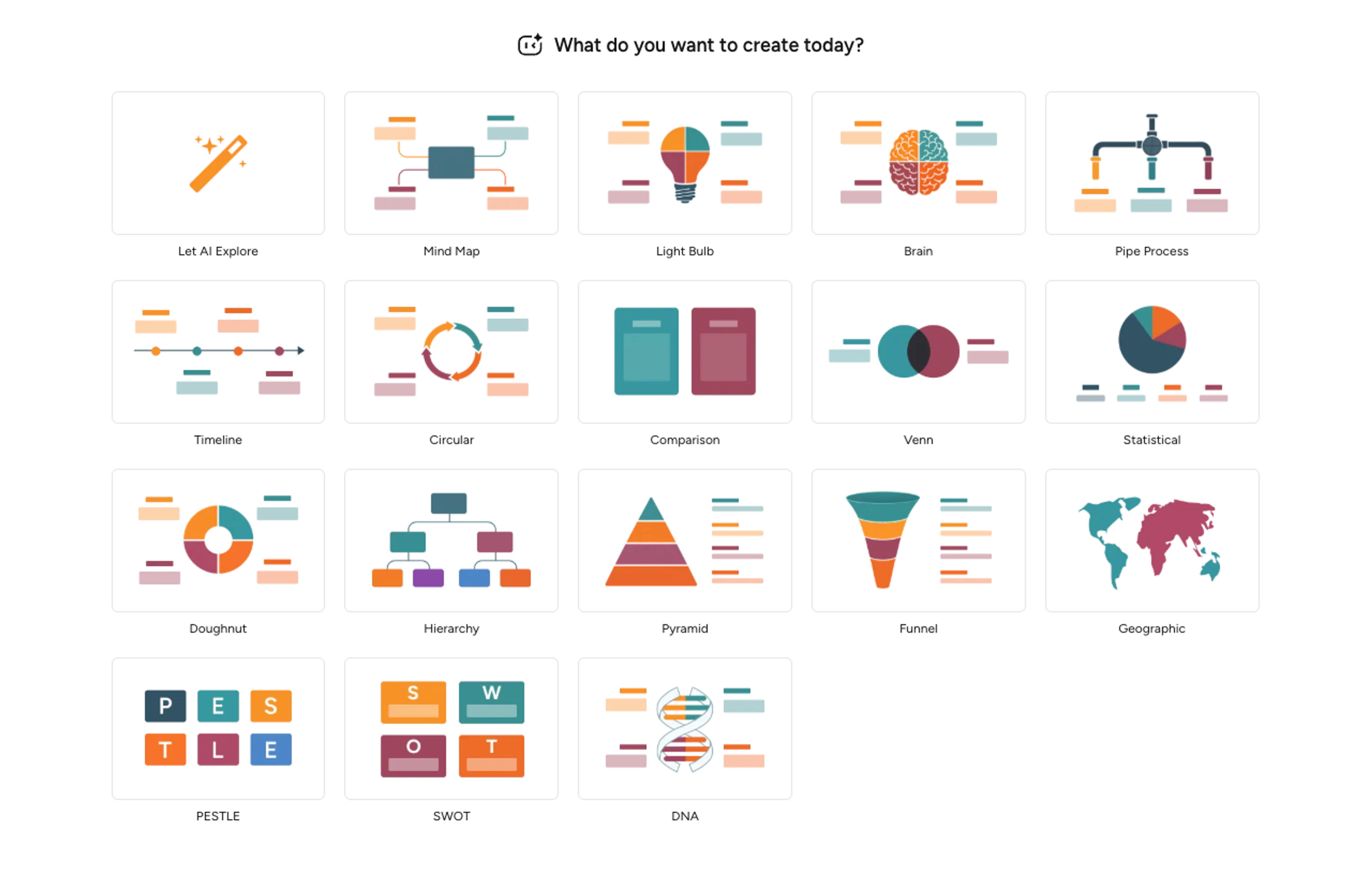
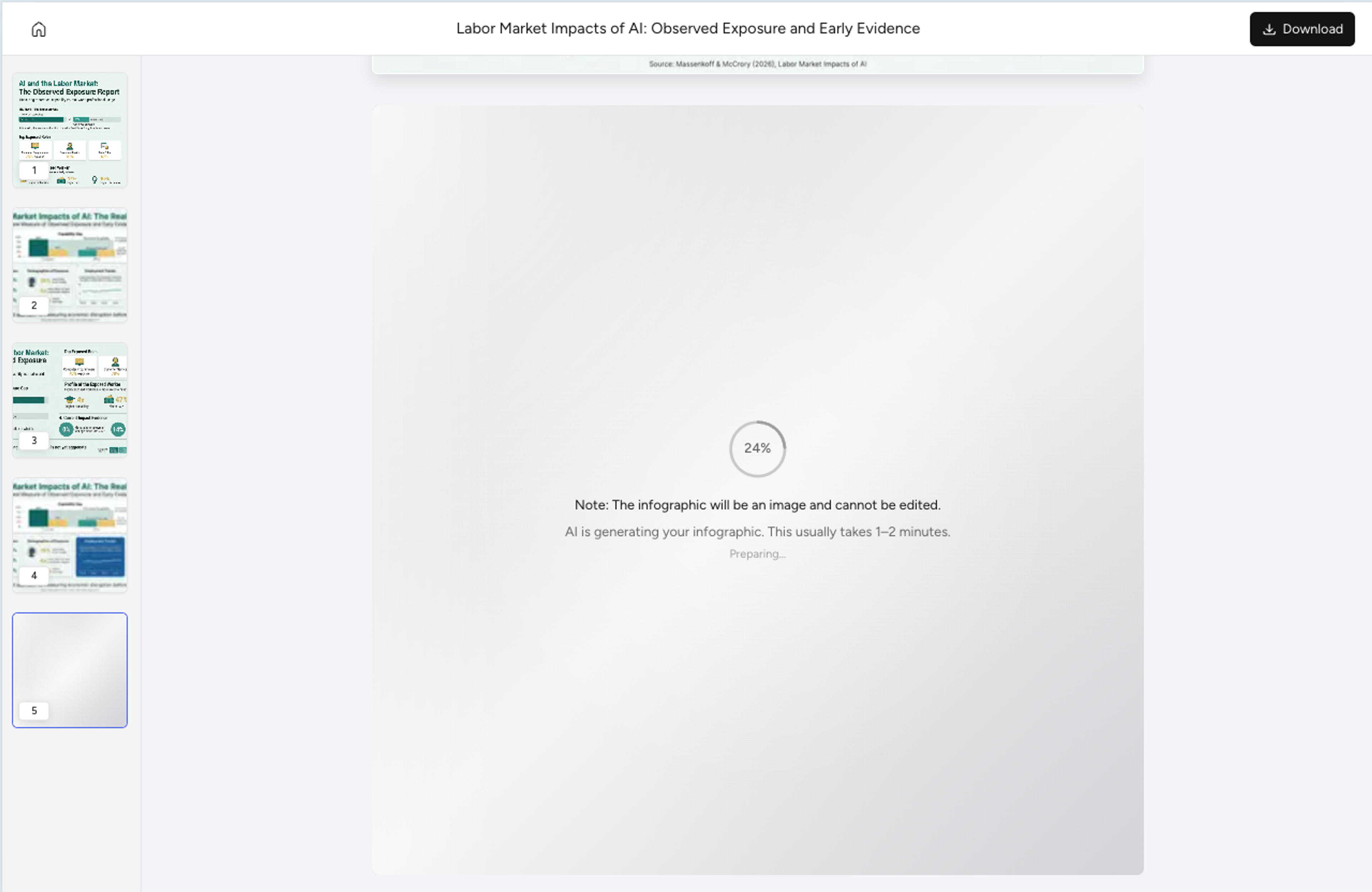
AI matches each value to the correct region, picks a color scale that respects your data range, and writes short callouts for the standout markets.
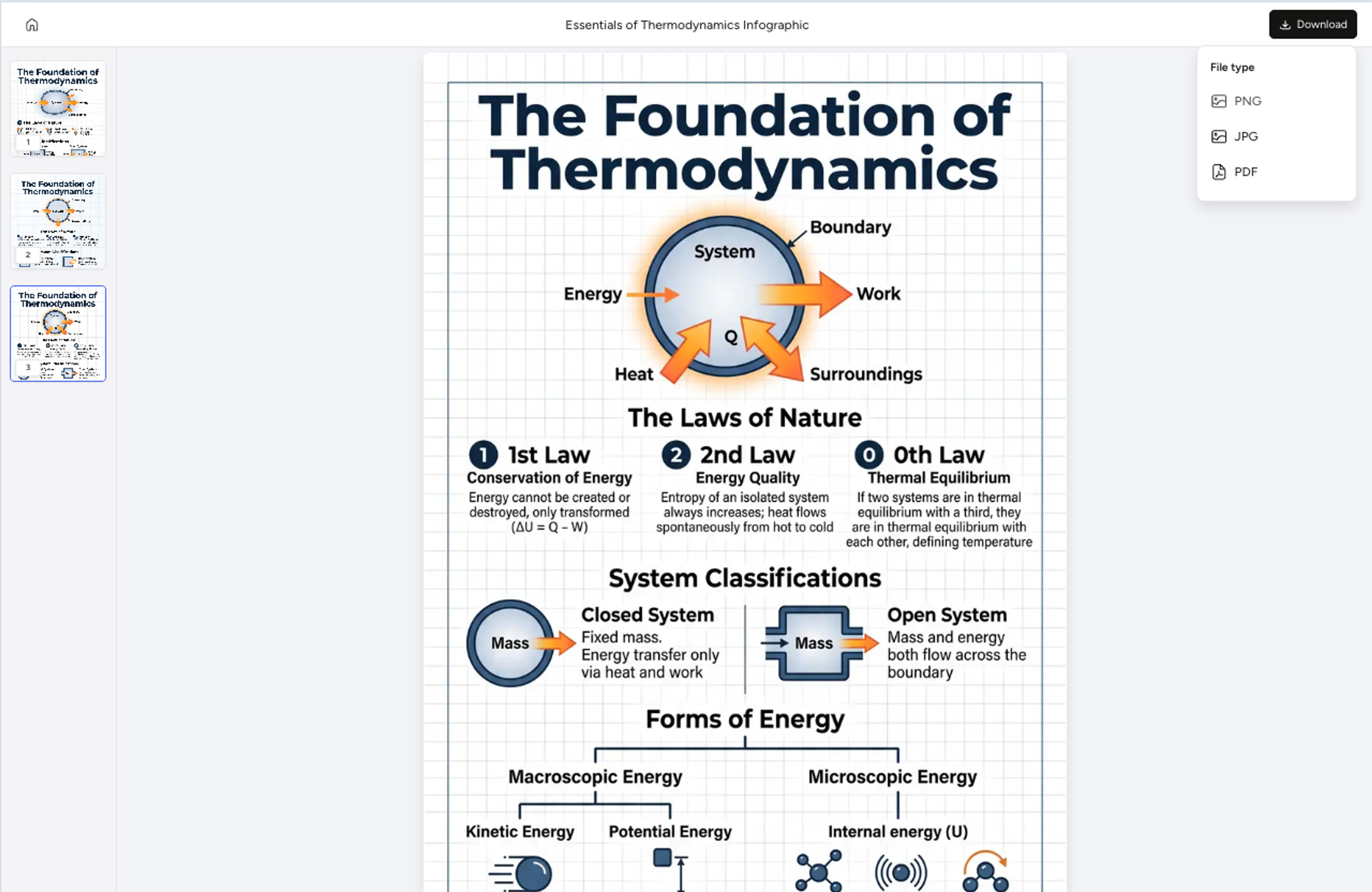
Adjust the legend, recolor a region, or rewrite a callout with a short instruction, then export the geographic infographic as PNG, JPG, or PDF.
Explore geographic infographic results Infograph can create for market planning, K-12 geography, academic research, and strategy work.
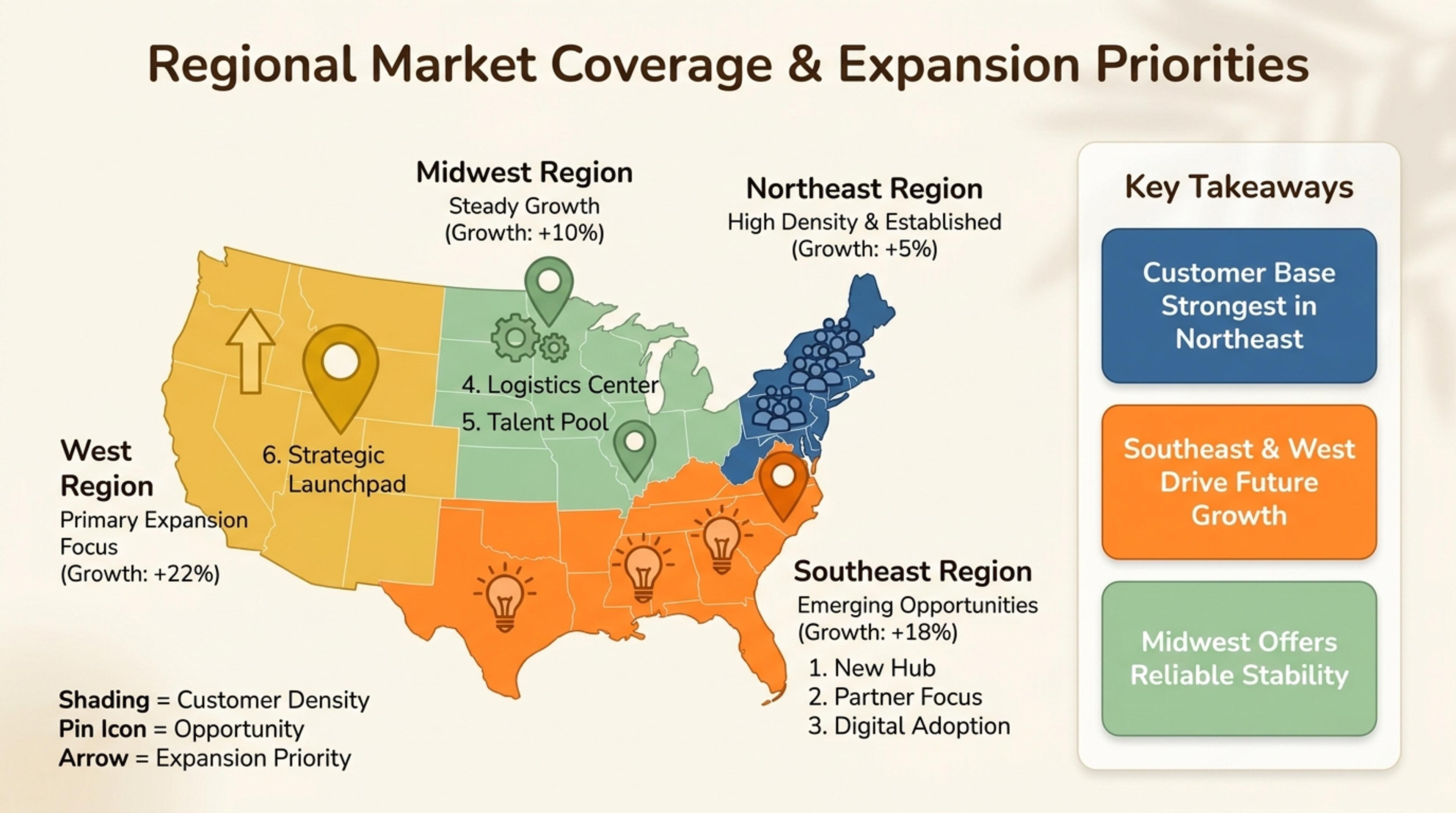
Show regions, opportunities, customer density, and expansion priorities in one visual.
World, continent, country, sub-region, and major-city levels are supported. The AI matches your data to the most readable level automatically.
Yes. The AI picks a color scale that respects your data range and writes a legend that explains the bins so readers can interpret the heat at a glance.
Yes. Tell the AI which regions to call out and it sizes markers, places labels, and writes short captions referencing your source.
Regions with no data are shown in a neutral fill and noted in the legend. The AI avoids implying values that are not in your source.
Export as PNG or JPG for blog posts and social, or PDF for printed reports and policy briefs.
Explore adjacent Infograph tools for statistical infographics, doughnut charts, comparison charts, timelines, and source-to-infographic workflows.
Drop in percentages, raw numbers, or a paragraph describing the breakdown and Infograph will compose a balanced doughnut chart with clean callouts.
Drop in feature lists, evaluation docs, or research notes and turn them into a side-by-side comparison chart that reads cleanly in decks and reports.
Turn project briefs, history readings, research notes, or links into a clean timeline infographic with milestones, labels, and visual flow.
Paste an article, transcript, or batch of notes and Infograph turns the text into a polished infographic with hierarchy, callouts, and chart treatments.
Drop in a CSV, paste a markdown table, or upload a sheet and Infograph turns the rows into a chart-driven infographic instead of a wall of numbers.
Turn papers, lab notes, links, text, and data into scientific figures, graphical abstracts, biology diagrams, and research visuals. AI Scientific Figure Maker | Built for research and education