

Find the Story in Rows
AI reads headers, values, categories, and trends so your data becomes a visual explanation instead of a static table.
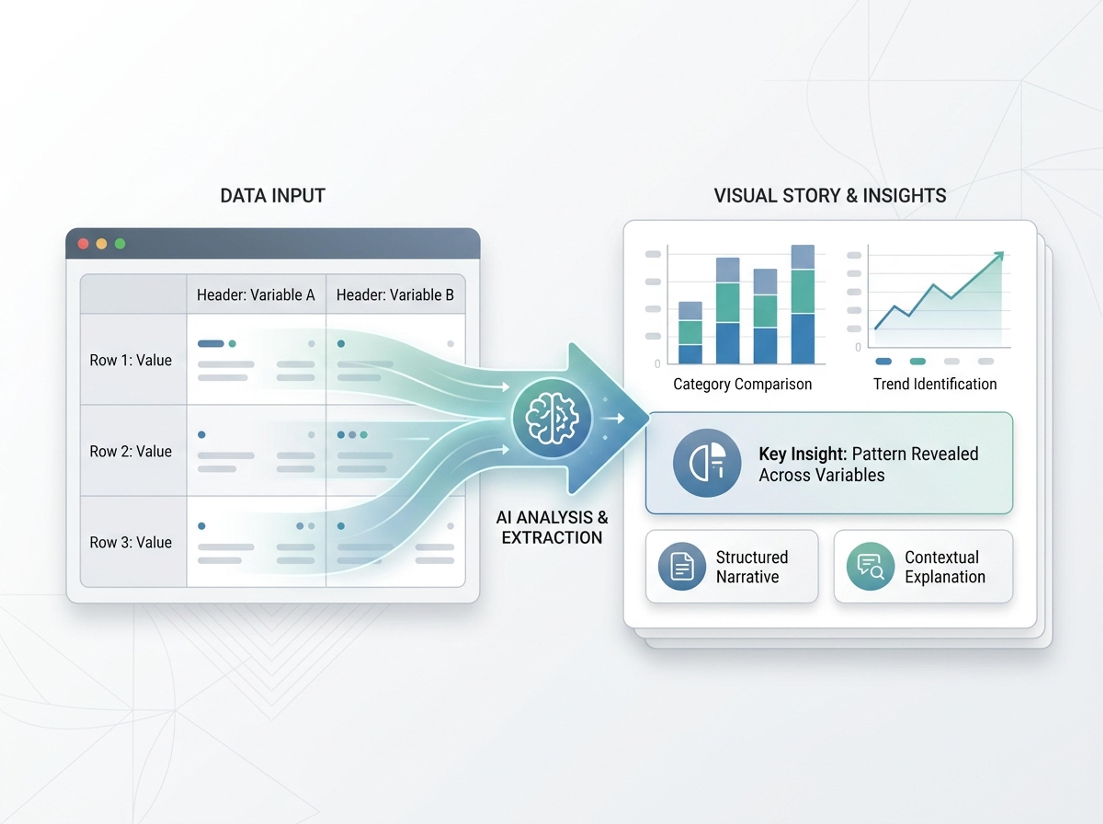
Drop in a CSV, paste a markdown table, or upload a sheet and Infograph turns the rows into a chart-driven infographic instead of a wall of numbers.
Explore finished infographic results created from CSVs, spreadsheets, classroom data, and research tables.
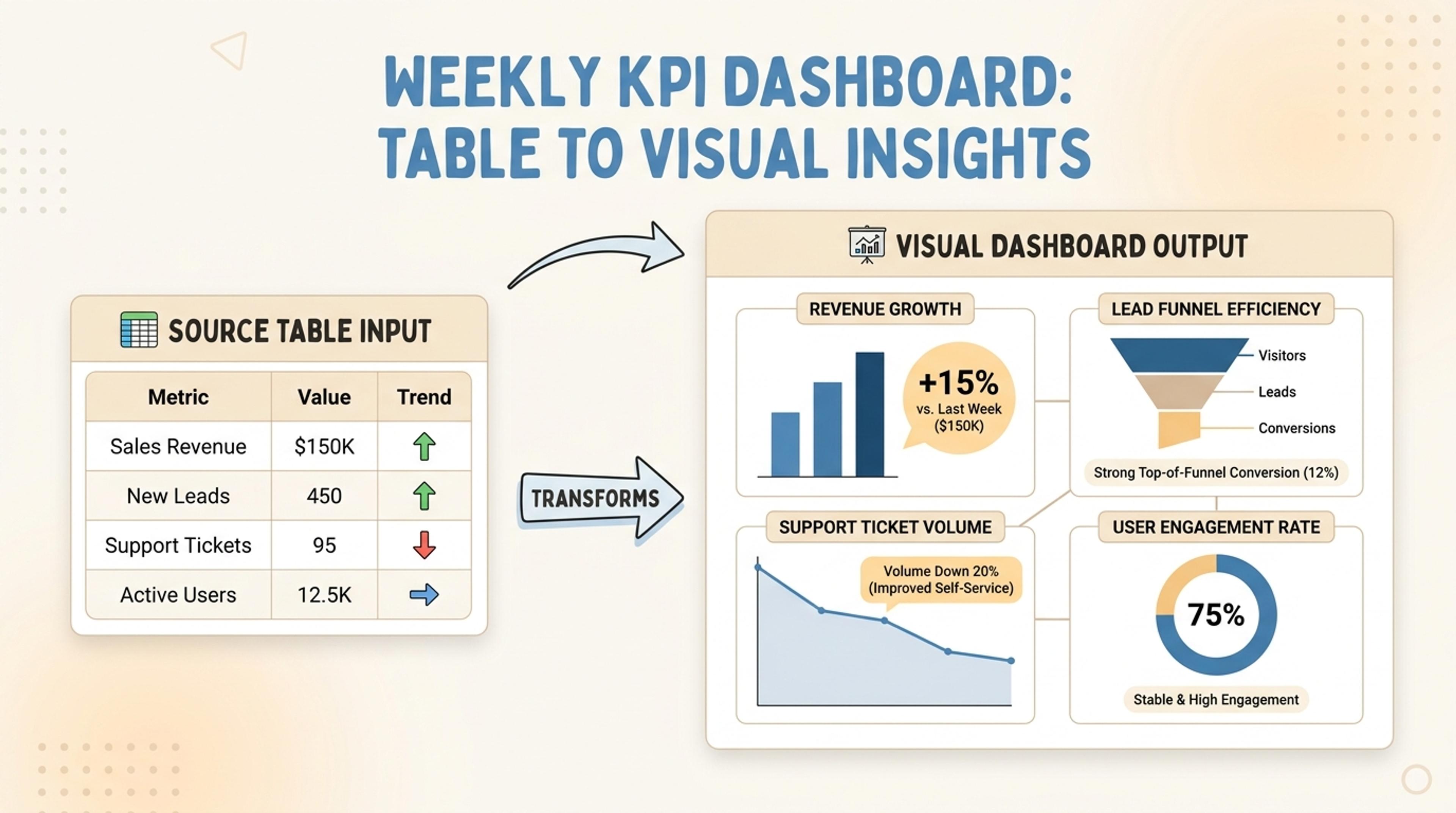
Convert weekly metrics into a chart-led infographic with callouts and trend highlights.
Paste rows, upload sheets, or drop in CSV data and let Infograph choose readable chart treatments and captions.
AI reads headers, values, categories, and trends so your data becomes a visual explanation instead of a static table.
Infograph can turn percentages, rankings, comparisons, distributions, and trends into the chart style that fits the data.
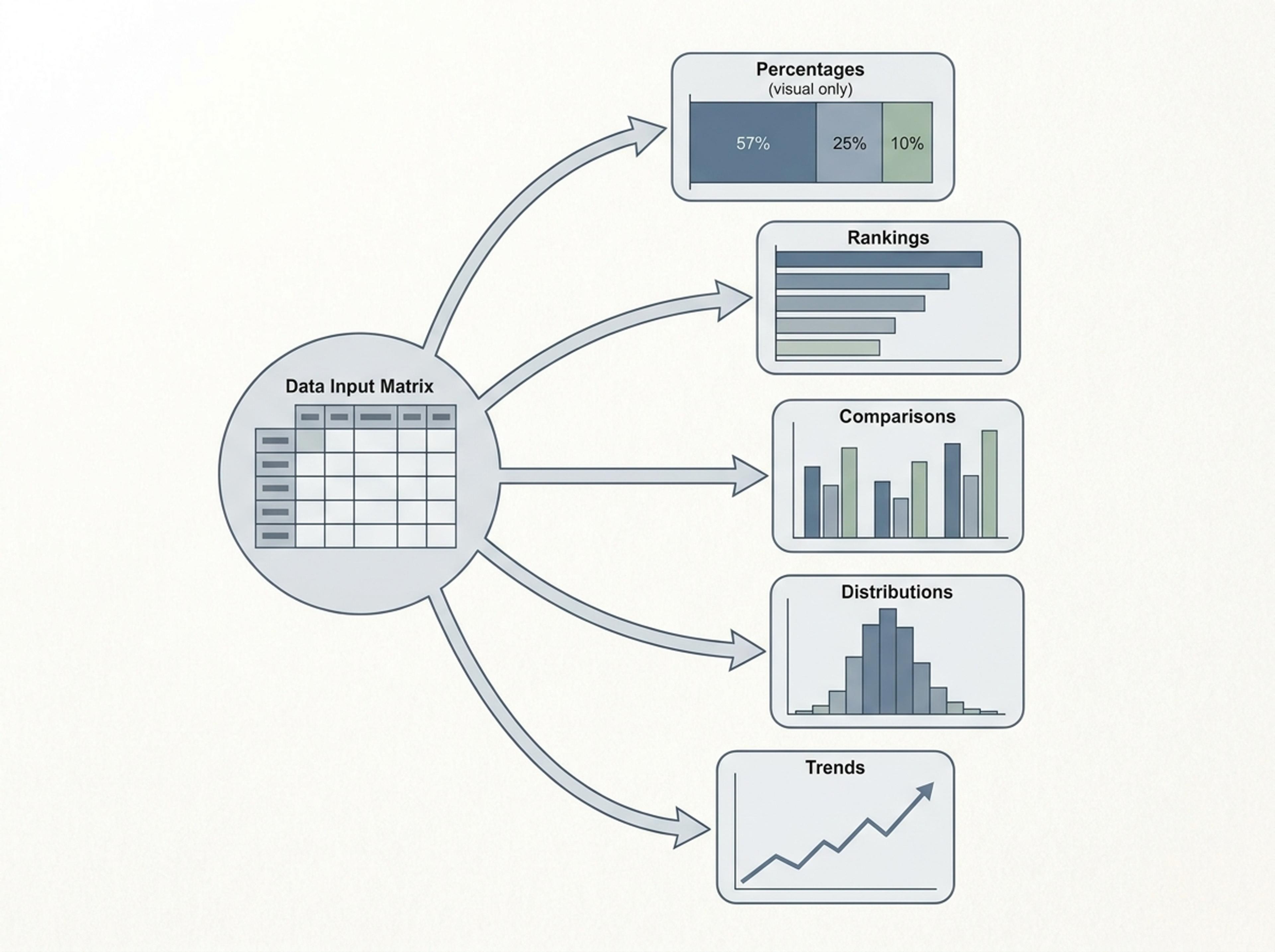
Captions and callouts explain what each chart means, helping readers understand the point without inspecting every cell.
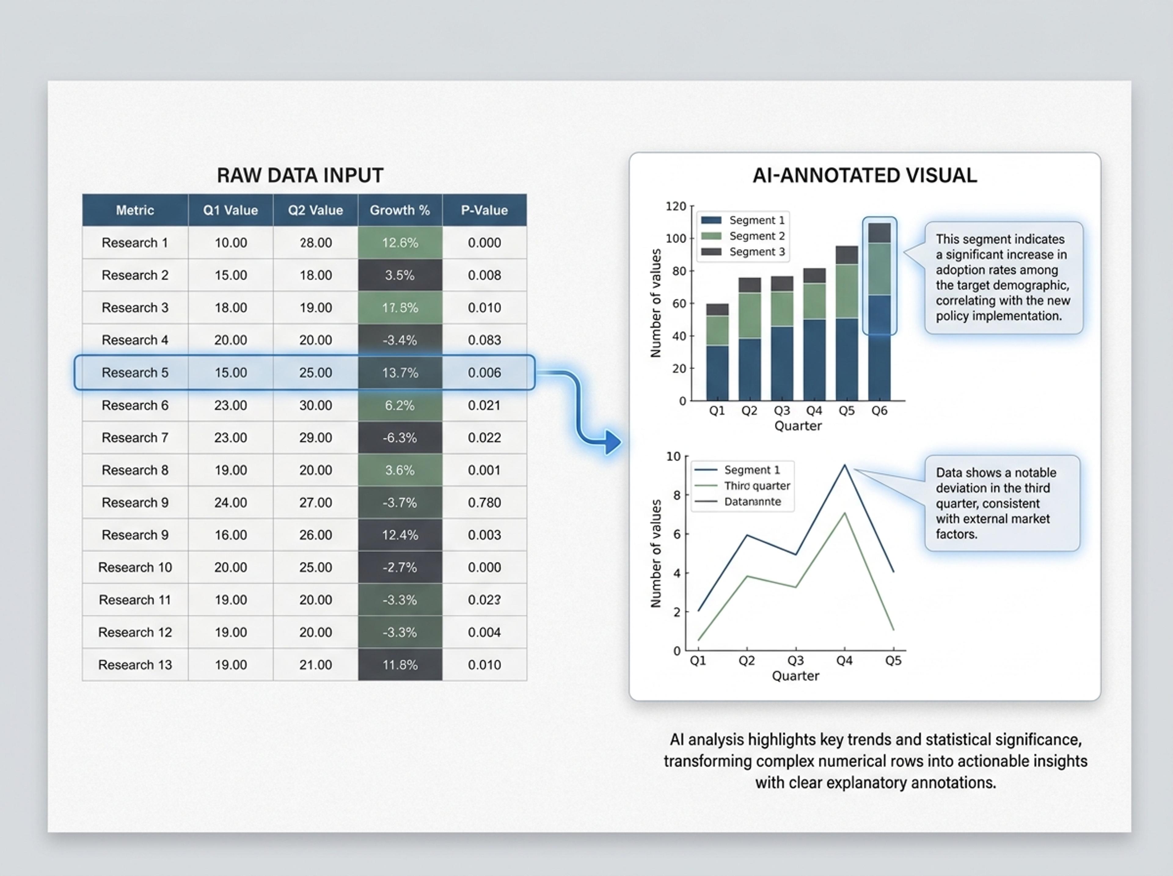
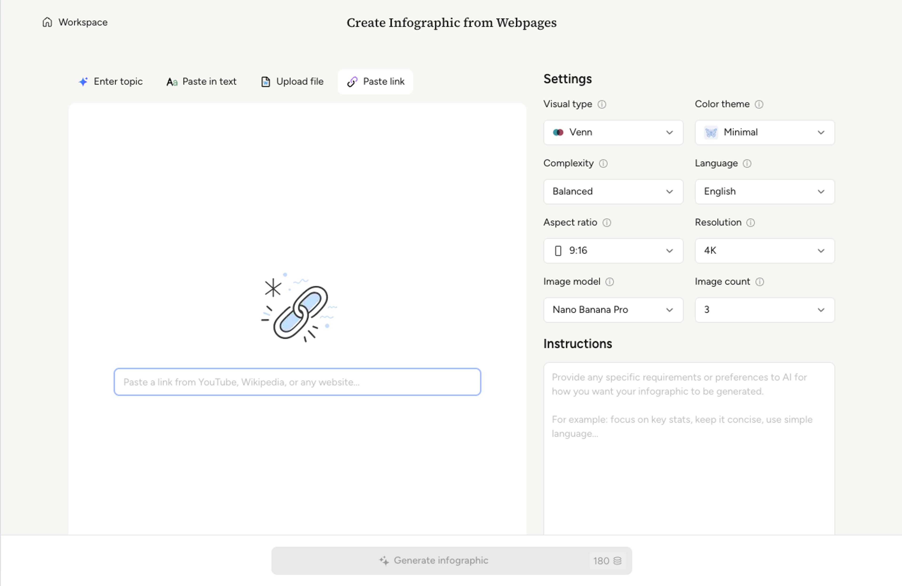
Paste a CSV, drop in a markdown table, or upload a spreadsheet. The AI reads rows, columns, and headers without you reformatting anything.
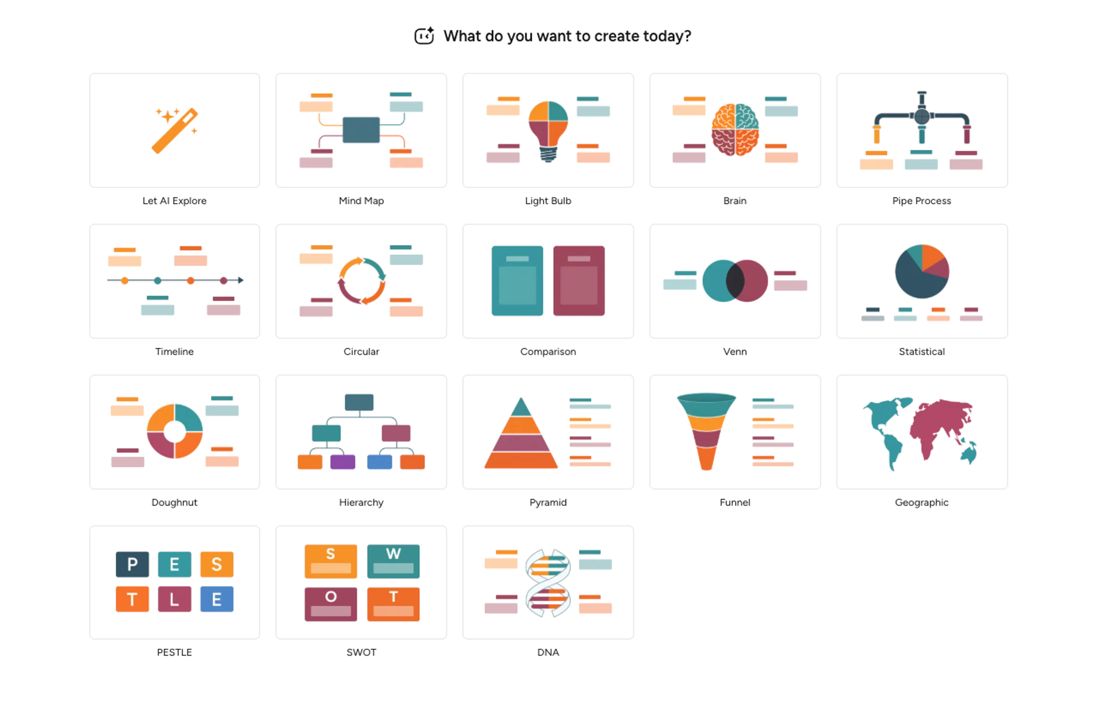
Decide whether to highlight totals, comparisons, trends, or distributions. The AI suggests appropriate chart types per metric and you can override with a prompt.
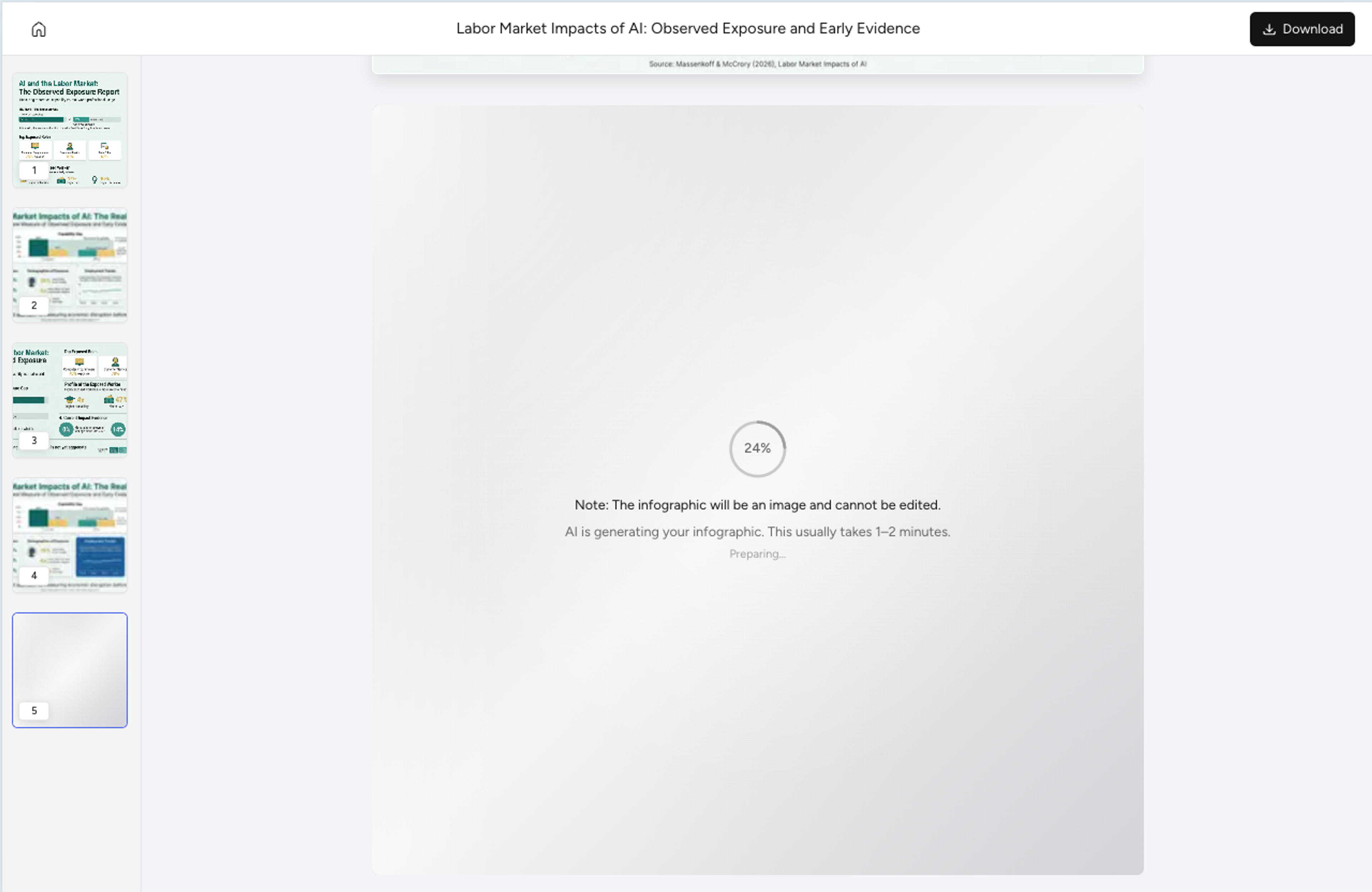
Infograph picks the right chart per metric, sizes elements proportionally, and writes one-line captions that explain what each chart shows.
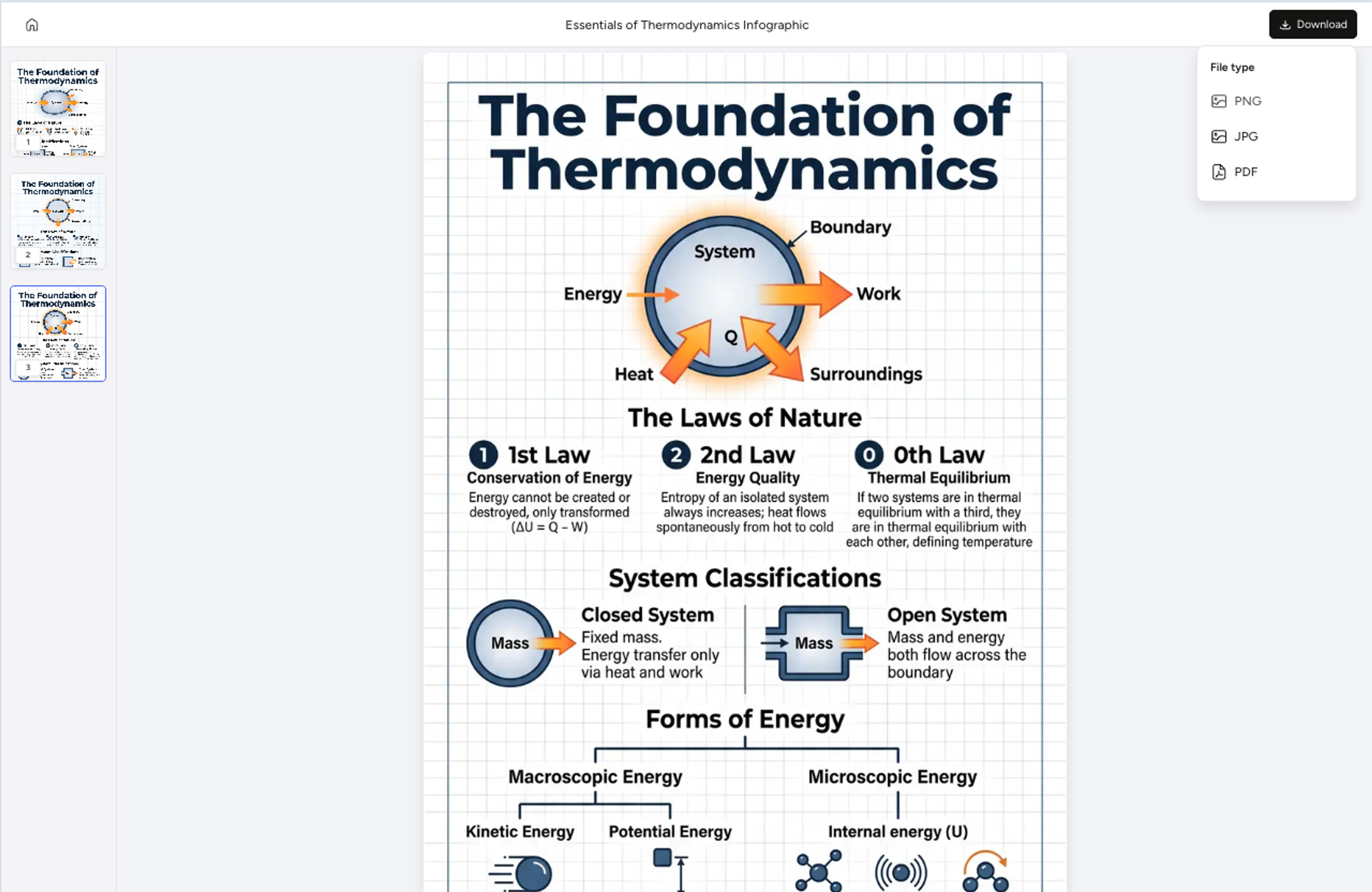
Swap a chart type, hide a column, recolor a series, or rewrite a caption with a short prompt. Export as PNG, JPG, or PDF for slides or reports.
Turn structured data into a visual story without manually choosing every chart and caption.
The AI reads column names and row values to understand what the data represents.
Metrics become bars, lines, rankings, grids, or callouts based on the data shape.
Each chart can include a plain-language explanation of what matters.
Use CSVs, pasted tables, spreadsheet uploads, and markdown tables.
Swap chart types, hide columns, or rewrite captions after generation.
Download the final visual for reports, dashboards, lessons, or decks.
CSV, markdown tables, copy-pasted tab-separated values, and uploaded spreadsheet files are all supported. Headers in the first row are detected automatically.
The AI picks chart treatments per metric based on whether the data is categorical, percentage, trend, or distribution. You can override with a prompt at any time.
Tables up to a few hundred rows convert well. For larger datasets, the AI samples or aggregates and offers a summary chart treatment with a note in the legend.
Yes. Paste several tables separated by blank lines or upload a workbook with multiple sheets. The AI organizes them into a multi-section infographic.
Export as PNG or JPG for embeds and social, or PDF for printed reports and dashboards.
Explore adjacent Infograph tools for PDFs, Word docs, PowerPoint decks, text, and chart formats.
Paste an article, transcript, or batch of notes and Infograph turns the text into a polished infographic with hierarchy, callouts, and chart treatments.
Upload a research paper, white paper, or report PDF and Infograph extracts the structure to render a clean infographic — no copy-paste between tools.
Upload a .docx — strategy memo, research note, internal report — and Infograph turns the structure into a clean infographic without rewriting the doc.
Upload a .pptx and Infograph extracts the slide content into a single infographic — perfect for blog posts, social posts, or executive one-pagers.
Drop in percentages, raw numbers, or a paragraph describing the breakdown and Infograph will compose a balanced doughnut chart with clean callouts.
Turn papers, lab notes, links, text, and data into scientific figures, graphical abstracts, biology diagrams, and research visuals. AI Scientific Figure Maker | Built for research and education