

Start With Source Material
Paste a methods section, upload research notes, or describe the finding you need to explain. Infograph uses that context to build a more specific visual.
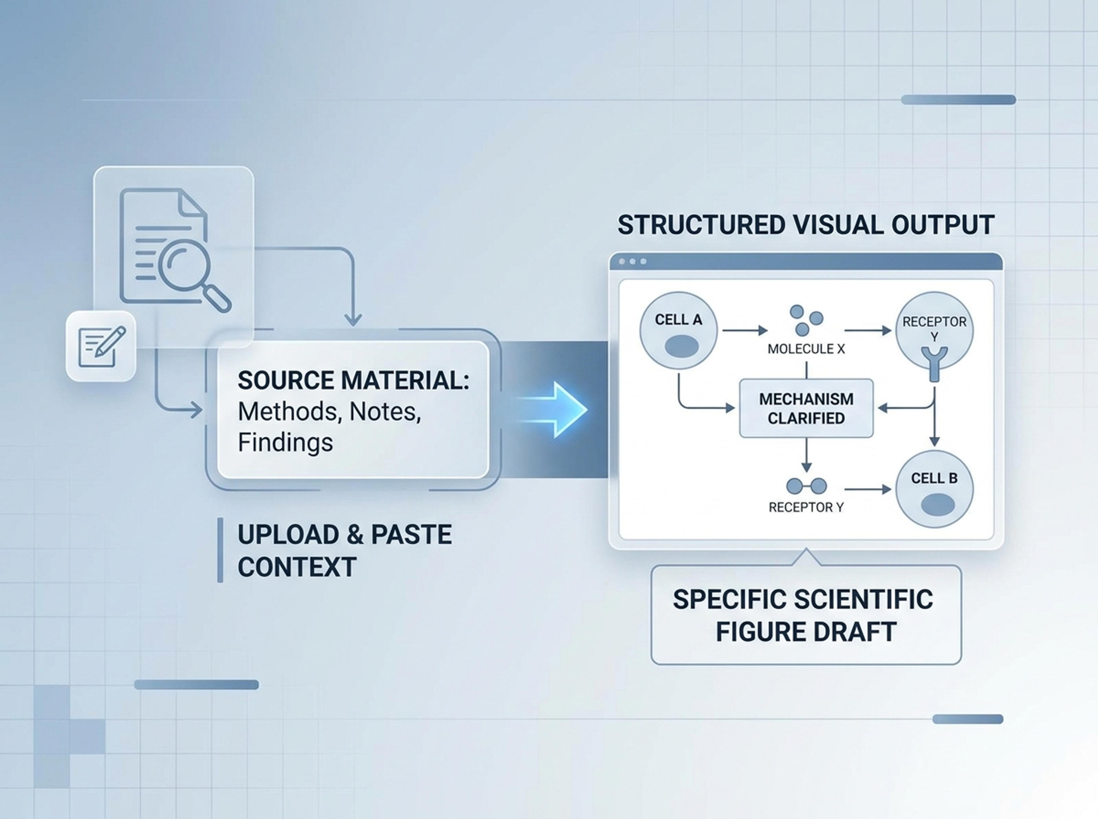
Transform your research papers, complex data, and notes into clear, publication-ready visuals with Infograph.
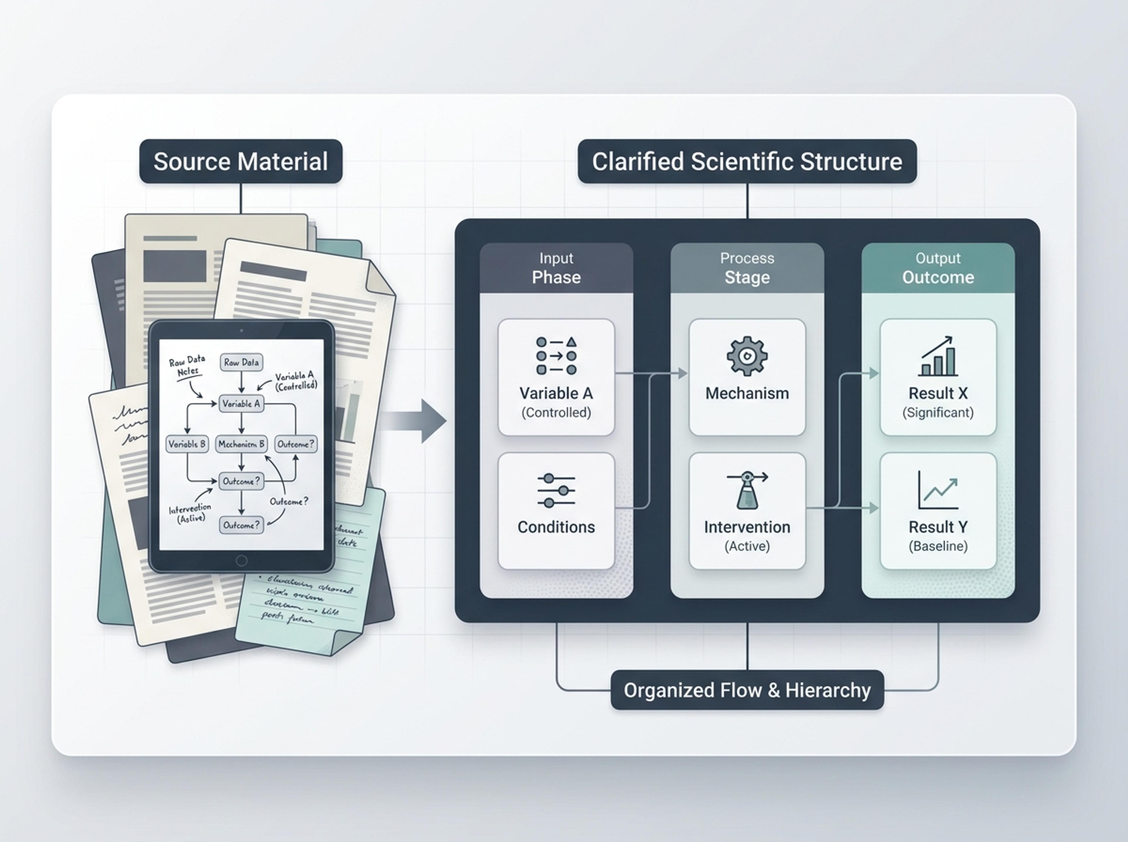
Turn papers, methods notes, lab summaries, and source material into structured scientific visuals with clear labels and readable hierarchy.
Paste a methods section, upload research notes, or describe the finding you need to explain. Infograph uses that context to build a more specific visual.
Organize variables, mechanisms, comparisons, sequences, or evidence groups so readers can follow the scientific story quickly.
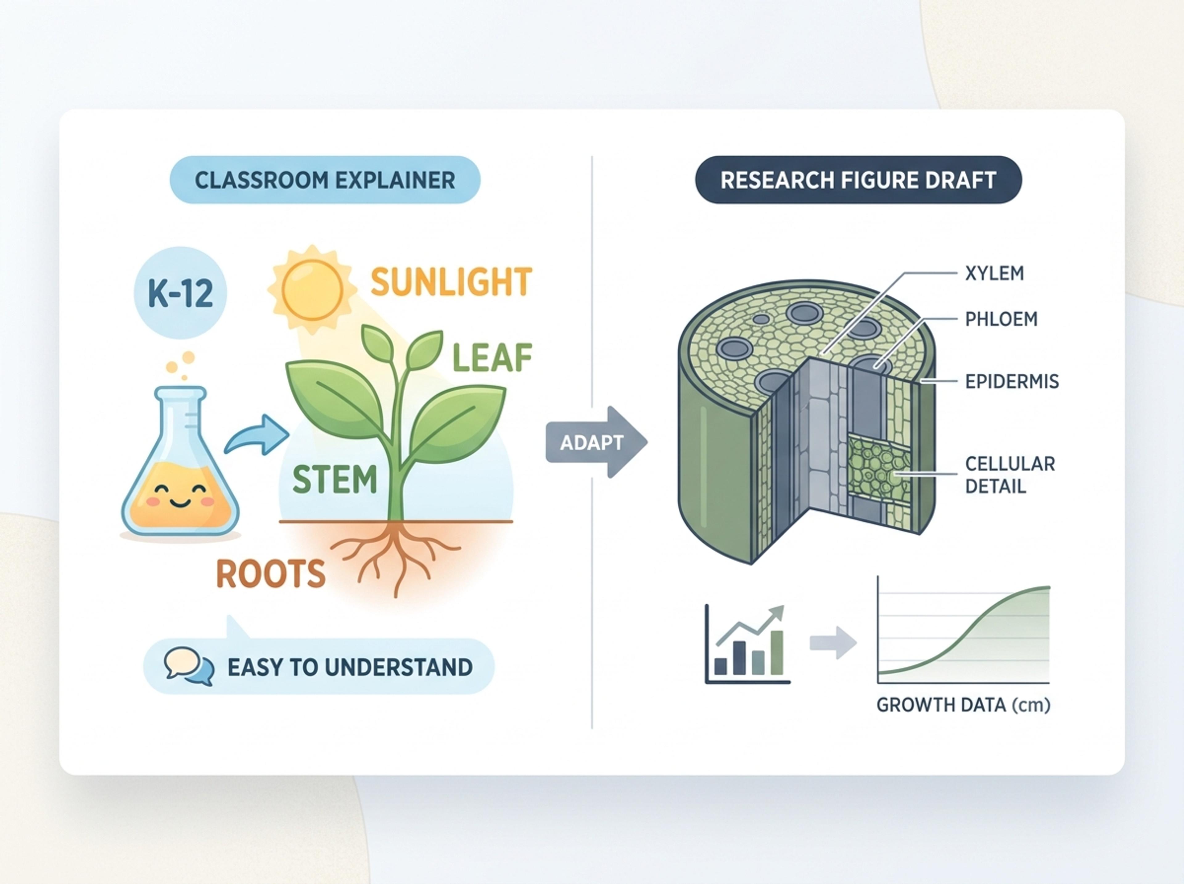
Create a simpler K-12 explainer, a formal academic figure draft, or a polished report visual without redrawing every element by hand.
Upload a paper, paste lab notes, or describe the process, pathway, or evidence you want to visualize.
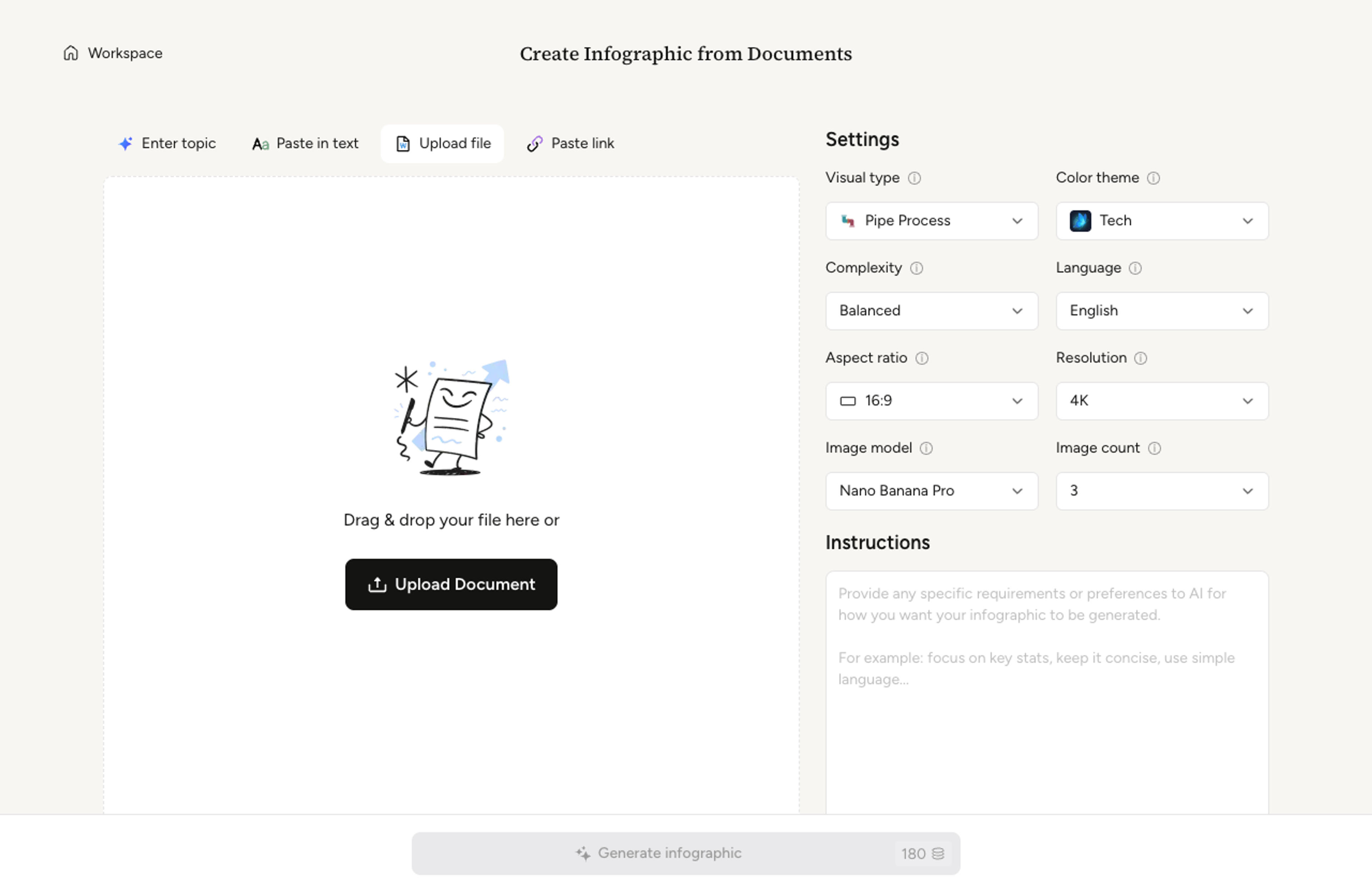
Select whether the result should explain a mechanism, compare conditions, summarize findings, or turn data into a visual figure.
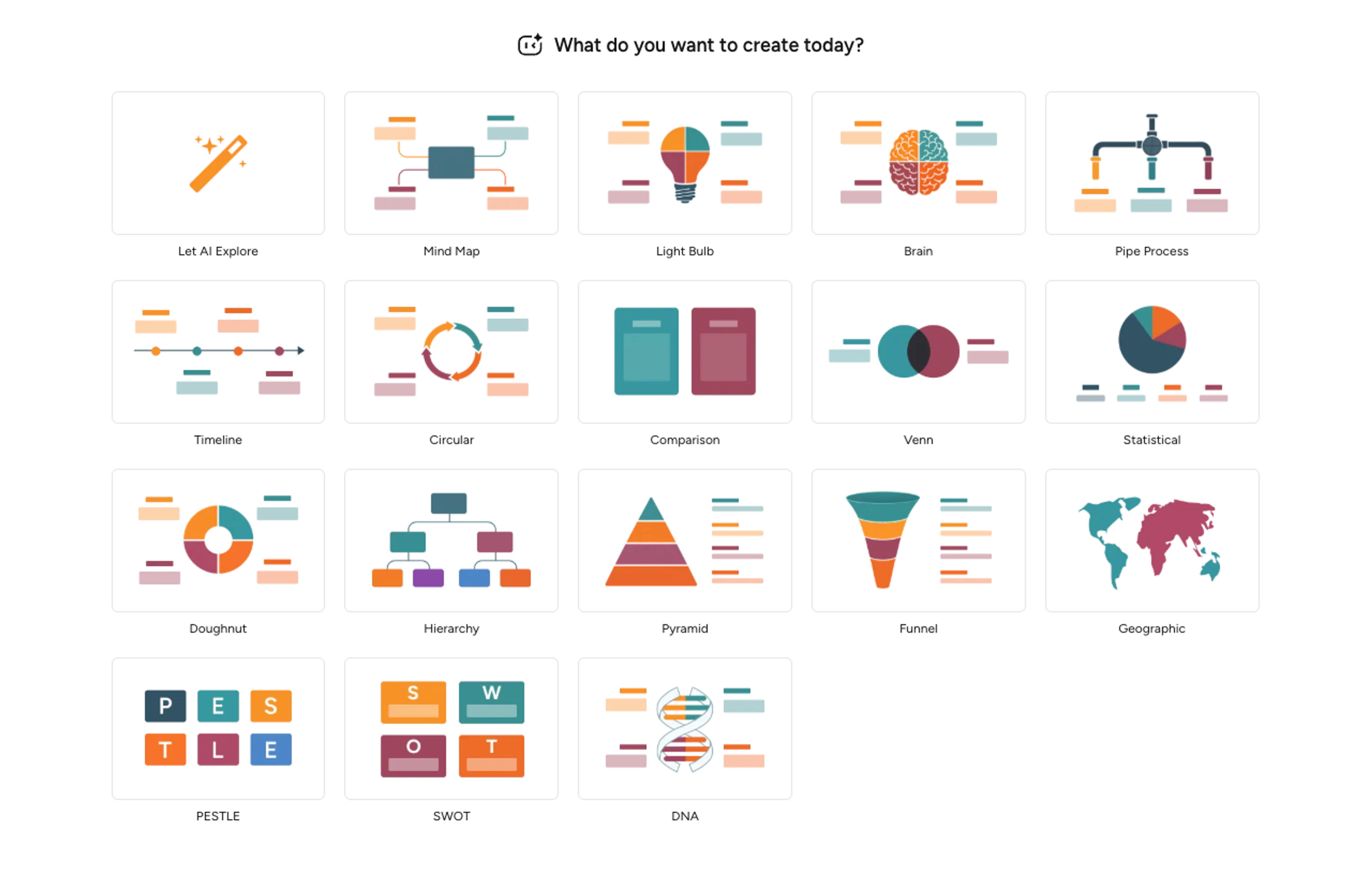
Infograph extracts the main entities, relationships, labels, and hierarchy, then lays them out as a readable figure draft.
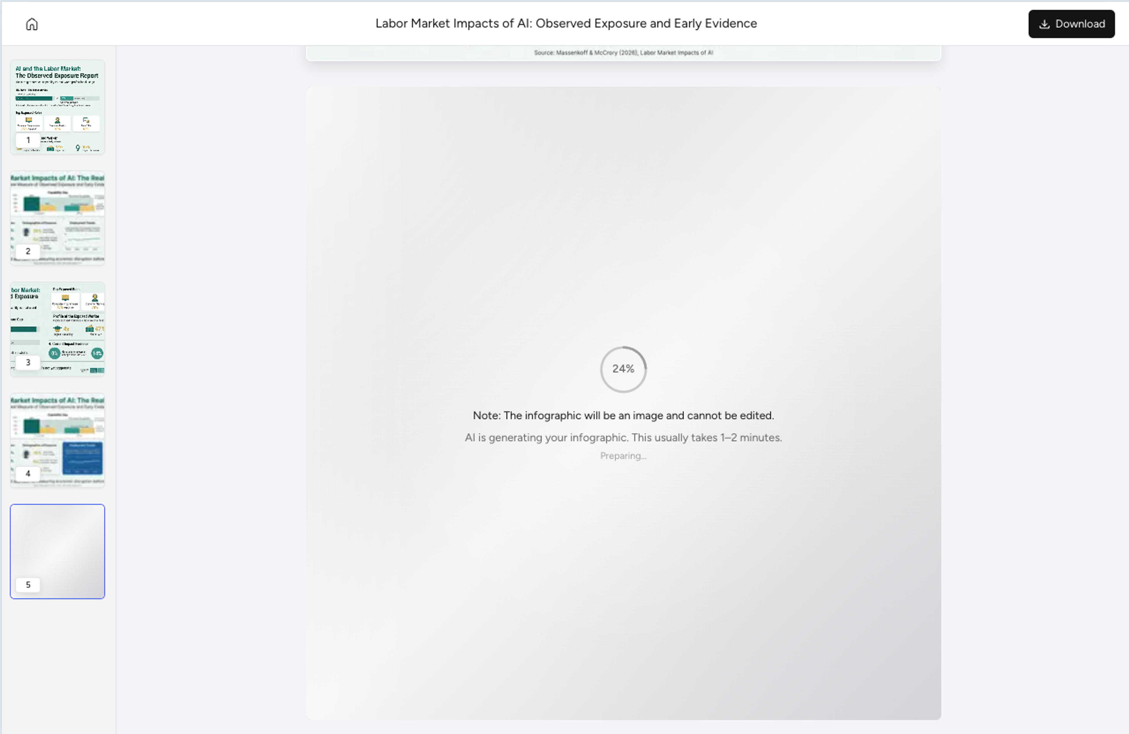
Ask for more formal academic wording, simpler classroom labels, or a different emphasis, then export the visual for reports or slides.
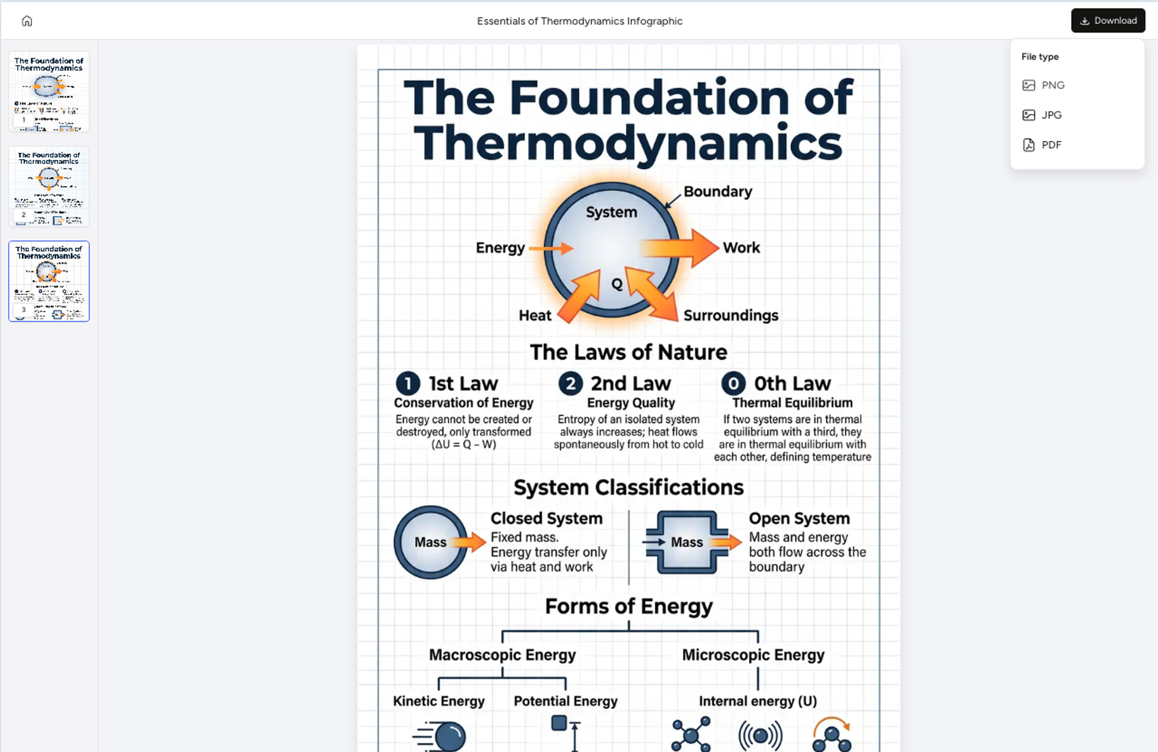
Explore result styles for research, classrooms, strategy communication, and technical teams.
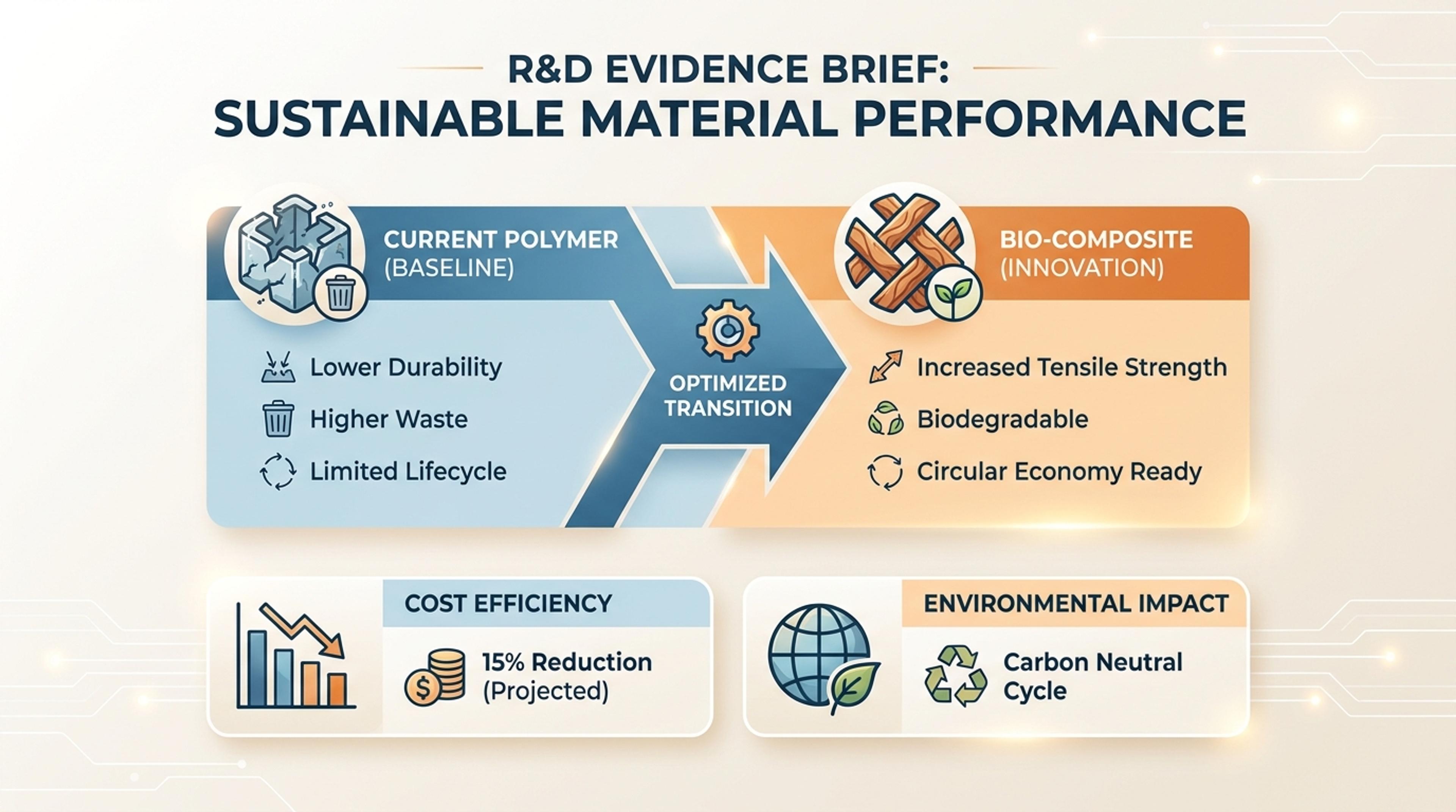
Summarize a technical finding for internal stakeholders with concise labels and visual proof points.
Move from raw explanation to a structured figure draft without starting from a blank canvas.
Use papers, notes, and real findings as the basis for the figure.
Show mechanisms, comparisons, pathways, and evidence groups in one readable structure.
Shift between K-12-friendly, academic, business, and strategy explanations.
Keep labels, callouts, and supporting details visually ranked.
Refine labels, simplify concepts, or change the figure emphasis after generation.
Download figures for slides, reports, handouts, and research communication.
You can start from papers, methods notes, lab summaries, data descriptions, lesson notes, or a plain-language topic.
Yes. Academic examples are intended for university, graduate, research, poster, and report contexts with more formal labels.
Yes. Education examples should be more colorful, approachable, and classroom-friendly than academic research visuals.
Yes. You can ask Infograph to simplify labels, adjust emphasis, change the structure, or make the tone more formal or more student-friendly.
Yes. Generated visuals can be exported for slides, handouts, reports, and other science communication workflows.
No. You can use it for biology, medicine, chemistry, data explanations, experimental processes, and other scientific topics.
Explore adjacent Infograph tools for scientific figures, data graphs, diagrams, and source-based visual summaries.
Turn methods sections, results tables, and lab notes into publication-ready scientific figures without rebuilding diagrams in vector software.
Turn complex research, raw data, and academic papers into clear science graphs with Infograph's AI generator.
Use Infograph to turn your research papers, data, and notes into professional scientific figures and educational graphics instantly.
Upload a research paper, white paper, or report PDF and Infograph extracts the structure to render a clean infographic — no copy-paste between tools.
Paste an article, transcript, or batch of notes and Infograph turns the text into a polished infographic with hierarchy, callouts, and chart treatments.
Turn papers, lab notes, links, text, and data into scientific figures, graphical abstracts, biology diagrams, and research visuals. AI Scientific Figure Maker | Built for research and education